

- Overview
- Transcript
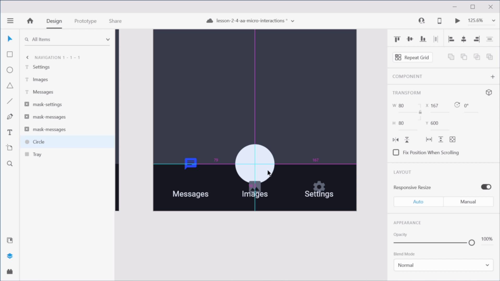
2.4 Micro-Interactions in Adobe XD
In this lesson I’ll show you how you can create micro-interactions in Adobe XD. Let’s begin.
Related Links
1.Introduction
1.1Welcome to the Course01:51
1.1
Welcome to the Course
01:51
2.Auto-Animate in Adobe XD
2.1Auto-Animating Position, Size, and Rotation10:26
2.1
Auto-Animating Position, Size, and Rotation
10:26
2.2Combining Masks and Auto-Animate19:08
2.2
Combining Masks and Auto-Animate
19:08
2.3Using Multiple Interactions on One Element07:49
2.3
Using Multiple Interactions on One Element
07:49
2.4Micro-Interactions in Adobe XD15:58
2.4
Micro-Interactions in Adobe XD
15:58
3.3D Transforms
3.1Next-Level 3D Transforms13:58
3.1
Next-Level 3D Transforms
13:58
4.Adobe XD Layout Tools
4.1Advanced Layouts With Stacks07:03
4.1
Advanced Layouts With Stacks
07:03
5.Components
5.1Advanced Components With States08:35
5.1
Advanced Components With States
08:35
6.Adobe XD Plugins
6.15 Top Plugins for Advanced Users11:27
6.1
5 Top Plugins for Advanced Users
11:27


