
 Lessons: 12Length: 2.1 hours
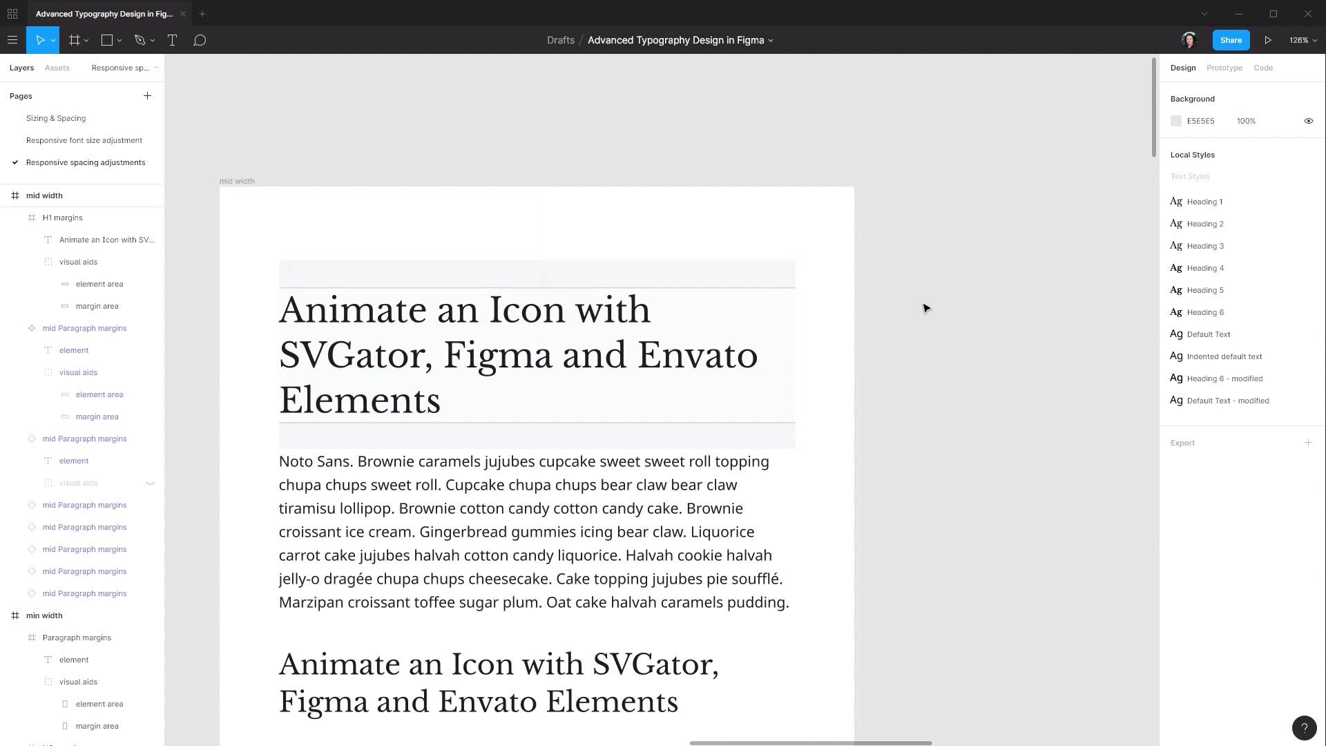
- Overview
- Transcript
2.2 Adjusting Spacing
In the previous lesson we set our font sizes to work in different viewport sizes. In this lesson, we’ll add some corresponding adjustments to the spacing around your lettering.
1.Introduction
1.1Welcome to the Course00:37
2.Responsive Adjustments
2.1Adjusting Font Sizes21:17
2.2Adjusting Spacing11:33
3.Color & Accessibility
3.1Site and Branding Colors29:03
3.2Dark / Inverse Mode05:36
3.3Color Contrast06:43
3.4Color Blindness04:10
4.Element-Specific Typography
4.1Links15:15
4.2Buttons08:39
4.3Blockquotes12:47
4.4Preformatted Code08:08
5.Wrapping Up
5.1Conclusion03:33
2.2 Adjusting Spacing
Hey, welcome back to advanced typographic design in Figma. In the last lesson, we got all of our font sizes set up for different viewport sizes to make sure that everything stays readable no matter what size viewport your site visitors are checking out your site through. But we still left our margins at the same default size that they were for our full size text. So in this lesson, we're gonna go through and adjust the margins for all of the text elements for our mid-width and minimum width breakpoint here. So, let's make a new page to work with this process. We're just gonna duplicate the page that we're working on in the last lesson, so right click and Duplicate, and now let's rename it to Responsive Spacing Adjustments. And we're gonna start by working on the middle width here so let's move this one out of the way for now. And then what we're gonna need to do is add a paragraph in between each of our headings so that we can check on the spacing in between each of our elements. To do that we're going to make a component out of the paragraph that we have here because we're gonna be placing it multiple times in our layout, it's gonna be easier for when we adjust the margin for this all of the instances of our paragraph are adjusted at once. So I'm just gonna move it way down here out of the way to start with, and we're gonna rename it and I'm just gonna add mid to the start here. Now we're gonna right click and choose Create component that's turn that purple so now we can add multiple copies of this into our design. So I'm just gonna copy and paste that to get the ball rolling and now what I want to do is, Put a paragraph in between each of these elements here. And then using the techniques we covered in the last course, make use of the visual aids to close the gap in between each of our elements so that the spacing between them represents the amount of margin that we currently have applied to each one of these elements. So once again, pause the video and set up your frame so that you have each heading with the paragraph in between it and the spacing between them accurately representing your current margin settings. All right, and when you're all done you should have something like this, each of your headings with the correct spacing and paragraphs in between the lot of them. And we're gonna make a duplicate of this frame, so just select and Ctrl+D cuz this way we can keep one of these as a reference so as we're adjusting the other one we can see how our changes compare. And because this is one that has the original paragraph component in it I'm gonna move this over to the right, and we're gonna change the rightmost version. And let's just get this out of the way a little bit as well. I said the first thing that we can do in this case, we're actually gonna start with the smallest element with the paragraph. And we don't actually need the second copy of that one there that's gonna be a bit distracting. Because we know already the font size of our paragraph text here we know from that font size how large the margin should be. If you remember from the last course whatever the line height is of your paragraph text that's how much space there should be in between one paragraph and the next. So we know that our font size here is 17 and our line-height is 160%, so to get the correct margin to update that value to all we need to do is take 17 and multiply it by 1.6, 160%, and that gives us 27, so we know that we need to have a margin of 27 pixels. Before we change this we're going to keep all of these paragraphs just as reference. So we're gonna go through, select all of those, and detach them so that these aren't changed. And then over here we're gonna update the margin size that we have by selecting the element, grabbing its height, I'm just gonna copy that, selecting its frame, pasting the height and then adding two rounds of that margin, so plus 27 plus 27, so now that's our paragraph taken care of. And then we can go ahead and re-adjust the position of each one of these paragraphs, although there's not much point in doing them all now because the headings are about to change. But we will just move this first margin down, paragraph rather, to help us with modifying the size of the margins on the heading-one element. So our heading-one element right now has a margin of 45 pixels, and it can help sort of conceptualize why this is too much by turning off the visual aids, so I'll just turn those off each of these for now. And you can see that it's just really it's wasting too much space. We don't have a lot of space to work with here so that's just too much gap. And actually, you know what, I'm going to select all of these elements and move them a bit closer to the top cuz that is also gonna help with eyeballing this a little bit more as well. What we're actually gonna do this one, instead of adjusting the margins the way that we have been before because we're trying to modify the space that we're looking at here at the bottom, we're going to shrink the size of this element from the top. So we're gonna drag this down until it looks like we've got around about the right amount of space in between the heading and the paragraph. So what have we got there? About 34. I think that can go a little bit smaller let's just drag it down a tiny bit more. 31, that looks I think about right. So now we'll turn on the visual aids again and make sure that everything is accurate, so that is all looking good. And then I'm also, I'm just going to grab all of these again and just drag them up to the top again just to help with the visualization. And that is looking much healthier, you wanna try to be as economic with space as you possibly can as you're decreasing the amount of overall room that you have to work inside of. Now we're gonna do the same thing with the heading-two element only this time we're going to move it up, seeing as we know that we have these two elements already in the correct position. So we're gonna shrink this up a little bit, check on what the margin is there, 26, that's probably a little bit, a little bit too small. Let's drag this up again. 29 that looks about right. And now I can move this paragraph up into the correct location. And then I can move this heading up to adjust to that as well, and then we can just repeat the process. So we're gonna be slightly shrinking down each one of these heading elements and then adjusting the paragraph below it until we have a nice smooth grade of spacing from our 31-pixel margin here at the top, down to a 27-pixel margin. And I think that you're gonna find as you start shrinking down these margins with smaller viewports is that when you get normally to about the H4 element that after that, that if you hit a margin that's already the same margin as you have on your paragraph element and you don't wanna go any smaller than that. You don't wanna have a space around headings that's smaller than the space around normal text. So, once you do hit, in this case, it would be a 27-pixel amount then you stop and you just make all of the headings from that point on a 27-pixel margin, so that you're not going any smaller than that baseline that you've set with the regular paragraph. So, once again I'm gonna leave it to you to go through and make the adjustments on each one of these headings. Of course, you can set these margins to whatever you think is right visually, but if you wanna use the same margins that I'm gonna be using here then as we've already seen, there's 31-pixel margin on the heading-one tag, 29 on the heading-two. Then we have 28 on the heading-three, 27 on the heading-four, and then also, 27 on heading-five and heading-six. So pause the video, go through and do that, and then come back. And when you've made those margin adjustments you're gonna get something like this. So this is the before on the left and this is the after on the right, and you can see we've got a much more compact and readable layout here. Let me just bump this up 100% so that you can see it in its actual size. So as you scroll down we'll see the effect on each of the headings and you'll notice that we're getting a lot more content into the same amount of space. And that's another thing to bear in mind is that means that there's a lot less scrolling that a person has to do on their tablet or whatever device they're looking at. They can absorb the content that you're trying to get across to them with less effort. So that is the spacing set up on a mid-width breakpoint, and then it's just a matter of going through the same process for the minimum width breakpoint as well. We wanna create a component out of the paragraph, however, because this paragraph is quite long it's gonna kind of be a bit of a pain to fit this as these in between each one of the headings. So you probably wanna come in and just delete the last half of this text so it's just a bit easier to work with, make all of the usual adjustments. And then there's not really anything extra to be learned by going through and showing you setting up the margins on this minimum width breakpoint because it's exactly the same process that we just went through. So what I will do is give you the margin values to add in here and then you can go through and make those changes. So once again, the margin for paragraph tag should be based on the font size being 16. We want one line height worth of margin and in this case, it's gonna make it 26, and at the top end we're gonna shrink our margins for the H1 element down to 35. So here are all the values that you will use, H1 will be 35, H2 will be 30, H3 28, H4 26, H5 is also 26, H6 is 26, and the paragraph is 26. So when you've done all of those you're gonna end up with spacing on your minimum width breakpoint that looks like this. So once again, everything is nice and compact, we're not wasting any space. And we're trying to make sure that we get the text that we need to have in this area across to the reader in the way that's most effortless for them. Move this over and we'll have a look at it compared to my mid-width. So you can see that there's quite a significant difference in the font sizing and in the spacing as we go through and downsize for different viewport sizes. So that is the process that you can follow to use Figma to design how your typography is going to respond to different viewport sizes. In a more complex design, you're gonna have more things to account for so you're probably gonna want more breakpoints. But regardless of how many breakpoints you end up with this is the essential process that you can follow to make sure that all of these things are considered as part of the design process. And that is everything that we needed to cover for the responsive part of our advance typography. The next section of the course we're gonna be moving onto looking at coloring and accessibility. And those two things go hand in hand to a fairly significant degree, and you're gonna see why. The first thing that we're gonna look at is how to work with site and branding colors, for example, taking a logo that a client has provided you and using that as a basis to put color into your topographic design. So we're gonna check that out in the next lesson. I'll see you there.


