
 Lessons: 12Length: 2.1 hours
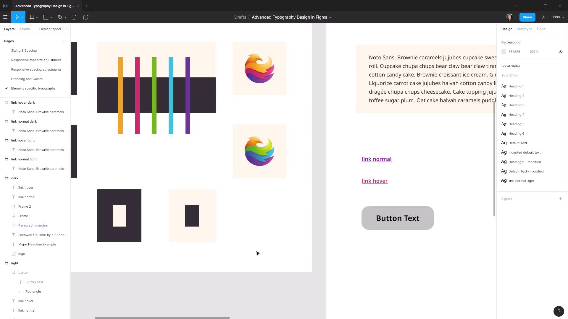
- Overview
- Transcript
4.2 Buttons
In this lesson we’ll look at designing buttons, and what considerations there are for working with text labels on buttons.
1.Introduction
1.1Welcome to the Course00:37
2.Responsive Adjustments
2.1Adjusting Font Sizes21:17
2.2Adjusting Spacing11:33
3.Color & Accessibility
3.1Site and Branding Colors29:03
3.2Dark / Inverse Mode05:36
3.3Color Contrast06:43
3.4Color Blindness04:10
4.Element-Specific Typography
4.1Links15:15
4.2Buttons08:39
4.3Blockquotes12:47
4.4Preformatted Code08:08
5.Wrapping Up
5.1Conclusion03:33
4.2 Buttons
Hey welcome back to Advanced Typography Design in Figma. In the last lesson we went through and setup typography for normal and hover link states, both light and dark versions. And in this lesson we are gonna do a similar thing, only we're going to be putting together our buttons. And even though buttons are arguably more of a graphic than typography, they always have text on them, and it's important to make sure that you control that text in a way that works well with your buttons. So, let's start by just drawing out a basic button shape, and then we'll set up the colors and the type so that everything works well together. So the first thing we're gonna need is a frame, draw out of frame as a rectangle and we're gonna set it up speed 245 by 80 pixels. So there it is there. Zoom it out a bit. Now we're gonna draw a background shape in here. Actually, first, let's just name this frame button. And we'll draw in a background rectangle. Just draw a rectangle inside here. And then we're gonna drag the corners out until they snap with each edge of our frame, then we're gonna give it some rounding on the corners. So up here, we're gonna change this number to 25. And now, we're gonna make sure that this background always fits the size of the frame. So, we're gonna go up to our constraints and set that to left and right and top and bottom. So now, if we change the frame size, then the background changes along with it. And then, the last thing we need is our text label. So, grab our text tool. Draw out a frame. We'll just add in text Button Text. Now we wanna get out of text editing mode, which we can do by just clicking on the canvas. And we wanna drag out each of the edges of this text box to fit the frame. And then we want to center align our button text, which we can do by hitting this button here to horizontally center it. And actually, let's detach that style. And then this button here to vertically center it. All right, now the first thing we're gonna need to do is get rid of that underline. So just hit this None button here. Now we need to decide which of our fonts we want to apply to our button text. So we've got our serif font here and our sans serif font. So we can just test each of the fonts in here if we want. We've currently got Noto Sans and we can also try Noto Serif. As for which looks better, that's really just down to a judgement call. However, for the utility side of things, I would suggest that you use the same font on your buttons as you use on your links. Because if you have some styling that's similar between your buttons and your links, then it helps to make that subconscious connection that both of these things are interactive. So, we're gonna to leave that as Noto Sans. And now at the moment, we have too much just empty space around the side here. So this is where we're going to bump up the font size. So I'm just gonna zoom to 100% so we're getting an accurate view of how big this text is. We'll leave the font weight at semi bold. Again, you can experiment with different font weights, but I'm gonna leave this at semi bold because it's nice and readable, but it's not too chunky. And we have, again, that subconscious connection with the styling of the links. So let's just hold down Alt and start dragging the slider up until it seems like we're at a good size. So I'm gonna say 26 is a good size for this text. It's very easy to read, and yet we've got a nice comfortable amount of space around the outside. So that's our basic button taken care of in terms of getting the text in place, the right size, with the right font and the right font weight, and now we need to make sure that the colors are gonna work well with this text. Now, generally speaking with your buttons, you're going to want to use your highlight colors. You could use these colors if you wanted to, your standard dark and light color. But because you're using these colors commonly it's gonna make it unclear that buttons are something different, that they're standing out. So you pretty much always gonna want to use your highlight colors. So we're gonna make two different colors of buttons for the light version and two for the dark version. We're gonna make one here based on our purple color and another one based on our pink color. And for these, we're not going to use exactly any of the colors that we have so far. Conveniently, there's already a really nice gradient built into this logo. So we are gonna sample from either end of this gradient as a nice quick and easy way to generate our colors. So let's select the rectangle that's forming at the background of our button here. We're gonna open up the color picker in here, we're gonna change from solid to linear to give us a linear gradient. Our first color is gonna be the color at the top, so we want that to be a lighter color. And we'll just start by selecting a color at the end of this pink section of the logo. And then for the bottom color, we will choose one at the other end. And now this is where you can see that the color that we have on our text looks a bit weird. Again, comes back to getting those contrasting colors right. In this case, it's probably going to be easiest to just go with a straight up white color. If we wanted we could, Use our lighter colour here, but it's just gonna be a little tiny bit more difficult to get all the colours working well together. But white like black goes with everything. So that's our first colour all done. And then we can just do the same thing to create another colored version. And actually by the way did you see there, when I move this over, there's a little white color on the corner there? That is because the frames here, actually let's delete that, the frame that's holding our button still has its own background color. So we're just gonna delete that. So now I'll duplicate. And now you can see there is no more white corner there. So now we're just gonna change this one up, so that's again it's meshing in with our highlight colors that we have throughout the design. So for a light colour, we gonna chose this end of the logo, and our dark color, Is gonna come from this end. And then automatically our white text here works really well in contrast with the button background color also. And then we can just do exactly the same thing for our dark version. So let's highlight both of these buttons, come over here to add dark version, And we're actually gonna be sampling from this logo, so let's just make things a bit easier by getting a copy of the logo and bringing it down here for sampling. So let's just change this one up to reflect our blue highlight color. So let's sample from this top end, And this bottom end. So that's that one done just like that. Again, this is the advantage of preparing your approach to your color scheme in advance. And then for the green one, come up here, And come down here. So now we have our button setup for both of our different color scheme versions. And we have the text working really well on each of those items. Again, that might not seem like it's a typography question as much as it is a graphic design question, but you don't know until you start to map out some of these colors how the plans that you've got for your text are gonna work in with them. So it's important to still go through all of these steps as part of your typography design as well. All right, next up we're gonna move on to designing another text element, this one is very clearly typography related, and that is we are gonna be planning how block quotes will look in our design. So for that I will see you in the next lesson.


