
 Lessons: 12Length: 2.1 hours
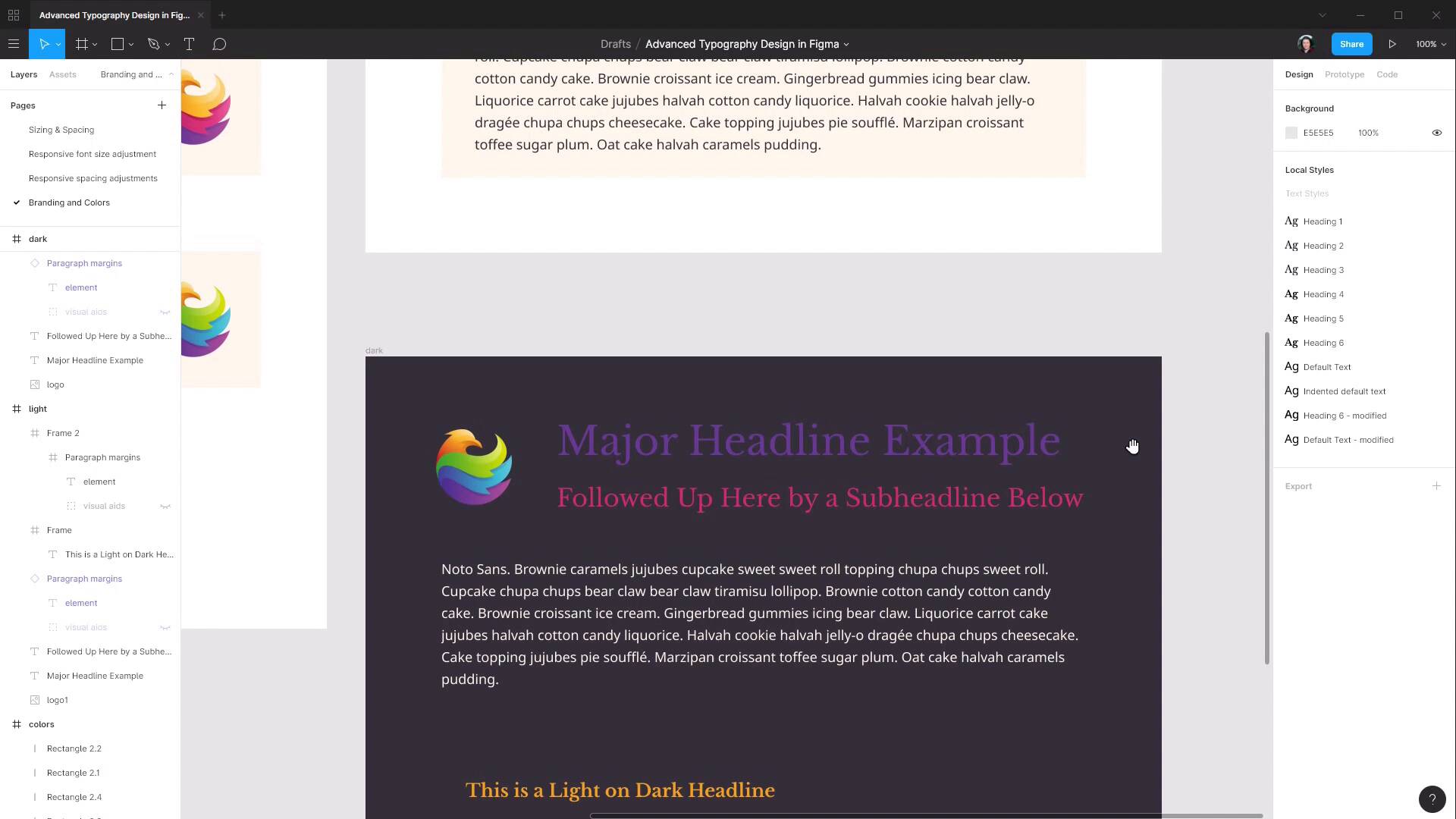
- Overview
- Transcript
3.2 Dark / Inverse Mode
It’s not absolutely essential to have a dark mode for your designs, but it can definitely be a bonus feature to offer for visitors reading at night, or just trying to ease eye strain in general. In this lesson, we’ll see how to use Figma to create an inverted color scheme for your typography.
1.Introduction
1.1Welcome to the Course00:37
2.Responsive Adjustments
2.1Adjusting Font Sizes21:17
2.2Adjusting Spacing11:33
3.Color & Accessibility
3.1Site and Branding Colors29:03
3.2Dark / Inverse Mode05:36
3.3Color Contrast06:43
3.4Color Blindness04:10
4.Element-Specific Typography
4.1Links15:15
4.2Buttons08:39
4.3Blockquotes12:47
4.4Preformatted Code08:08
5.Wrapping Up
5.1Conclusion03:33
3.2 Dark / Inverse Mode
Hey, welcome back to Advanced Typography Design and Figma. In the last lesson, we saw how you can start by looking at your clients' branding, their logo, and the colors that they use in their logo. Extract colors from that will work with your typography, test them, and compare them to one another and make sure that they contrast and work well together. And then apply them to the font selections and sizing selections that you've already made so far in your typography design. In that lesson, we created a light version of our typography color scheme. And in this lesson, we're going to just create an inverse version of that color scheme, a dark version. As I mentioned at the end of the last lesson, it's getting increasingly important to consider including a dark version in your site designs. Because more and more people are starting to use that as a preference, either having everything set to dark mode all the time, or flipping their systems over to dark mode at night, right? So we're gonna start by just renaming these frames so that we keep things a bit better organized. So we'll call this one colors and then we'll call this one light. And now all we need to do is duplicate, I'm gonna drag this down here, and rename it to dark. And I'm gonna move this color selection down here so it's just a bit easier to reach. Now, because we've already done the preparation, we've already done the legwork and selected our colors in advance, this should be a relatively straightforward process. So we're gonna begin by just selecting our frame. It currently has a white background, and we're gonna change that over to our dark background color. So that's a big part of the job already done. And actually, we're going to swap out this logo for this logo. I'm just gonna copy and paste that here, Put it in position, and then delete the other logo. And we're going to use the colors from this logo on our text elements. Actually, before we do that, let's just turn off that white background here on this paragraph because it's sort of throwing out how that looks. And while we're at it, we're going to set the text color so it looks like the element for that paragraph. Now, we could, if we wanted, just use a white text color. Let's just zoom in on this with Shift+0. But it's actually gonna work in with our color scheme probably a bit better if we use our light color that we defined earlier instead. So I'm gonna reselect that text, and I'm gonna grab the color picker and sample one of the light color instances instead. All right, so now that bit's all squared away. So it's going to throw out our assessment of the colors that we apply to our headlines here. Now we've already used the purple and pinky colors from our highlights over here, so now we're gonna use the green and the blue. We're going to apply the green to our main headline by just sampling our green color over here. And then we're gonna apply the blue, To our sub-headline. And it's that straightforward. You can change up the colors and apply different ones if you want. They're all gonna work together relatively well, again, because we did that groundwork. Next, let's change up our headline here. And we're actually still gonna keep this as a light on dark headline. We're just gonna change the colors so they work well in this dark mode. So we're gonna change the background color to use the same purple that we sampled from the bottom of the logo here, once again trying to bring all those colors from that logo together on the same page. So let's go to our background color for this frame, and we're gonna select that purple. And then we'll select our text, and for this, we're just gonna use white. We could, again, use our sort of a yellowish color, but it's gonna give us just a little bit better readability if we go with white there instead. And here, again, we could leave a yellowish color on this block quote. But just for the sake of demonstrating the different variety in the way that you can combine your colors, we're gonna switch this over to white as well. So now we have a light and a dark color scheme sorted out for our typography, put together quite quickly just by choosing the right colors to start with before we even begin applying them to our text. The next thing that we're gonna look with color is how it influences accessibility. It's very important to make your content as accessible as possible to as many people as possible. So that includes making sure that people aren't excluded from being able to read the content if they have some type of visual impairment that makes it more difficult for them to read colors that are too close together. And that's why it's really important to have a process in place by which you check specifically what degree as a number, as a numerical value, reflects the amount of contrast that you have between the colors that you've selected. And on top of proper color contrast, making sure that your sites are accessible. It really just improves the capacity for everybody to read your content easily. So in the next lesson, we're gonna see how you can use a plugin inside Figma to check on your color contrast values as a number, and how you can use that same plugin to make any adjustments that are necessary. So we're gonna go through that in the next lesson. I'll see you there.


