
 Lessons: 12Length: 2.1 hours
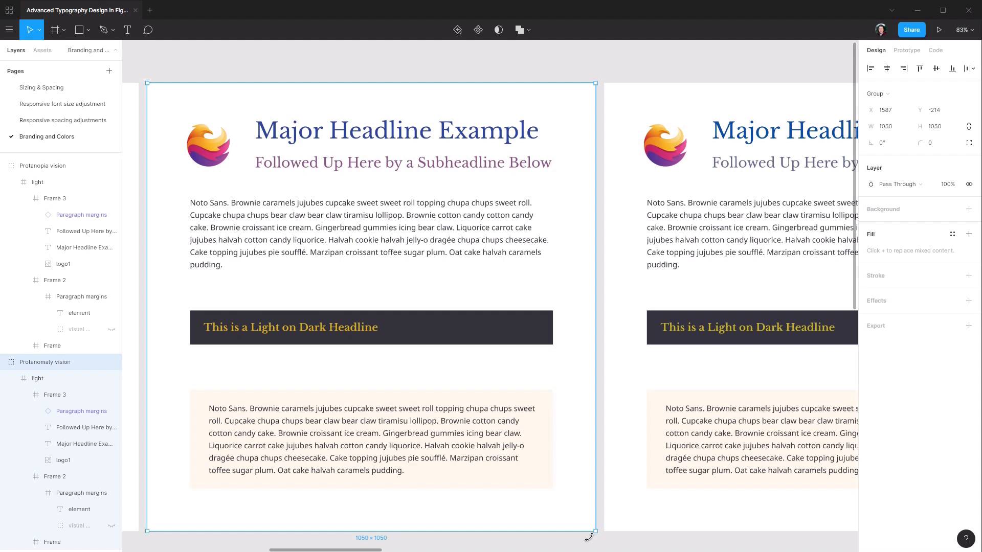
- Overview
- Transcript
3.4 Color Blindness
An additional step we can follow in creating web typography that’s as accessible as possible is considering the effect of color blindness on our color scheme choices. In this lesson we’ll see how you can make sure your typography is still readable regardless of how your colors are perceived.
1.Introduction
1.1Welcome to the Course00:37
2.Responsive Adjustments
2.1Adjusting Font Sizes21:17
2.2Adjusting Spacing11:33
3.Color & Accessibility
3.1Site and Branding Colors29:03
3.2Dark / Inverse Mode05:36
3.3Color Contrast06:43
3.4Color Blindness04:10
4.Element-Specific Typography
4.1Links15:15
4.2Buttons08:39
4.3Blockquotes12:47
4.4Preformatted Code08:08
5.Wrapping Up
5.1Conclusion03:33
3.4 Color Blindness
Hey, welcome back to advanced typography design in Figma. In the last lesson, we learned how to make sure that we have sufficient contrast on the colors that we're using for our typography design. And in this lesson, we're gonna learn how to make sure that our colors are also suitable to ensure that they're accessible for people with color blindness. And once again, this is just a straightforward matter of using a plugin as part of your design process. So I'll show you how to find it. Go to Menu > Plugins > Manage plugins, browse all plugins. And we're just gonna search for color blind. You'll find this plugin, Color Blind. You can go ahead and install that. And now all you need to do is select the frame of the design that you've done so far. Go up to your plugins, choose your color blind plugin. And then these are all the different types of color blindness that it's possible to have. So in a nutshell, it's just missing the ability to see a particular color. And what this plugin will do is generate a version of your color scheme with each of the relevant missing colors removed from that design. So let's see how it works. Let's hit Create views. And then you can see that it's now created a whole bunch of different versions of your color scheme, With all the different colors. And this shows you how a person with each different type of color blindness would see your design. Right down to someone that's not able to see any colors at all and just sees things in monochrome. So let's zoom out so we can see all of them, and get a bit better view. And then if you select each one, you'll see in the frame name, it shows you which type of color blindness is being represented there. And now the next part is not an exact science, it's just a matter of going through and looking at each of these different frames and just asking yourself, can you read these colors? Just putting yourself in the position of the person who is reading your content with this form of color blindness. And asking yourself, can you see this okay? And if not, then making adjustments to your colors, regenerating these views, and checking them again. If you wanna be extra thorough, you can also go through and re-check all of your color contrasts and make sure that even after these adjustments have been done, the color contrast is still sufficient. Generally speaking, though, it should be, because color contrast is a question of lightness versus darkness. Whereas color blindness relates to which hues are available in a person's perception. And then we can do the same thing with our dark version as well. Just select the frame, go to our Plugins, go to our Color Blind plugin, and Create views. And then once again, we can just go through and check and just eyeball it and just make sure that these colors are all still sufficiently readable and legible. Just ask yourself, can you read everything okay? Look through everything and just check that this is still a comfortable viewing experience, even with those changes to how the colors appear. And that wraps up our color and accessibility portion of this course. In the next section of the course, we're gonna look at the last aspect of creating typography for any site design, and that is designing typography for specific elements. This is something that's pretty frequently forgotten by designers during the design phase. It can be easy to focus on the overall design and forget to do the granular things like deciding on the coloring of links, for example. And if the designer doesn't complete that portion of the typography design, then it falls to the coder. And the coder may or may not choose the colors and the look that the designer would like to have in the overall design. So in the next section of the course, we're going to put together some element-specific typography for links, buttons, block-quotes and pre-formatted code. And the first cab off the rank is going to be links. So we'll step through that in the next lesson. I'll see you there.


