
 Lessons: 10Length: 47 minutes
- Overview
- Transcript
2.3 Grid Areas
In this lesson, we will take a closer look at our Grid Layout setup for the overall page layout. We will be marking up the main sections of the page using Grid Layout syntax, and then we will define where each of those layers will be placed.
Useful Links
1.Introduction
1.1Introduction00:44
1.2Comparing Flexbox and the Grid05:11
2.Flexbox and Grid, Sitting in a Tree
2.1Where We’re Going02:42
2.2Looking at the Markup05:43
2.3Grid Areas11:00
2.4Fixing the Widths05:17
2.5Styling the Header05:54
2.6The Space Between04:24
2.7Recent Posts05:11
3.Conclusion
3.1Final Thoughts00:42
2.3 Grid Areas
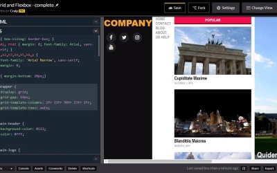
Hello and welcome back. Now that we've got a good idea of how our HTML is set up, let's jump into our CSS and start laying out the main structure of our document, using the grid layout system. So as a very very quick review, if we collapse this, we can then see the main sections inside our wrapper. So our wrapper div is going to be the container for our entire grid system. And we need a container, if we're gonna be using the grid layout system. So this div with an id of wrapper, is gonna be a container. And then each of these items inside that container are going to represent the different areas that we are going to place within our grid. Now, there a couple of different ways that we can do this. A couple different ways that we can lay each section of this site. One way we can do it is by specifying the row and column that each of these sections start in In and then specifying how many columns or rows that it will span or we could do it using named template areas and we're gonna be using this second method in this particular lesson. So before we get started let's go and go ahead and create a new copy of our code pen. So you can find the URL for this code pen in the course notes for your lesson. Once you open that up, go ahead and click on fork to create a new copy and then we'll create our changes in this copy. So again we have our wrapper. Let me collapse these sections again so we can go back and reference it when we need to. So we have a wrapper, and that's where we're going to apply the display of Grid. And so, if we look through our CSS here, you'll see we don't a rule for the wrapper element yet. And I'm gonna place this just above the main header just below this paragraph tag here. And we're pointing to an ID. So we're gonna say pound-wrapper. And here we're gonna set the display property to a value of grid. And you'll see that that doesn't really change much yet, because it doesn't know how it's supposed to lay out each of these sections within that grid. And that's what we're gonna be creating these template areas for. One thing I do wanna go ahead and do, is I wanna set up a grid gap here, and this will define the amount of space between each of the grid sections here and we're gonna put a gap of about 14 pixels and then we're gonna create our column layout. So the way I'm gonna set our columns up here is I'm gonna use a couple of basically empty columns for our margins on the left and right hand side of our layout and the reason I'm gonna be using columns instead of just putting margin on the left and right hand side is because I want the header and the footer to extend all the way to the end, to the left and right ends of our browser window. But the rest of the content is going to be indented a little bit, so we're gonna have a little bit of space to the left and right. So we're gonna create really small narrow columns on the outer edges, on the left and right edges and then larger columns in between. So the way we define the number and size of our columns is we use this grid template columns property here and I'm gonna be using the FR unit. So for example, if we had two columns and each of them were set to 1FR, then that would make both of the columns the same size. If we were to set the first one to 1FR and the second one to 2FR then the second one would be twice as large as the first one. Now sometimes the size of the content inside those columns will alter the size a little bit, but we're gonna fix that in a moment. For now, I wanna lay out these columns, and one way that we can do this is we can think in terms of percentages. If we're gonna be using this fractional value here. And so, if we want our columns or our gaps on the left and right-hand side, our edge margins to be, let's say 2% of the width of the entire browser window, we can set that to 2fr. And I'm gonna go ahead and type out the rest of our sizes here and then I'll explain. So as you can see, we have five columns set up here. The middle column where our main content is going to be, our featured articles, if you will. That column is going to be 50 percent of the width of its container. The left and right side bars are each going to be 23 percent of the width the container. And then our margins on the edges are going to be 2%. So as you can see, these numbers do add up to 100. But that's only because I'm thinking in terms of percentages. You, these numbers do not have to add up to 100. Because this FR unit is just a fractional unit. It's just defining one unit's size or one column's size in relation to another column's size. So you could simplify this quite a bit using smaller numbers. But for the purposes of this particular layout, I like having these 2% margins on the edges. That way we can span our header and footer over those edges and then for a rose we're just going to set those up using a similar property called grid template rows. And I'm just gonna set that to auto. So as much content as we have in there it's just going to automatically fill up any rows that might be in that grid system. Now this wrapper is where we would also define our grid template areas or where we would lay out the grid template areas that we're going to define. And as we mentioned before, those grid template areas are going to be this direct descendants of our wrapper, so it's gonna be the main header, main nav, our two side bars, feature articles and our main footer. So let's define those and we'll get started with our header. So we have this main header rule already defined down here. I'm just gonna go inside that rule and the way we've defined this grid area is using the grid hypen area property and then we can give it a name. I'm just gonna call it header. And then we will use this name whenever we are laying out those items in our wrapper element. The next major section just beneath our header is going to be our main nav unit. And you can see we have a rule here for the anchor tags within the main nav element. So I am going to create another rule just above that for the main nav element by itself and so we're going to define this grid area property. And let's just give this one a name, of main nav, the same name we gave to the ID of that element. Then below the main nav, we're going to have our three main columns, our sidebars, and our feature content in the middle. So I'm gonna scroll down just below our main nav anchor tag rule in just before our sidebar heading class. And I'm gonna create a rule for sidebar1 and we're going to find the grid area for this one. And we'll give it the same name as well sidebar1, and then we can copy that. And go ahead and paste it as sidebar2, so we'll just change those 1's into 2's. And then in between those we're going to have our featured articles, so I'll scroll down below our sidebar. You'll see that we have a rule for feature-articles, article elements. So we're going to create another rule just above that for just the feature articles element by itself. And we're going to set it's grid area to a value of, let's just call it feature articles. So the last one we have is going to be our footer and we're gonna scroll down to the very bottom, here. Here we have our rule for our main footer. And that's the one we're looking for, so I'm just gonna go inside that, and set the grid-area to a value of footer. So now that we've defined all of our grid areas, and we've defined how wide each of our columns are going to be, we can now go back into our wrapper element and define where all of these grid areas are going to be laid out within the grid system. And we're gonna do that using a property called grid-template-areas. And the way this works is, for each of our rows In this template, we're going to define which items or which grid areas are going to appear in which sections of that particular role. So the top row is our header row and we want our header to span the entire width of that row. So it's going to span all five columns that we've set up here. So the way we make that happen is we type in the name of the value we gave to that grid area down here which we call the header. And so we've just type in the word header five times. I'll just copy at there and paste it four more times. And now that header should take up all five columns of that first row. So then we can hit enter to go down to the next line. You'll notice we haven't had a semicolon yet, and inside another set of quotation marks we can define our second row and our second row is going to have our main navigation in it. And we're actually going to have two empty columns on each side. And the actual menu is just gonna take up the same width as this center column that we've set up. So the way we create an empty column is we just type in a period there. So there's our first empty column. Our second empty column. And then the name of our main nav unit which we called main-nav. And then two more empty columns. So now that that's set up, we can set up our third row which is going to have a very small column on the left and right that are going to be empty. So we use a period there to denote an empty column. And then we called our first sidebar, sidebar1. We called our feature articles, feature-articles. Our second sidebar called sidebar2 and then we have another empty column on the right. So that takes care of that particular row. Now we're gonna go to the next line and find our last row which is our footer. So we're just gonna set up our footer here, copy that and paste it four more times for a total of five footers. And all that means is our footer section is gonna expand all five columns of our grid. So now we can see how everything is set up. Now we still have some work to do because our content is wider than the screen as you can see right now. So we've still got a lot of work to do to get this where we needed to be but as we can see we've already got the basic grid column layout setup. So with that done we can go ahead and save and we'll move on to the next lesson. Thank you for watching.


