
 Lessons: 10Length: 47 minutes
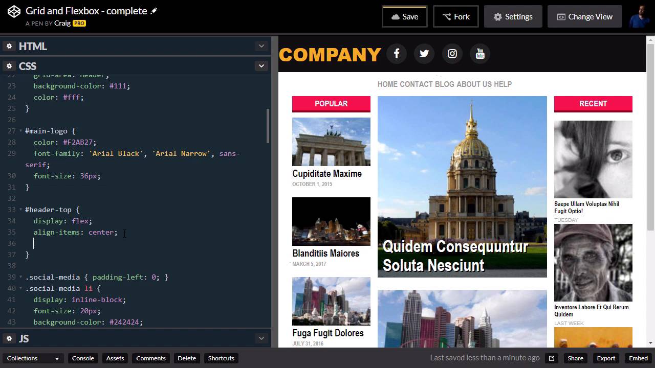
- Overview
- Transcript
2.5 Styling the Header
Now that we have our grid structure for the overall layout, in this lesson we’re going to jump into Flexbox to style the header of the site.
Useful Links
1.Introduction
1.1Introduction00:44
1.2Comparing Flexbox and the Grid05:11
2.Flexbox and Grid, Sitting in a Tree
2.1Where We’re Going02:42
2.2Looking at the Markup05:43
2.3Grid Areas11:00
2.4Fixing the Widths05:17
2.5Styling the Header05:54
2.6The Space Between04:24
2.7Recent Posts05:11
3.Conclusion
3.1Final Thoughts00:42
2.5 Styling the Header
Hello, and welcome back. Now that we've got our basic grid structure set up, we're gonna move on and talk about the header of our site. Now, our header basically just has two items inside of it. Remember, we have this header element called main-header. And inside of it we have our h1 and our unordered list with a class of social media, which are gonna be these media icons here. And I want to align all of these horizontally so that our logo is on the left and our social media icons are over here on the right. And since we're lining that up along one axis, just the horizontal axis, this would be a perfect time to use Flexbox. So, let's do that. But before we do that, I'm gonna add a little bit more markup to our header. And we'll explain why in a moment, but basically what I am gonna do, is I am gonna put another wrapper inside this main header. And this is going to be in the form of a div, and I am going to give that div and ID of Header-top. Again, I'll explain why I am doing this a little bit later, and hopefully it will make sense. And I'll put our closing div after the unordered list. So this header-top element here is going to be the container for our Flexbox setup here. So we're gonna jump into our CSS and create a rule for that header top element. So just underneath our main header and main logo, let's create a new rule for header-top, which is the id that we gave to that container. And we're gonna give it a display value of flex. Now, by default, that's going to align is as a row instead of a column, which is exactly what we want. If we wanted to actually specify that, we could use the flex-direction property and set that equal to row, or column if you wanted to set it up vertically. So then, in order to align our items on the cross axis here, our main axis is going from left to right because we set this up as a row. And our cross axis, in this case, is going top to bottom, our vertical axis. And if we want to align these items along the vertical axis, we would use the align-items property. And I wanna do that because it looks like our social media icons are vertically centered, but our logo is not. So again, I'm gonna use the align-items property, and simply set it to center. And there we go, now our logo is vertically centered. Then we are going to set up our justified content property. So our justified content property is the way we align our items across the main access. Which, in this case, since we are dealing with a row here, is the horizontal axis. And you can think of the justified content property as text justification in a paragraph. So you can align your paragraph to the left, to the right, to the center, or you can justify it so that every single line of text touches both ends. It basically just puts more space in between some of the words. So again, this property is called justify-content, and we're gonna use a value of space between here. And what this value does is it kinda works like the justify property when you're dealing with text. It tries to align every line so that the leftmost item is in the far left edge of the container and the rightmost item is in the far right-hand of the container, and any items in between will just be spaced out evenly. So what this does for us is it puts our logo on the left and our social media icons over here on the right. And now we get to the reason why we created this extra markup here, this extra header-top div. Because what I wanna do is I want to align the left edge of our text and the right edge of our icons over here with our columns. And remember, when we step our grid layout, we have this little column over here on the left, and another little column over here in the right that don't have any content in it. And each of those takes up 2% of the full width of the browser window. So what we can do is we can go into our main header here and give it a left and right padding of 2% so that whatever's inside it, which is going to be the rest of our content for the header, those should line up, then, with our columns if we do that. So let's go into our header-top rule. I'm sorry, not our header-top rule, our main-header rule outside the header-top. So we're gonna go into main-header, and we're gonna apply some padding here. So, I want our top and bottom pudding to be zero, and our left and right pudding, as we mentioned a second ago, to be 2%. And when we do that, you'll see that it doesn't quite line up yet. And the reason for that is, if you remember, when we set up our grid, we have this grid gap of 14 pixels. So there's an extra 14 pixels over here on the left edge of our column, and another 14 pixels over here on the right edge of our second sidebar. So we just need to do a little math in order to fix that. And what I'm going to do is I'm going to apply 14 pixels of left margin and right margin on our header-top item right here. So I'm gonna add a margin property here. And I'm gonna set it to auto because I want our top and bottom margin just to be automatic. And then, the left and right margin to be 14 pixels. And when we do that, you can see that our edges are now aligned perfectly. So that's how we can use the Flexbox model in combination with a little bit of extra margin and padding in order to set up the header for our site. Thank you for watching, and I'll see you in the next lesson.


