
 Lessons: 10Length: 47 minutes
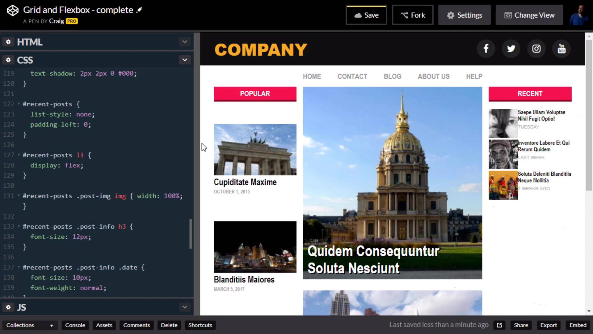
- Overview
- Transcript
2.7 Recent Posts
In this lesson, we will finish up our site layout by applying a little Flexbox magic to the right column of the page.
Useful Links
1.Introduction
1.1Introduction00:44
1.2Comparing Flexbox and the Grid05:11
2.Flexbox and Grid, Sitting in a Tree
2.1Where We’re Going02:42
2.2Looking at the Markup05:43
2.3Grid Areas11:00
2.4Fixing the Widths05:17
2.5Styling the Header05:54
2.6The Space Between04:24
2.7Recent Posts05:11
3.Conclusion
3.1Final Thoughts00:42
2.7 Recent Posts
In this lesson, we are gonna take a look at our right most column in our web layout here. And we're going to set this up so that our image thumbnails are going to be to the left and the text is going to be over here to the right. Now, we're not really gonna deal with any media query's or responsive options in this particular course. But you would definitely wanna take this a little bit further so that once you get down to a smaller browser size such as this, that it would end up looking like it does now, with the image on top and the text on the bottom. But again, because of the brevity of this course, we're going to skip over the responsive options. And just build it as though we knew our browser was gonna be large, so let's preview our HTML for that right column. We have our sidebar2 div here, and inside that we have an h2 with a class of sidebar-heading and then under that we have an unordered list with an id of recent posts. But, what we really wanna focus on here are the list items within that recent posts unordered list. These list items are going to be our flex containers because that's where we're going to set up our images to the left and our text to the right. So, you'll notice that our images are contained inside this div with a class of post-image and all of our text is contained inside a div with a class of post-info. And wrapping that in a container div makes it easier to set up our flex box layout. Because these are now direct descendants of that list item. So once you've opened up the CodePen listed in your course notes for this lesson. Go ahead and click on Fork to create a new copy of it. And then our new copy let's jump into our CSS. And in our CSS, we're gonna scroll down quite a bit until we find the recent posts items. And I wanna create a new rule for the list items within those recent-post, remember those list items are now going to be our flex container. So recent-post li, so we're gonna set the display of those list items to flex. And as you can see, that already gets us most of the way there. It's a little cluttered right now and we need to fix that, but that gets us most of the way there. Also I'm not setting it up for a browser size this small, so let's go ahead and make that a little bit larger to get a better idea of what it's gonna look like in a larger browser window. And I will leave it up to you to go in when we're done and create some media queries so that this will look good at all browser sizes. Now the first thing I see that I want to do here, is I wanna put a little bit of margin at the bottom of these list items so that there's a little bit more space in between each of these articles. So we're gonna go into this list item rule that we just created. And I'm gonna create a margin-bottom property here and set it to 14 pixels, which if you remember is the same gap that we gave to our overall grid system. The second thing I wanna do, is I wanna set up the image to be half the size of the info over here on the right, and we're gonna do that using the flex property. So just beneath our recent posts, I'm gonna create a new rule for the post-image class, which is that div that contains those images, and we're gonna set those images. We're gonna set the flex value of those images to 1. Which by itself doesn't do anything for us until we set the flex value for the other item inside that container div. And the other item is going to our post-info. Remember, this post-info class contains the header and the day of the week, or the date of that particular article. So, we need a rule for the post-info class. Let's just highlight everything here, except for the h3 and copy it. And then just above that h3, we'll paste it. So for this post-info class, I'm gonna set the flex value here to a value of two, so that it will be twice as wide as the image. Remember, when you use this flex value here, it basically just compares those two numbers. If one number is twice as large as the other number, then it will be twice as wide as the first one. And then I wanna do one more thing here, I wanna add 10 pixels of left-padding. So that the text isn't right up against the images. So we're gonna set padding-left to 10 pixels, and there we go. We've now got a really nice-looking sidebar over here on the right. And again, I want to encourage you to go in and fix that so that when you get to a smaller browser size, it doesn't look like this. Instead it would have the image on the top and the text below it. So I'm gonna leave that up to you, but for now hopefully you've got a really strong idea of how to use flex box and grid together to build your page layouts. Thank you for watching, and we'll see you in the next video.


