
 Lessons: 10Length: 47 minutes
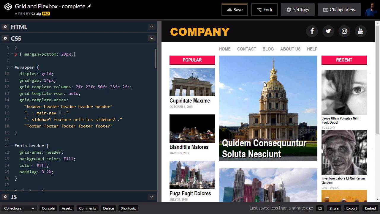
- Overview
- Transcript
2.6 The Space Between
In this lesson, we are going to use the space-between value to align our menu text as well as some of our sidebar items.
Useful Links
1.Introduction
1.1Introduction00:44
1.2Comparing Flexbox and the Grid05:11
2.Flexbox and Grid, Sitting in a Tree
2.1Where We’re Going02:42
2.2Looking at the Markup05:43
2.3Grid Areas11:00
2.4Fixing the Widths05:17
2.5Styling the Header05:54
2.6The Space Between04:24
2.7Recent Posts05:11
3.Conclusion
3.1Final Thoughts00:42
2.6 The Space Between
In this lesson we're going to use the same space-between value that we used in our header to align the text in our menu. As well as some of our articles over here on the left side bar. And so for our menu, we're going to be aligning these items horizontally. And for our sidebar, we're going to be aligning these articles vertically. And the space-between value of the justify-content property is going to act the same way as a paragraph would if you were to justify the text in that paragraph. It's going to pull the left-most word all the way to the left, and the right-most word all the way to the right, and just space out the words in between. And then for our column here, it's gonna do the same thing, but it's going to do it vertically, instead of horizontally. So again, in our HTML, we can get kind of a preview of what we're gonna be looking at. We have our main nav here, which is just a nav element with a few anchor tags inside it. And then we have sidebar1, which is going to be our second item that we are going to dive into in this particular lesson. So these should both be pretty quick, let's jump into our main nav first, and we already have a rule for that. If we scroll down a little bit we can find our main nav rule, and that main nav is going to be our flex container. So we're going to give it a display value, or display property, of flex. And you'll see that all of that text kind of bunches up against each other. So now we just need to use the justify-content property, and set that to space-between, and then we have it where we want it. Now remember, when we set this up, if we scroll back up to our grid layout. You'll notice our main nav has two empty columns to the left and two empty columns to the right. So that first and last empty columns are going to be the 2% of empty space there. And then the second and second to last columns there are going to coincide with our sidebars. So that our main navigation only takes up the same amount of space that our center column does. Now, we can certainly change that. If we created a media query, for example, for this wrapper. Once we get down to a certain size, you can change this grid template area so that that main nav takes up more space. We would just need to retype all of this out inside that media query with our main nav taking up three columns instead of just one. But that's beside the point, we've now got that lined up, now let's jump into our sidebar. So again, if we go into our HTML, our first sidebar has an id of sidebar 1. So in our CSS, we can scroll down till we find that sidebar, and here it is. And we're gonna give that a display, because it is the direct parent of the items that we want to space out here. We're gonna give it a display of flex. Now initially that's gonna break everything, because by default, anything with the display of flex wants to be horizontal, it wants to be a row. So we need to change that using the flex-direction property. So we're gonna set flex-direction to column, and things will automatically start looking a little bit better. And then all we have left to do is to set up the justify-content property. Now remember, the justify-content, you might think of it as going from left to right, but that's only if you're dealing with a row. It's gonna go in whatever direction the main axis is going. So if this is a column, and we use the justify-content property, it's going to align things vertically. So let's enter that in here, and again, we're just gonna do space-between. And this basically allows us to spread our articles out so that the bottom-most article here will line up with the bottom-most article in the center column. So again, it was very easy to accomplish, we just had a couple of extra lines of CSS to do that. And this is something that was much, much more difficult to do before we had access to things like the flexbox model. So thank you for watching, and we'll see you in the next lesson.


