
 Lessons: 10Length: 47 minutes
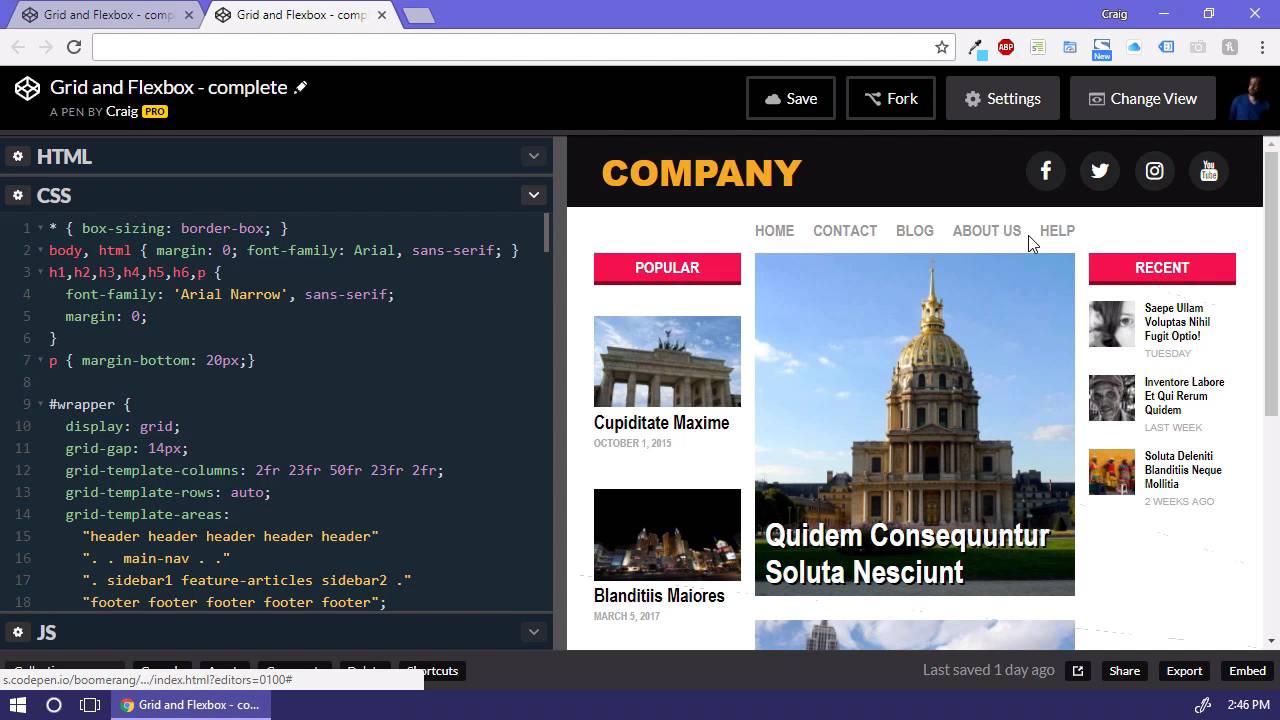

- Overview
- Transcript
2.1 Where We’re Going
In this lesson, I will walk you through the web page that we will be building in the coming videos. I’ll give you a brief rundown of where it makes sense to use the grid layout system and where it makes sense to use the Flexbox model.
1.Introduction
1.1Introduction00:44
1.2Comparing Flexbox and the Grid05:11
2.Flexbox and Grid, Sitting in a Tree
2.1Where We’re Going02:42
2.2Looking at the Markup05:43
2.3Grid Areas11:00
2.4Fixing the Widths05:17
2.5Styling the Header05:54
2.6The Space Between04:24
2.7Recent Posts05:11
3.Conclusion
3.1Final Thoughts00:42
2.1 Where We’re Going
Hello and welcome back. In this lesson, we're gonna take a look at the webpage that we'll be trying to build and we'll be discussing how we're gonna use the CSS grid layout model and the Flexbox model to structure the layout of our page. And we're gonna do that using the concepts that we already talked about in the last lesson. So really the only thing that we're gonna be using the grid layout system for is for structuring the overall columns and rows on the page. As we mentioned before, you wanna use the grid layout system whenever you need to layout items along two different axis. Here we have a horizontal axis, and a vertical axis that we need to lay out our items on or in other words we have a set of rows and columns that we need to worry about here. So, the grid layout is going to be our best option for laying out the page as a whole. But then we have items within the page that will work much better using the flexbox model. For example, we have our header bar up here at the top which is really just two items. We have our logo and over here on the right we have a list of social media items. And we just want those lined up side by side. And we could do those using floats. But that's one of the great things about the flexbox model is that you don't have to worry about floats anymore, whenever you use it. We also have the main navigation underneath the header that we're gonna be using the flexbox model for. If we were to stretch this out a little bit further, you can see that the space between those items grows as we increase the size of the page or using the space between property there to space out those items. Then for our left column we have a number of different items here and you'll notice and the top of this column is even with the top of the middle column, the featured column. And if we scroll all the way down at the bottom the bottom of the two columns are aligned as well, and the way we will achieve that is using the flexbox model and we're gonna be using that for this column over here on the left to space out our items evenly. So those are some of the main areas that we'll be focusing on as we move forward in the next few lessons. And if we jump over to our starter file over here, you can see that I've prepared this file that has some of our base styles in it as far as colors and fonts and things like that, but we haven't done any layout here yet. And we're gonna be doing all of that using the grid layout system and the flexbox model. So now that we have a good idea of where we're going, in the next lesson we'll get started with our starter file and we'll make steps towards getting there. So thank you for watching and I'll see you then.


