

- Overview
- Transcript
3.3 Adding Better Styling to the Slides
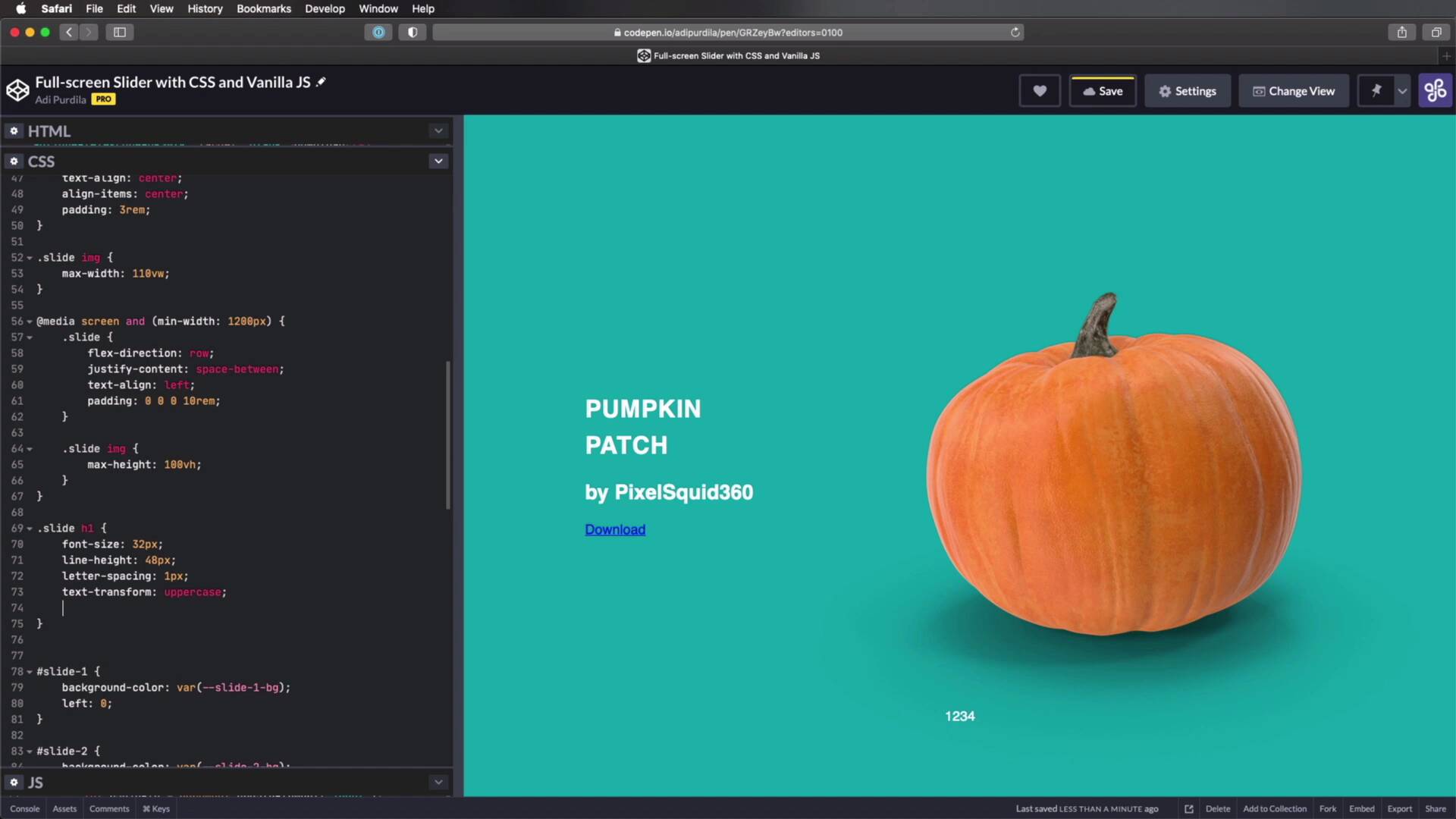
In this lesson, we’ll add some better styling to our slides. Currently, we're still using the CSS we wrote in the first chapter, and that’s not very pleasing to the eye. So let’s begin.
Related Links
1.Introduction
1.1Welcome to the Course01:27
2.Let’s Create a Simple Slider
2.1Writing the Markup07:11
2.2Writing the Basic CSS13:43
3.Let’s Add Some Advanced Functionality
3.1Simplifying the Markup With JavaScript13:16
3.2Adding an Automatic Slide Change12:35
3.3Adding Better Styling to the Slides08:31
3.4Styling the Pagination06:03
3.3 Adding Better Styling to the Slides
Welcome back to the course. In this lesson, we're gonna add some better styling to our slides, because currently, we're still using the same CSS that we wrote in the first chapter and that's not very pleasing to the eye. So, let's go ahead and fix that right now. And we're gonna start by actually properly styling these slides for mobile, and then we'll move on to desktop. So on small screens, here's what we'll do, on this slide, we'll do this, flex-direction, column. I guess I should start by setting a display to flex, actually, okay? So we're setting a flex direction to column so that our content and our image are stacked instead of setting one next to the other. Let's do text-align to center. Let's also align the items to the center, there we go. And let's add a padding of 3rems. Now the slide image is a little bit too big. So, I'm gonna change its max-width to about 100viewport width, and that should fix things. But now that's a bit too small, so maybe increase this a little bit, 110viewport width, right. So that looks pretty good. Now, what about on larger screens? Well, let's do that right now, media screen and let's say mean-width, we set this to what? 1200 pixels, that's a good size for a large screen. Here, we'll basically do the following, let's say if we can get 1200 pixels here. Yes, we can, okay? So here, we'll put things side by side. So I'm gonna set a flex-direction to row, And I'm gonna set justify-content, space between, and I'm gonna align the text to the left, and I'm also going to add a left padding of 10rems, just so I can move the text a little bit more to the right side. And then for the image, I'm gonna set a max-height of 100viewport height. So now the image is a little bit smaller and fits within my viewport. So now, this changes nicely from small screen to large screen, just like that. That's pretty cool. Now let's also style the h1, h2, and the anchor tags. So for that, let's do this slide h1. I'm gonna set a font-size of about 32 pixels, a line height of 48 pixels, maybe even a letter spacing of 1 pixel because I wanna make it uppercase. So text-transform as uppercase and just like that. And what else, maybe let's make this a little bit bolder, so font-weights, let's set it to 900, which is the the heavy size. And also, let's set a margin-bottom of, let's say 16 pixels. Okay, next is slide h2. And here we're gonna change the font-size. Let's say 18, the line-height is gonna be 24 font-weight. We're gonna set this to a light variant. And also let's set a margin-bottom of 64 pixels, so we can push that download button further down. Now for this, we actually have to load the Lato fonts. So I'm gonna do that right here, I'm gonna place it right there. This is just a script that I got from Google fonts, and it just loads Lato with the 300, 700, 900 weights. So that will make sure that I have the proper font-weights on all of these elements. And then, let's target that download button. So, slide a, we'll do this, display, we'll set it to inline-block. Let's remove that underline, so text-decoration, none. We'll set the color to white. Let's also make it uppercase. And let's set a font-weight to 700. Let's do a letter-spacing of 1 pixel. Let's set the font-size to 14 pixels, okay? Now it's starting to look a little bit more like a button. And we'll do a padding here, 16 pixels 32. So 16 top bottom, 32 left and right. Let's also set a border-radius, 50 pixels, and I'm just speeding through this because this is not really that important to how the slider works, it's just a little bit of styling that I decided to apply to it so that it looks a little bit better. So I just added a border-radius, a border, a transparent one, because we're going to change it on hover, and the transition for all of the elements. So now, I can just say slide a hover. And I can change the border-color to let's say white, I can change the actual text color to white, and I can change the background-color to transparent. Transparent and I'm gonna make that important, because we're gonna override some styles that we need to set right now. So, I'm actually make this a little bit smaller, there we go. So we can see the whole thing. So in here, all I'm gonna do is set the proper background color for each anchor tag, and it goes something like this. So the anchor tag in slide 1 gets the slide-1-link color. And so on for slide 2, 3 and 4, because these are different colors. And then, you'll see that when you hover, you get this nice transition. And that's it really for the styling of the slide. The only thing left to do now is the actual pagination. As you saw, the pagination is still in its original state. So we have to do something about that and make it look a little bit better. I will do that in the final lesson of this course. So, I'll see you there.


