

- Overview
- Transcript
2.3 Building With Default Components
In this lesson, we’ll build a simple page with UIkit. In doing so, you’ll learn the syntax and the proper way of using components that are available in the framework.
Related Links
1.Introduction
1.1Welcome to the Course01:43
2.Getting Started With UIkit
2.1What Is UIkit?02:36
2.2Installing UIkit06:29
2.3Building With Default Components18:49
3.Customizing UIkit
3.1Installing UIkit With Sass Sources05:00
3.2Customizing Components With Sass13:47
2.3 Building With Default Components
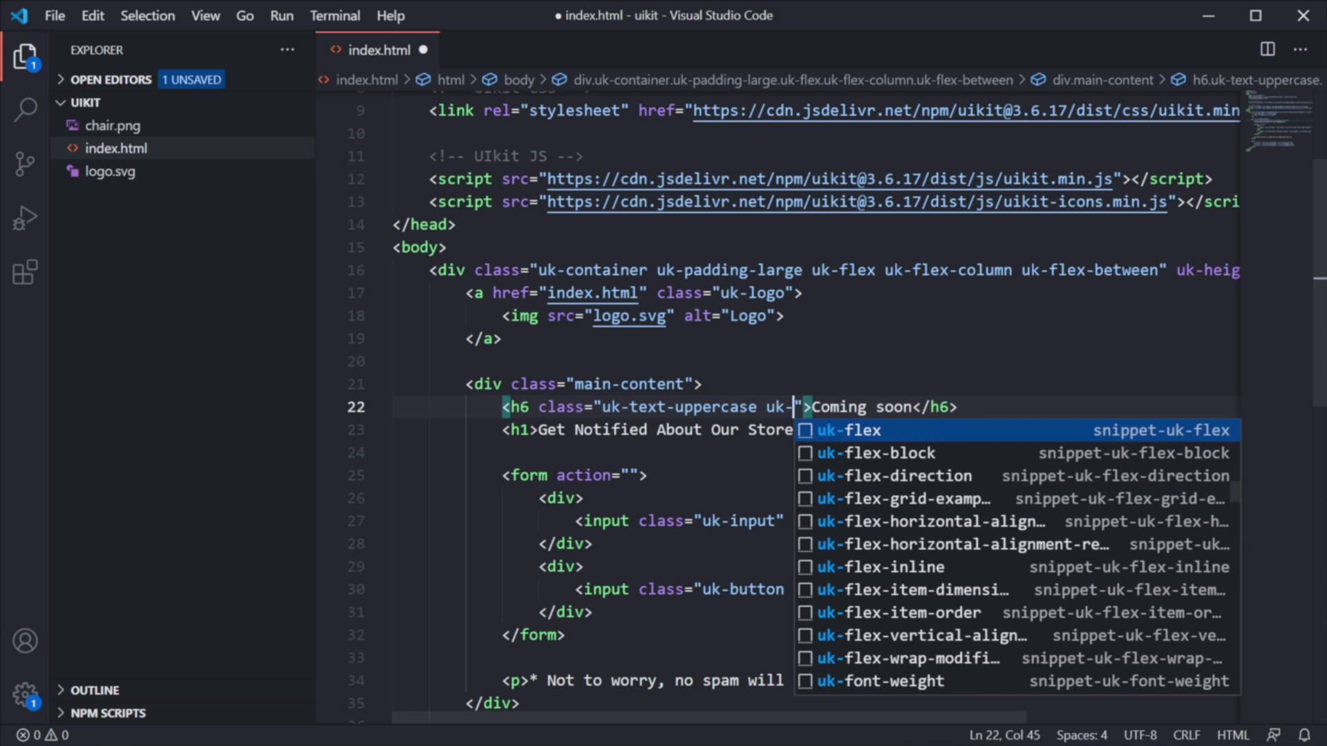
Welcome back to the course. In this lesson, we'll build a simple page with UIkit. And by doing that, you'll learn the syntax and the proper way of using the components that are available in this framework. So, let's begin. We're gonna build a simple coming soon page. And in doing this, we can use two very valuable resources. The first one, the main one is the official Documentation that can be found on the official website. And here, you can basically go to any component that you wanna use, for example, this Container. And you can see the proper syntax, and you can also see some additional options that you can use for it. Other components actually have code examples like this Button, right, here we can see a Preview of the button. And if you switch over to the Markup tab, you can select this markup copy it, and then paste it in your own project. Or you can simply click the Copy button and that will happen automatically. Now there's also a very handy plugin for Visual Studio Code and I believe they have this plugin for other text editors as well. The plugin is called UIkit 3.0 Snippets, it's made by Keno Clayton. I have that installed already. So, what it does is basically, you can start typing uk for UIkit. Let's say you wanna add an accordion, and here you basically get all the snippets that match your search criteria. The first one here is an accordion-sample, and I can just press enter and that will automatically populate my markup with the correct syntax. How cool is that? This will be super handy for you especially when you're getting started, and it saves you a bunch of time because you don't have to like all tab all the time to the documentation, get the markup, all tab again, paste the markup in here. It's really, really convenient. So, now let's talk about the page that we're gonna build. It's a simple coming soon page. It has a very simple structure, we're gonna have a logo on the top, some headings and a form in the middle, and some social icons on the bottom. And we're gonna add a background image in just a little bit. For that, I prepared two assets here. This is the logo.svg. You can actually see the svg code here. But you'll see the actual image in just a little bit. And I have a chair image. It's a PNG, so transparent background. And both the logo and the chair can be downloaded on Envato Elements, and you'll find a link to all of these resources in the lesson description. So, without further ado, let's start coding this coming soon page. We're gonna start with a container. So you can start saying uk-container and that's gonna populate. In here I'm gonna add a logo, so uklogo, href is gonna link back to index.html. What's important here is the class of uklogo. This adds particular styling to that anchor tag, the image source will be logo.svg, and the alt is gonna be Logo. And let's just close this anchor tag right here, like so. Next, we're gonna add two headings and a form. But we're gonna wrap those in a separate div. So I'm gonna create a div with a class of main-content. And I've added my own class name here because maybe I want to style this later on. And we're gonna have an h6 and an h1. The h6 is gonna say, Coming soon, the h1 is gonna say, Get Notified About Our Store Opening. Below that, we're gonna create a form and inside the form, we're gonna create a div and inside an input, the type here will be email. Placeholder will say Enter your email address, and I'm gonna add a nice asterisk. And finally I'm gonna add a class here to the input of uk-input. Next, I'm gonna duplicate this div. The type here will be submits, so we're creating a submit button, and the value will be Notify me, class will be uk-button and uk-button-primary. Next under the form, we're gonna be creating a paragraph, that's gonna say *Not to worry, no spam will be coming your way. And finally, for the final section on our page, we'll create a div, and inside three anchor tags that will represent our social media icons. So here you can use the snippet uk-icon-button. And for the icon, I can simply say twitter. I'm gonna create another one for facebook, and another one for instagram. And that's it. Now let's go back to Chrome, on our page refresh and there we go. The markup for our page produced this, you see how easy that was. Now, to get this to a rough final form, we need to add some extra classes. And we also need to add that background image. So it goes like this. We're gonna start with our container. So under container, let's add some padding. We can do that by using the class of uk-padding-large. And if you don't know how to add a padding, for example, you can simply go back to the documentation, scroll down your component list until you find Padding. In here, you can actually find all the classes that you can use, pretty cool. So we're gonna add a padding-large. But also I wanted this container to behave like a Flexbox container, right? Because I want to space out the logo, the middle portion and the bottom portion equally across the vertical axis. And for that, we can use Flexbox, right? UIkit comes with support for Flexbox. They have special utilities for that, and I'm gonna add the class of UI flex, sorry, uk-flex. This basically turns that components display mode to Flexbox. And I also wanna change the flex direction. For that I'm gonna be using the uk-flex-column. And to display the elements with equal space between them, I'm gonna be using the class of uk-flex-between. So let's save that, refresh. And now you can see the padding is being applied correctly, but the old ones are still kind of positioned the same way. And that's because the overall height of my container doesn't match the height of my viewport. To make that happen, I'm gonna add uk-height-viewport is gonna be = expand: true, save, refresh. And now the height of my container matches the height of my viewport. This is what this data attribute is doing, pretty cool. Now, let's move on. The logo looks okay, I don't have to do anything to it. Let's see about this main content. First of all, on the h6, I wanna make this uppercase, and I wanna change its color a little bit. So for that, I'm gonna add the classes of uk, it's actually text-uppercase and uk-text-muted. So, that makes this h6 go from this to this. On the h1, I want it to be bold. But also I want it to take up like half of the available space. For that, I'm gonna add a class of uk-text-bold, nice. And also uk-width-1-2. 1-2 means half of the available space. And if you go to the documentation under Width, right here at the end, you'll see all the available combinations. So 1 1, or 1-1 is like 100% of the available width, 1-2 is half, 1-3 is a third, 2-3 is two thirds, and so on and so forth. You can see all the available options here. Next, let's take a closer look at our form. For this we're actually gonna be using a grid component, because I want my input and my button to be placed on the same row. So, I'm gonna add a class of uk-grid-small, again, you can check out the documentation for all the available options. And I also want to give this half of the available width. So uk-width-1-2, and that will make this form half of the available width, and it's gonna add a grid element to it. Now to take advantage of that grid element we need to set the proper column widths. So for that on the div, so I'm gonna say class = uk-width, I'm gonna be using a three quarter size here. And for this class uk-width, I'm gonna say expand, and expand basically means take up the rest of the available space. Save, refresh, we're still not getting the grid that we want, okay. So, let's check if our syntax is correct. class uk-grid-small, so I added the grid class. Let's check out the documentation on the grid, see if maybe we missed something. Okay, so, create a fully responsive, fluid and nestable grid layout. Okay, so we actually need to add the attribute, the data attribute of the uk-grid. This is something that I forgot to do. So, let's do this uk-grid, save. And now there it is. That's our grid. Now this element takes up three fourths, or three quarters of the available space and the button takes up the rest of the available space. Next, let's see about this paragraph. I want to make this text small and also italic. So I'm gonna add two classes here. And you can find these under Text. Where is it, right here, you can find all of these classes. So, uk-tech-small is one that we're gonna use and also uk-text-italic to create italic text. Save, refresh and that's our italic text. Finally, let's add a bit of distance between these items. For that we're gonna be using a class, a utility class for adding margins. So right here after uk-icon-button, I'm gonna say uk-margin-small-right. And we're only adding to the first two because it's not necessary to add that margin to the third item. Unless we plan on adding a fourth icon to our list. Finally, let's add a nice background image right here. For that, we're actually gonna style the body element and we're gonna say the following, style, I'm gonna set the background-image as an url to chair.png, right. So right now that image is being repeated and it's being displayed in the default position which is top left. We can change that by using some special classes. The first will be uk-background-norepeat to not repeat the background. I wanna place this image center right. So I'm going to say, uk-background-center-right. Let me get rid of that sidebar like that, and also let's add a nice muted color to the background. I'm gonna be using the class of uk-background-muted, nice. And that just adds a nice gray background to our page. So that is the desktop version of our page. Now the cool thing about UIkit is that it's responsive. So you can use special classes to determine how your elements will look like across various breakpoints. For example, on smaller screen sizes, I don't wanna display this image. So for that, I can actually use a specialized class that's called uk-background-image@ s or m or l and so on, depends what breakpoint you're targeting. So @m means that this background image will only be displayed on screens that are m size or above. And you can find all of that information in the documentation. Let's take a quick look here under, I believe it's Breakpoints, or actually let's go to the Background property. And you can actually see the Responsive mode here, right? So @s means small, so this plays the background image on device widths of 640 pixels and larger, and then follow the rest. @m is 960 and larger, l is 1200, xl is 1600. So by doing that, if we now do a refresh, you'll see that this image is nicely displayed on the desktop version, but as soon as I go under a specific value, that image is now gone. Also, I want this half width that we applied to the form and this heading to only be applied again on larger screens. And to do that, I can go to my h1 where I added this half width and I can say @m and also do the same for the form. So, width 1-2 it's gonna be again @m or whatever breakpoints you wanna target. And I'm gonna do the same for this. So now, if we do a refresh, you'll see that on small sizes, so on mobile, these elements will have 100% width, but as soon as I go past that m breakpoint, the image now reappears and those elements are now back at half width, which is great. So this is how you can control how your elements will look like and behave on different breakpoints. All right, and that's how you can build web pages with UIkit. That wasn't so difficult, right? Especially when you have all the documentation at your disposal and also very handy plugins for your code editor like the one I showed you in this video. Now, the page that we built here is pretty bland in terms of aesthetics, right? That's because it uses the default styling from a UIkit, but you can change that. You can customize UIkit to match your brand's aesthetics, your brand's colors, typographies, spacing, sizing and all that. I'm gonna show you how to do that in the next chapter. So, I'll see you there.


