


- Overview
- Transcript
2.1 Pattern 1: Slide Down Menu
Welcome to the second lesson of this short course, where we’ll build our first desktop to mobile navigation pattern. We’ll be using a slide down menu—an approach best used for menus with few items and no submenus. Let’s begin.
1.Introduction
1.1Welcome00:49
1.2A Simple, but Flawed, Approach03:56
2.Simple Navigation Patterns
2.1Pattern 1: Slide Down Menu07:28
2.2Pattern 2: Full-Screen Overlay08:03
2.3Pattern 3: Overlay Mega Menu09:21
3.Advanced Patterns
3.1Pattern 4: Off-Canvas11:38
3.2Pattern 5: Alternative Off-Canvas07:51
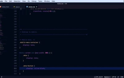
2.1 Pattern 1: Slide Down Menu
Welcome to the second lesson of this short course where we'll build our first desktop to mobile navigation pattern and that will be using a slide down menu. This approach is well recommended for simple menus that have few menu items, and no sub menus. So I went ahead and prepared a page. We have the simple menu, and as you can see right now, it's using flux box so it's always centered with the logo but the point is it doesn't do anything on mobile devices. So what we want is that when we get to a specific screen size, we're gonna hide this completely. We're gonna replace it with a menu-button, which when clicked will slide up and down this copy of the navigation menu. Now, the copy of the menu sits in a div, with a class of mobile menu container. And it's basically, as I said, a copy of this menu right here. You could get fancy with this, write a little bit of jQuery to clone, basically, this menu into its new container right here, but we're gonna keep things simple for now, so I'm just gonna copy and paste the same list items. Now, for our style sheet we're gonna start with the following. We're gonna say mobile menu first thing we'll do is target mobile menu container, we're gonna hide it, so we're gonna set display none and that will get rid of it. And what else, for now that's about it. Let's resize our page. And try to find the break point for maximum width where we should be showing this menu. In my case, I think it's around 900 pixels. I'm going to create a media query. I'm going to say, media screen and the max-width 900px. So when it's below 900px, first thing we'll do is hide the menu so we're gonna say menu display none, and menu is basically our main navigation, right. So now when we, Get to 900, our main menu disappears. And instead we're gonna show the menu-button, which the menu-button if we take a look here is a simple anchor tag with the class menu-button, and it has four spans. It's essentially a hamburger menu icon. The styles for this are not really important, you could just put a link there if you want, it's still gonna do the same thing. So I'm gonna say menu-button display inline-block, okay? So now, when we have a screen width that's higher than 900 pixels would display at the regular menu, when it's lower than that would display the hamburger menu. So inside my app, JS, which is just the Java Script function that or Java Script file that I wrote, I am using J query for this. What I'm doing is listening for the click event on the menu-button and when that happens, I toggleClass of active on the button itself visibly. Transforming it into an x, and then I am doing a slight toggle on our mobile menu container. So we're simply sliding it up and down, Revealing our navigation. All we have to do now is right. A little bit of CSS to style this properly. So we're gonna go back here. Let's do a background color and let's align the text to the center, like that. Let's style that ul. So .mobile-menu-container ul. Let's get rid of the bullets so list Style type. Let’s set that to none. Let's also remove any padding and margin it might have. All right. Finally, let's style the anchor tags. So mobile-menu-container a. We're gonna make them white. I want to set display to block so they have 100% width. We're gonna give them a little bit of padding let's say .75 Rems, top bottom 0 on the sides. What else, let's get rid of the underlines so text decoration, none okay? Now, let's add a border bottom, border-bottom, 1 pixel solid. And we'll use a semitransparent white. So 255 with a transparency of 20% or 0.2. All right, so now we have some separators. And let's actually add a hover state. So mobile-menus-container, a hover. We'll simply change the background color to two e three one three five which is a darker color than the one we had previously. So now, I made a small typo here background color, there we go. So now, we have a proper style for our menu. And the good thing about this approach is that the menu doesn't take up lot of space. It only pushes down the content when it's expanded but when it's contracted like this, it's out of sight. And it puts the focus on the actual content. A bonus to this is that if you have more that four menu items, they will fit nicely in this menu. You can have ten menu items. And because none of it is positioned like absolutely or anything like that even if you have like 10, 15 menu items, which is absurd but just for the sake of these example, you can still scroll and you can see all of them. So that was the very first paddle. Another approach to this problem is a full screen navigation overlay which also works best for smaller and simpler menus. We'll be covering that in the next lesson.


