

- Overview
- Transcript
2.3 Pattern 3: Overlay Mega Menu
Welcome to the fourth lesson of this short course, in which we’ll build an overlay mega menu component as our mobile navigation. Let’s begin.
1.Introduction
1.1Welcome00:49
1.2A Simple, but Flawed, Approach03:56
2.Simple Navigation Patterns
2.1Pattern 1: Slide Down Menu07:28
2.2Pattern 2: Full-Screen Overlay08:03
2.3Pattern 3: Overlay Mega Menu09:21
3.Advanced Patterns
3.1Pattern 4: Off-Canvas11:38
3.2Pattern 5: Alternative Off-Canvas07:51
2.3 Pattern 3: Overlay Mega Menu
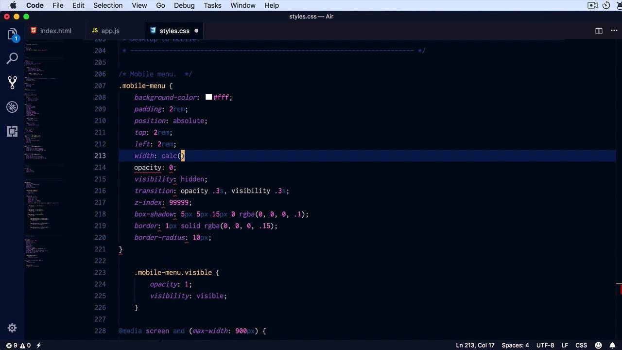
Welcome to the fourth lesson of this short course where we'll build a mega menu component for our mobile navigation. So when I say mega menu, I think it's a bit improper, I just mean a menu that's a bit more complex than what we've seen in the previous examples. So right here, I have the same main navigation but the stuff that I wanna show on mobile is this bit. So I have my main navigation here, a copy of what I have on the top but also an additional menu, four categories, and they're separated by a horizontal rule. So we're gonna display this as an overlay but not as a full page overlay like you saw in the previous lesson. Just a simple overlay like a contextual menu basically, let's get started. Looking inside the HTML we can see that the menu for the mobile is called mobile-menu. And so div with a class of mobile-menu, so this is what we have to focus on. It has the close button, which is basically a copy of the menu button. It has the category menu and it has the main navigation, separated of course by an hr. In appJS, all I'm doing when I click the menu button is toggling the class of visible on that particular menu. So with that said, let's start adding some CSS. So from mobile menu, first thing I'll do is set a background color of white because I don't want it to be transparent. I'm gonna add a padding 2rem, I am gonna position it absolutely, and I'm gonna do that, 2rems on the top, 2rems on the left. Let's have a look, all right, but actually you know what? I kind of started off on the wrong foot, because we only want to display that when we reach our breakpoint. So let's add some media queries first, so media screen max-width 900 pixels. Yeah, we'll hide the menu, we'll display the menu button just like previous, display inline-block. And then this mobile menu, I'm gonna set an opacity of 0, and a visibility of hidden. And I'm gonna transition those two properties, so opacity, 0.3 seconds and, Visibility 0.3 seconds. Also I'm gonna set a really large or really big Z index to position it above everything else, so let's have a look. Okay, so when I click this, we should toggle the visible class, so mobile-menu.visible, all I'm doing here is setting opacity to 1 and visibility to visible, just like that. Right, now let's add some more styling, I want a box shadow around it, so I'm gonna say box shadow. Five pixels on the x and y axis, 15 pixels, blur 0 spread, I'm gonna use an RGBA value of black with 0.1 or 10% opaacity, let's also add a border of 1 pixel solid. Again, an RGBA value of let's say 15% and let's make it around, or let's give it around corners 10 pixels. All right, all I have to do now is add a width that spans the entire page while keeping a two RAM gap on the sides. So for width, I'm gonna say, I'm gonna use calc 100% minus 4 RAM, so I want two rams on each side, in total, four rams, so that will span the entire width of the page. Now let's quickly style these elements inside, so for the ULs we're gonna repeat the same steps, just reset the list style along with the padding and margin. But also, I want to, since we have a lot of horizontal space, I wanna split these menus in two. So I wanna float each menu item and give it a width of about half of the available space. For that, I'm gonna say .mobile-menu ul li, simply float left, we're gonna give it a width of 45% each and a margin of 0 and 2.5 % on each side. So 2.5 % each side means 5% + 45 means 50% for each menu item. We also have to clear these floats, so I'm simply gonna say overflow to hidden on the parent list. From here, it's just a matter of styling those anchor tags, so mobile menu A, we're gonna give them a color 5067bc. We're gonna move the underline, set a display to block and give them a padding of 0.25 rems and 0 on the sides. Lets also add a hover state, where it will simply change their color to 3d4146. All right, Not bad, let's style these H6's and the separator a little bit, so h6, let's make it upper case. Let's add a little bit of letter spacing, 1 pixels should do it. And let's change to 1 RGBA value of 0.5. And the HR at a margin top and bottom of two rems, 0 on the side. We'll set our height to 0, and we'll set a border top 1 pixel solid, RGBA, this value. So that is our third pattern instead of just showing a simple menu. You can show multiple menus creating a more complex element. Now when we get to a really small size, I don't think the two column approach is working very well, so let's fix that. I'm gonna add another media query, so media screen and max width, let's say for about 500 pixels. When that happens .mobile-menu ul list item, we're not gonna float them anymore, so float none, we're gonna set a width to 100% and a margin of 0. So they'll now be displayed stacked and when we have enough room, we'll split them into two columns, so that is pattern number 3. Again, this works for relatively simple menus that don't have sub menus. Now what about the cases where we have sub menus, like the very first baseline example I showed you, what do you do then? Well, that's when you need to take a slightly different approach, you need to build a different component that can handle the extra menu items. We're gonna build a component like that in the next lesson, see you there.


