

- Overview
- Transcript
2.2 Pattern 2: Full-Screen Overlay
We’re still building simple patterns, suitable for menus with few items. In this lesson we’ll build a full-screen navigation overlay, so let’s begin.
1.Introduction
1.1Welcome00:49
1.2A Simple, but Flawed, Approach03:56
2.Simple Navigation Patterns
2.1Pattern 1: Slide Down Menu07:28
2.2Pattern 2: Full-Screen Overlay08:03
2.3Pattern 3: Overlay Mega Menu09:21
3.Advanced Patterns
3.1Pattern 4: Off-Canvas11:38
3.2Pattern 5: Alternative Off-Canvas07:51
2.2 Pattern 2: Full-Screen Overlay
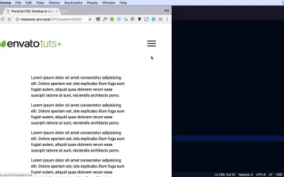
Welcome to the third lesson of this short course. We're still building simple patterns for menus or for navigations with few items and with no sub menus. And in this lesson, I'm gonna show you how to create a full-screen navigation overlay that's patter number two. So, we start from the same situation, basically, we have the same menu as in the previous lesson. And what I did was instead of that mobile menu container that we saw previously, I now have a div with a class of overlay-navigation. And the overlay-navigation has a close button and has a copy of our main navigation here. Again, if you don't want to duplicate this color manually, you can write a little bit of jQuery, which will clone that element in this overlay navigation container. Let's begin the styling process. We're gonna first take care of the overlay navigation. We're gonna hide it initially, so just like in the previous lesson we'll set display to none. And then on smaller screens. We're gonna use the same 900px break point like in the previous example. But feel free to modify this to suit your needs. We're gonna do the same, menu display none. And we're gonna hide the menu or we're gonna show, sorry, the menu-button. Display: inline-block;. Okay, so now the same story as before. Now, in the JavaScript side of things, when we click the menu button we're not gonna apply the active class on the menu. I guess we could apply it but that's optional because we're gonna show the overlay instead on top of it. So what we do is basically toggle class of visible on this overlay navigation. So let's go ahead and build that one. We'll start with this. We'll give it a background color 1288fc, again, you can choose whatever color you want. I'm gonna align the text to the center. And then, here's where it gets interesting. In order to stretch this on top of the entire view port. We're gonna give it a position of fixed. That means it's gonna stay there even if we scroll. We're gonna set its top and left to 0. We're gonna give it a width of 100%. A height of zero, this is important, you'll see why in just a little bit. We'll also set capacity to zero and visibility to hit. So why all of these properties? Well, because we want to animate them. Visibility hidden is important so that even if it's totally transparent, we can still click on it. By adding visibility hidden, we make sure that doesn't happen. So, we'll set a transition for opacity. Let's say .3 seconds, for visibility .3 seconds and for height, same amount of time. And then overlay navigation with a class of visible, which is the one D menu button toggles. We'll simply set opacity:1, visibility: visible, and height: 100%. So now, if we click this button, Well, if we click this button nothing happens, okay. So what did I do wrong here? So overlay navigation, toggleClass visible. We have the visible class here, setting the opacity: 1, visibility: visible and height: 100%. All right, let's open an inspector here, and try to figure out what's wrong. Let's see, we don't have any, JavaScript errors. And the class is toggled correctly. So why isn't this working? Well, it's not working because we have a display none set up. That's why it's not working. There we go. All right, so we're gonna keep this, display none. And on top of this because we're gonna properly align elements inside the overlay, to the middle. We're gonna set a display to flex. And let's do this right now, since we're here aligning items. Center and justify-content: center. Okay, Let's try that again. Okay, so that works. So as you can see, we have a nice transition for opacity, visibility and height. Now this button is the same one as this button. So it does basically the same thing, it toggles the visible class. I didn't actually position this right in the center of this button because it's really a subjective choice. You can put a link here, if you want, not necessarily a button. You can style this in any way that you want. So, let's quickly go and style these manual items. We are gonna say overlay-navigation below, I'll simply list-style-type: none;, padding: 0;, margin: 0;. I'll style the links, let's make them white. Set our display to block, padding: .75em, it's actually the same styling as In the previous lesson, with a few minor changes. The hover state will always simply had a number of line test-decleration: underline;. Okay, so that should do it. Of course, feel free to style these in any way you see fit, but this our second pattern. So, instead of showing like a slide down menu here, we display the menu items on a full screen navigation overlay like this. And this is actually a better approach than the previous one because it gives you way more space to play around with. You're not just limited to displaying a menu. You can put other types of information in here, it's really up to you. Now speaking of putting more complex content in a navigation like this, we're gonna explore that aspect in the next lesson. Where we are going to build an overlay, let's call it mega menu. Although it's a bit too much mega menu. But it's a more complex menu than what we've seen before. So thanks for watching this lesson, I'll see you in the next one.


