

- Overview
- Transcript
3.2 Pattern 5: Alternative Off-Canvas
Welcome to the sixth and final lesson of this short course. Let’s wrap things up by building the fifth pattern, which is an alternative off-canvas—a very popular choice.
With that done, I hope you enjoyed watching this short course, and I look forward to seeing you in the next!
1.Introduction
1.1Welcome00:49
1.2A Simple, but Flawed, Approach03:56
2.Simple Navigation Patterns
2.1Pattern 1: Slide Down Menu07:28
2.2Pattern 2: Full-Screen Overlay08:03
2.3Pattern 3: Overlay Mega Menu09:21
3.Advanced Patterns
3.1Pattern 4: Off-Canvas11:38
3.2Pattern 5: Alternative Off-Canvas07:51
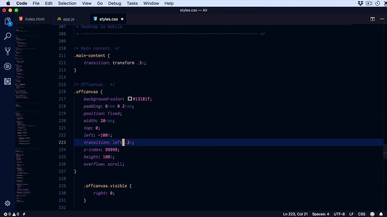
3.2 Pattern 5: Alternative Off-Canvas
Welcome to the sixth and final lesson of this short course. Let's go ahead and build our fifth pattern by slightly modifying the one that we built in the previous lesson. This is an off-canvas slider, I guess you could say, or an off-canvas menu that slides in. But also pushes the main content to the right. So a very popular choice, let's go a head and build that. I made a couple modifications to the html. What i did was place the actual off-canvas, this is the stuff that gonna show on mobile, first and only after that the main content. The main content that contains the nav bar, and the main content of the website. We have a lot of the same things, we have our main navigation. We have the menu button which will appear on small screens. And I also went ahead and copied the styles from the previous lesson to this one. In JavaScript, I'm doing things a little bit differently. When I click the menu button, I'm toggling the class of menu opened on the body element, and you'll see why in just a little bit. Otherwise, the same thing goes for the off-canvas. We have the same slide up, slide down functionality on the sub menus. So, first thing I have to do is replace mobile menu with off-canvas, because I changed the name slightly. So mobile menu, we're gonna replace it in all instances with, off-canvas, all right, let's see what we have. So now, that's gone. Okay, I made a little change as well here. I placed the menu button on the side or on the left side instead of on the right side. And what I want is for the logo to be positioned on the left side as well. For that, we need to make a small change right here. When we reach our media query, I'm gonna target the nap bar and I'm simply gonna say justify content, flex start. Because I'm using flex box, these we're distributed at first, logo on the left and this on the right, but now i want both in the left. And also, let's add a little bit of margin right to this menu button, two rems should do the trick. So now, when I click this, I want the off-canvas to slide in from the left while at the same time pushing the main content to the right. So let's go up here, style the main content. All we have to do here is set a transition, main content. We're gonna set a transition, transform .3 seconds. We're doing that, because we're gonna transform the main content on the x-axis we're gonna move it. So off-canvas, let's see background color. We're gonna change this to 13181f, we're gonna keep the same pudding position fixed, same with top: 0. Instead of right, we're gonna say left because we're gonna slide it in on the left side. We're gonna transition the left property, z index same, height overflow scroll, and maybe add a font size a little bit smaller than usual, 85%. Of course totally optional. We don't have a visible class anymore, instead, we have a menu. Opened class on the body, and then we'll target the off canvas, we'll set a left to 0. And also menu opened, let's target the main content and we'll say transform, this is the property that we're animating. Translate 3D to benefit from hardware acceleration, let's say 20 ramps on the x-axis, 0 and 0. And I did input 20 ramps because that's the size of my off canvas. All right, let's see if that works. And it does, perfect, all right. So, when I click this button, I'm sliding the whole content to the right as well as the off-canvas navigation. All we have to do now is add a proper styling to the menus inside. So let's see off canvas UL, we were using main navigation or a mobile navigation class in the previous example, but we don't have that anymore. Instead, we just have the off canvas, so I'm gonna replace this. We just need to make a couple of small changes. The color here should be a white, let's put about 80% opacity, this will stay the same. A hover, instead of black, we'll set white, okay And yeah, the rest should be the same apart from the arrows. We also want those. To be white. And with that, our navigation is now complete. So this is the fifth and final pattern that we're gonna explore in this short course an off-canvas element. So to recap, we covered five different patterns. Three of them were for when we had simple items or simple menus with few items and no sub menus. The first one was a slide down menu. The second was a full screen navigation overlay and the third one was a overlay mega menu. And then we had two extra patterns for more complex menus. The one that you saw In the previous two lessons. I off-canvas that would slide in from the right and would also darken the background. And enough canvass that would slide in from the left and would slide the main content along with it. So those are five patterns that you can use when transitioning your navigation from a desktop format to a mobile format. I hope this was an interesting course, I hope you learned something valuable. I'm Mario Padilla, thank you very much for watching and until next time, take care.


