

- Overview
- Transcript
3.1 Pattern 4: Off-Canvas
It’s time to work with more complex menus, with lots of items and submenus. For this pattern, we’ll be using a simple off-canvas component. Let’s begin.
1.Introduction
1.1Welcome00:49
1.2A Simple, but Flawed, Approach03:56
2.Simple Navigation Patterns
2.1Pattern 1: Slide Down Menu07:28
2.2Pattern 2: Full-Screen Overlay08:03
2.3Pattern 3: Overlay Mega Menu09:21
3.Advanced Patterns
3.1Pattern 4: Off-Canvas11:38
3.2Pattern 5: Alternative Off-Canvas07:51
3.1 Pattern 4: Off-Canvas
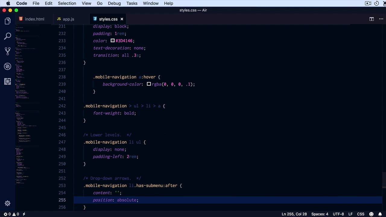
Welcome to this 5th lesson of this short course. Now, is time to start working with more complex menus, like the ones with a lot of menu items, and the ones that have sub-menu. So, I prepared an example, here is the initial one that I showed you that has some menus. And what I did was basically duplicate this menu into a div_ class of mobile menu, which we'll use to create a simple off-canvas component. The idea is the following, on small screens Yeah, we have this menu button. When we click it, this menu that you see here is gonna slide in from the right side. Click it again, it's gonna slide back out. So, I already went ahead and added some styles for the mobile menu. And also, on our media query, just hiding the menu and showing the menu button. Let's begin by styling the mobile menu. We want it to be white; let's give it a padding of six rims on the top, zero on the sides, two REMs on the bottom. I'm gonna set this position to fix, I'm gonna give it a width of 20 REMs, set the top to zero, and set right to minus 100%. This will essentially move it off screen, by -100% which is it's width. And then, to hide it back out, I'm gonna add it to show it back or to slide it in. I'm gonna set a transition for the right property .3 seconds, set a z-index. I want to make the mobile menu appear on top of everything else, at a height of 100%, and then let's add the visible class. So mobile menu visible, I'm simply gonna set a right to zero, let's give it a go, There it is. Now, because we set a position to fixed and a height to 100%, it may be possible depending on the content that we don't see all of it. All of the content inside that menu, so a simple way to fix that is to add an overflow, to scroll. That will essentially add a scroll bar inside the menu, allowing us to scroll inside independently from the page. Now, let's add the styles for the mobile navigation. And the mobile navigation is simply the class that I added for the actual cloned navigation. So, we're gonna say mobile navigation a, we're gonna set it to display block. Remember, we have to treat this a little bit differently now, because we have submenus, and that we're gonna have to slide in and out, we're gonna set a color to 3D 41 and 46. A text decoration to none to get rid of the underline, and let's add a transition for all properties .3 seconds. These are just tiny details. The actual pattern we've already created. It's the slide-in off canvas. But, we might as well style this properly. Let's add a hover state to the A, so A hover, let's add a background color, very very light gray. Like this, and then, let's put a stronger emphasis on the first level menu items. To do that, were gonna say mobile-navigation immediate children you u l l i a, font weight, bold, so this will bold only The first level menu items. The rest are basically sub menus. Let's go ahead and hide those sub menus. So here, we're gonna say lower levels. And we're gonna say, [COUGH] Mobile Navigation liul. That's the structure that we have here. Each sub is a ul inside a list item. So that's what we're targeting here. Simply set a display to none, and also a padding left of tour end. Just so, it's pushed to the side a little bit. We can also add some drop-down arrows. And that's actually really simple to do with CSS. We're gonna say Mobile Navigation liul, with a class of has submenu, we'll create an after pseudo elements. We're gonna set the content to none, position, absolute. This is an element that we're gonna position absolutely inside each list item. And that actually reminds me that we need to set Mobile Navigation l i. Position relative, otherwise position absolute will just position that element according to the body, instead of the list item, which is not what we want. Let's set a top to 1.6 REMs, and a width and height to zero. This is really important, setting the width and the height to zero, because we're gonna create these arrows using borders, okay? So Im gonna say, right one rent, positioned on the side,.and then to create an arrow pointing down. We're gonna set a border left and right to five pixels, solid transparent. And then the border top, which is the opposite of the direction we want the arrow to point to, same value, five pixels solid. But here, we can specify the color that we want. In my case, 25% black should work just fine. And that basically, adds drop down arrows. And if we click those menu items, you can see that they now toggle, the correct submenus. So, how is this possible? Well, I kinda cheated on this a little bit, and I went ahead and wrote the JavaScript. So, let's go with line by line. When I click the menu button, which is this, what I'm doing is basically, toggling the class of visible on a mobile menu. And then toggling the class of visible on the dark overlay element that we haven't styled yet. But, bear with me on this for a little bit. Then, when I click one of these element that has a submenu, what I'm doing is that I'm getting the anchor type that was clicked. I'm finding the parents and I'm tangling the class of opened. And the class of opened will simply allow us to style this arrow. And then I'm finding the sibling list, and I'm just doing slideToggle. The sibling list is this one basically, so when I click on How-To Tutorials. And basically slide toggling this ul right here, which contains the submenu. So, couple of finishing touches here, let's style that opened class, that's actually very simple to do. So list item has submenu, opened after and all I'm gonna do here is simply set a border bottom. To display the color and set a border-top to none. And by doing that I'm essentially inverting the arrow, just like you can see here. Now, the overlay that I was talking about will be set on the main page basically, highlighting this menu. So let's go ahead and style that quickly, dark overlay. I'm just gonna fast forward here a little bit, because it's essentially the same style that we use on the full screen navigation overlay. We have a position fixed, it starts at 0 top and left, we hide it, we set a z index that's very high but 1 unit lower than our menu. So it sits behind the menu, with height 100%, it's black 80% opacity. And it looks something like this. So I basically show it, and the same time as the main menu slides in. And when the main menu, or when the mobile menu slides out, I hide that overlay as well. So that is our fourth pattern. A off-canvass component that slides in from the right. You can also slide it in from the left, it's really up to you. Now the advantage of using such a component is that, again, you have a lot of freedom. You can put whatever you want in it, plus it supports Drop-down Menus which is fantastic. Now for our fifth and final pattern, I'm gonna show you a variation of this very component. Let's call it an alternative off-canvass which doesn't, or it actually slides in, just like this one, but it also moves the content along with it. That's a very popular pattern, so we'll have a look at that in the next lesson.


