

- Overview
- Transcript
3.2 Highlight One Specific Plan
Best practice #7: highlight one specific plan. This is very useful for your potential customers because they can make a decision more easily if you suggest which pricing plan to choose. Let’s find out more.
1.Introduction
1.1Welcome00:45
1.2What Is a Pricing Table?03:40
2.Correct Planning
2.1Be Consistent With the Website’s Design05:42
2.2Name Your Plans Suitably02:49
2.3Use a Sensible Number of Plans03:44
2.4Dial Down the Visual Noise05:04
2.5Make the Price Stand Out02:37
3.Focus on Your Customers
3.1Offer Multiple Payment Options02:32
3.2Highlight One Specific Plan02:19
3.3Offer Just the Right Amount of Information02:32
3.4Focus on the Benefits to the Customer02:19
3.5Make It Easy to Compare the Plans04:17
3.6Use a Clear Call to Action02:40
3.7Think About Mobile Users03:22
4.Conclusion
4.1The Conclusion02:46
3.2 Highlight One Specific Plan
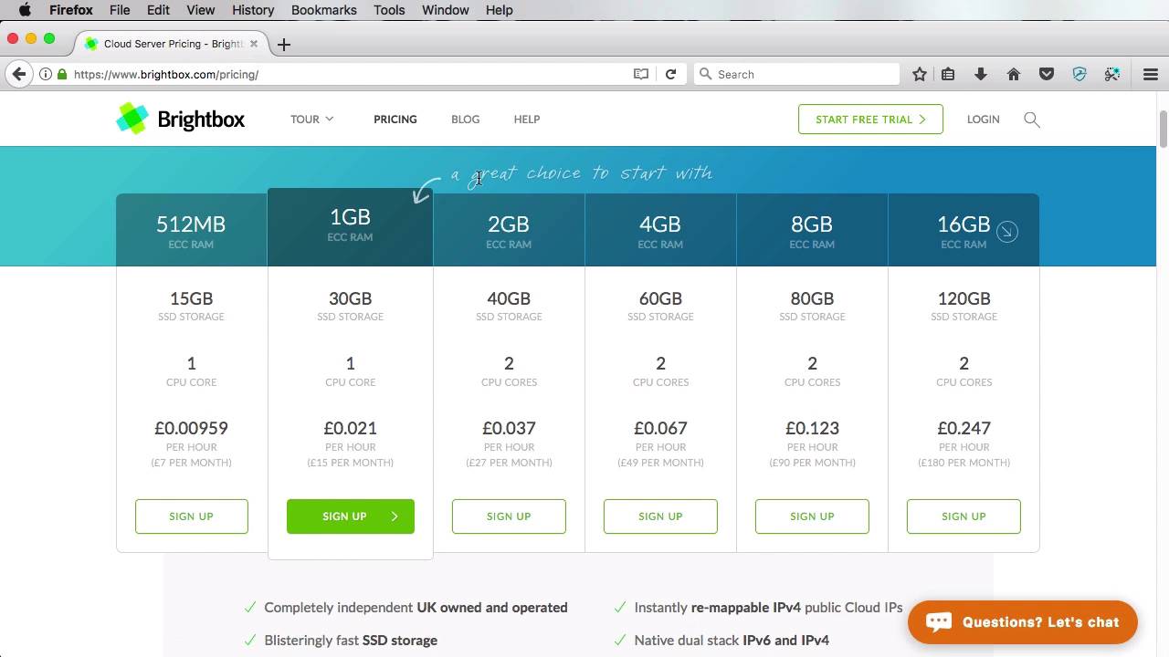
This practice number seven, highlight a specific plan. Now, by doing this, you are actually making it easier for your customers to make a decision. You can highlight either your best seller, your most popular plan, or the one with the best value, or you can use whatever criteria fits your business or your product. Now, there are a few different ways to highlight a plan, so let's have a look at a few examples. Type Kit takes a very subtle approach by adding an accented top border and increased padding to the plan header. Box adds lots of emphasis on the middle plan by adding box shadows, increasing the box size, using a different color for the buttons, and also adding a banner on the top that says Most Popular. Wistia uses a full color background on their highlighted plan. This is very effective, because it immediately stands out. Brightbox uses a full button on their highlighted plan, instead of a ghost one. And adds an arrow and a handwritten text pointing to that plan. TunnelBear uses a ribbon on the most popular plan, while also stating a benefit for choosing that plan. Now, the examples can go on and on. And it's really up to you how to highlight that plan. But when you do it, make sure you don't over do it. Just adding simple things, like a background color or a shadow, or maybe make the border darker. Increase padding on the plan header, or the pricing plan box. Whatever it is, just make sure it's subtle, it does look like it's different but it doesn't do too much. It doesn't try to stand out too much. That's just overdoing it and I don't recommend you do that. So that's best practice number seven. Highlight one specific plan. Well let's move on to number eight, which is offer just the right amount of information. That's coming up.


