

- Overview
- Transcript
2.5 Make the Price Stand Out
Best practice #5: make the price stand out. This is very important because the price is the first thing customers want to see when they look at a pricing table, so you need to make sure you give it the proper emphasis and communicate it properly. Let’s find out more.
1.Introduction
1.1Welcome00:45
1.2What Is a Pricing Table?03:40
2.Correct Planning
2.1Be Consistent With the Website’s Design05:42
2.2Name Your Plans Suitably02:49
2.3Use a Sensible Number of Plans03:44
2.4Dial Down the Visual Noise05:04
2.5Make the Price Stand Out02:37
3.Focus on Your Customers
3.1Offer Multiple Payment Options02:32
3.2Highlight One Specific Plan02:19
3.3Offer Just the Right Amount of Information02:32
3.4Focus on the Benefits to the Customer02:19
3.5Make It Easy to Compare the Plans04:17
3.6Use a Clear Call to Action02:40
3.7Think About Mobile Users03:22
4.Conclusion
4.1The Conclusion02:46
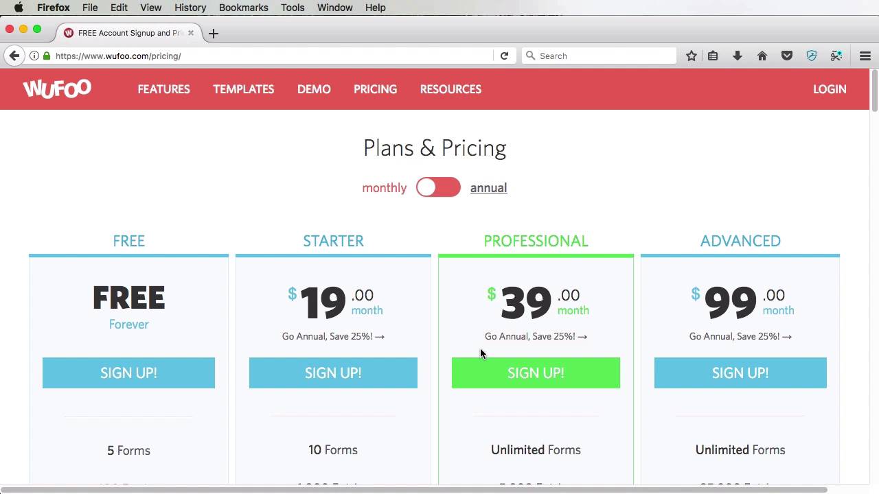
2.5 Make the Price Stand Out
Best practice number five, make the price stand out. This is very important because the price is probably the first thing that a user sees in a pricing table, so it's very important Important to give it the right emphasis. Now this doesn't mean give it a super large font size. You still need to respect the typographic scale of your website. But you need to put more emphasis on it. Beanstalk for example, uses a pretty conservative scale, so the price is not that large but it's still bold and larger in size than everything else in that pricing table which makes it standout. Shopify gets it right by using a large font size and font weight. Campaign monitor is also nailing it. I particularly like how the word month is much smaller and it puts all the focus on the actual price. Invoice Era uses a large font size but also an accent color for making the price stand out. Wufoo is another great example of how to make the price stand out. They use a very thick font and also a dark color which contrasts very well with the rest of the elements. Now here are some examples of some pricing tables that could use a little bit more work when it comes to making the price stand out. WISTIA puts more emphasis on the pricing plan title, rather than the price itself. While the price is thicker than the normal text, it doesn't stand out that well. Slack uses the exact same text style for both the pricing plan title and the price itself. It's not necessarily bad but again, the price doesn't stand out on its own. The price on the Brightbox table looks just like any one of the features. It doesn't stand out with anything, instead, they put their emphasis on the amount of RAM. Maybe that's a big deal for them. I don't know. Maybe the amount of RAM is their biggest selling point. If that's the case then, I guess it's fine but otherwise, I think the price should be emphasized more. So that's the best practice number five. Make the price standout. Now, let's move on to number six which is offer two to three payment options. That's coming up in the next lesson.


