

- Overview
- Transcript
2.5 Transforms
So far you’ve seen how you can create transitions between regular CSS properties like height, width and so on. However, there is a way to create animations that can be even more powerful, and that is by using “transforms”. Learn all about transforms and what you can achieve with them in this lesson.
2.5 Transforms
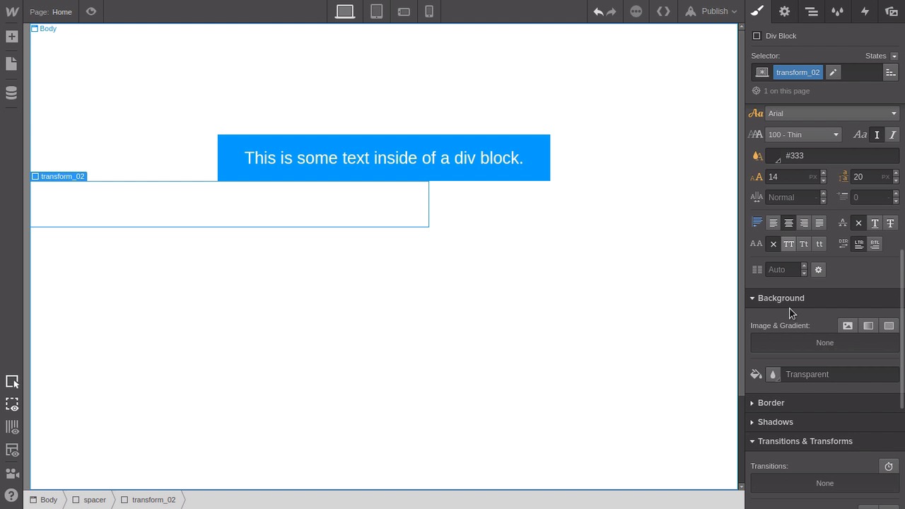
Hey, welcome back to a visual guide to CSS animation. In this lesson we're gonna go through working with transforms. So far, we've been doing transitions on just regular CSS properties like width and height and so on. But transforms are a little bit different. With a transform, you're actually transforming the shape of the element itself. And transform is a term that you'll find in other forms of animation. You'll find it in 3D work. Now, transform in CSS 3 allows you to modify one of four things. It allows you to modify the position of the element, the scale of the element, the rotation of the element, or the skew of the element. All right, so let's check these things out. We've got a little set up to do as usual. We still have our container here with the spacer class on it from the last lesson, just with the content removed. And then we're gonna drop in a new div block. Let's give this one the class name transform_01. We'll give it some background color. And we'll give it a width of 500 pixels. We'll hit this little button here to center it and under Typography, hit this centering button here. We're gonna drop some text in here, we want that text to be centered. Then we'll drop in a text block. Give it the class text_reveal. Set this color to white and bump the size up to about 25 pixels. Then we just wanna put some spacing around it, so we'll add a margin at the top and bottom of 1m each. Now what we're gonna do is apply a transform when we're hovering to scale this element up to twice its original size. So make sure you've got the transform_01 element selected and switch into hover state. Then down in the same section that we've been working in so far, the transitions and transforms area, we're gonna hit this + button here to add a new transform. And you can see here one tab each for the types of transforms that I mentioned earlier. So we're gonna select Scale. Now the other thing that you might notice in this panel here, is that we've got the x and the y-axes that we were talking about before. You'll also see the zed or z-axis, we're gonna talk about that later so you can ignore that for now. But you'll note from our earlier lessons, what the x and y-axes represent, horizontal and vertical movement respectively. So if you grab the dragger on the x line here and start moving it up. You'll see that the y dragger is also going up with it. That's because in Webflow those two are locked together by default. And as you do so, you'll see two things. You'll see that the numbers for both the x and y values on the right here in these fields are increasing. And so too is the overall scale of the element. If you want to, if you need to do something different or if you just want to see in a bit more detail how x and y scaling work, you can hit this little lock button to unpair these two values. Now you can scale each one independently, so you can squish them and stretch the elements out however you please. And the way these numbers work is as a multiplier. So the default scale on any given element is one, one times its original scale on the x and the y-axes. So if you set either of those axes to a scale of two, you're making it two times as large. And you can change that to any value that you want, any multiplier. On the other end of the spectrum, if you go down lower than one, now you're multiplying your original size values by a fraction. So that means that you're gonna be making it smaller. So for example, if you made your scale multiplier 0.5, then you're gonna be halving your original scale. So for this demo, let's just lock those two back together and set them both to two. So we're making our whole shape twice as big as it was originally. Now let's go back into our default state, and set a transition for the transform that we just added. Now, you don't need to look for the individual scale or rotate or skew properties or anything like that. Just the transform property is the only thing you need to apply your transition to. And now when you hover over your button, you're gonna see it inflate all the way up to twice its size. And then when you take it away, it'll deflate back down to its original size. Next up, let's try doing the same process again. But this time, we're going to make the shape move. Now, this is labeled move in the Webflow interface. But the correct name is actually translate. And when you're doing this in code, you're gonna be using the word translate, not move. So to make things a little bit quicker, jump into this tab here and select your existing transform_01 div. And then just Ctrl+C copy and Ctrl+V paste or Cmd+C, Cmd+V. Now select the second version that you just pasted in, switch back into the Styles tab. Put your cursor in here and just hit backspace to remove the existing transform_1 class name. Now we're gonna add in a new class name. We'll add transform_02. Give this one a width of 600 pixels. We'll make sure that text inside is centered and we'll give it a background color just like the first one. Then just to give us a bit of space so these two aren't smushed together, we'll just drag this up to create a bit of a top margin above this block. With this one what we're going to do is push this whole block off the screen and then just leave a little bit of a tag left on the inside of the screen. So that when somebody hovers over that tag, the whole block is gonna slide in and be visible in the viewport. Making sure you're still in the default none state, go down to the transform section and add a new transform. This time, we're gonna use the Move tab. And remember, that's actually representing what's called translate. So if you're wanting to look up any help or information on using these types of settings. Remember you want to look for translate, not move. Now you already know that the x-axis is the horizontal axis. We want to move this block over to the left, so that means that we need to decrease the value on the x-axis. We can use this little slider to do it. So as we drag this off to the left, the number goes below zero. And with this one, it maxes out at -250, but we want to take that a little bit further. So we're just gonna mess with this number until we have just a little tag hanging on the inside of the screen here. Now we're gonna make it so that when you're in the hover state, the translation is put back to its defaults. So jump down into this transform here, and now you want to reset that move value, translate value, back to zero. Now switch back into the default state and we're going to add a transition on the transform that we just created. With this, once again, you only need to put a transition on that transform property. So now, we're jumping to preview mode. When you hover over this little tag, out zooms the whole element. And you can also combine multiple transforms on a single element. So for example, let's take the element that we've just been working with making it move, and also make it scale when you hover over it. So select your block again, go into hover mode and down into the transform section. Here, we're gonna add another transform. This time we're gonna make it a scale transform. And then we're gonna drag the slider up to two times, so that now when you hover over this element, you're gonna get the effect of both of those transforms at the same time. You might notice though that now that we've increased the scale in the hovering, you can't quite see the text anymore. So we're gonna go into this move transform here or translate transform. And we're just gonna bump this over to the right a little bit by sliding the value for the x-axis up to 250. In this case, even though we've added something to our transition, we don't need to add a second transition because we're already covering that transform property. And both our scaling and our translating come under that single property. So if we jump into preview mode, you can see that as we hover, the element is also now increasing in size as it shows up in the viewport. So now you've seen how two of the four types of transforms work. You've seen scaling and you've seen translating. The other two are skewing and rotating. And we're not actually gonna go through an example of working with skew. But what you can do is just select your existing block here, open up that skew transform, and drag those sliders around a little bit. And you can see the effect of the skew being applied there. We're not going to go through an example of actually making something working because what you'll notice there is when you're skewing the element, you're also skewing everything inside it. So if you're wanting to start skewing elements that have content inside them, then what you actually have to do is apply another transform to the child elements that skews them in the opposite way. So that you end up with a correction that counteracts the skewing of the parent to make the child look normal. And we can't actually control the transform on a child element that's being hovered over with the toolset that we have here. But just bear in mind that if you do wanna start working with skewing, then that's what you're gonna need to do. The other type of transform is rotation. Now so far, everything that we've been working on is to 2D, and in the next lesson we're gonna start talking about 3D. And you have to sort of have a bit more of an understanding of 3D in order for the rotation tools to make sense. And the reason is that rotation happens around the axis that you're specifying. So let's say you change the x rotation number. Now if you imagine that you're holding a stick in front of you like it's the x-axis and it's on the horizontal. And then if you imagine you slide a donut onto that stick. Now if you were to spin that donut on that stick, that would be like rotating it on the x-axis. It would be moving around the x-axis. Now, if you put a rotation on the y-axis, you can imagine that that stick is straight up and down. And now you're rotating the donut around the y-axis. So if you want to get what looks like a 2D rotation, you actually have to rotate around a third axis. And that is the zed axis or the z-axis depending on where you live. So that takes us in to working with 3D space. And that's what we're gonna start going through in the next lesson. I'll see you there.


