- Overview
- Transcript
2.4 Transition Duration and Timing Functions
You’re ready to start fine-tuning your animations. In this lesson you’ll learn how to control the exact way your animation plays out by setting transition duration and timing functions.
Related Links
1.Introduction1 lesson, 00:49
1.1A Visual Guide to CSS Animation00:49
2.A Visual Guide to CSS Animation6 lessons, 46:52
2.1A Quick Animation Demo and Overview04:31
2.22D Animation Essentials07:25
2.3Transitions13:05
2.4Transition Duration and Timing Functions04:57
2.5Transforms10:03
2.63D Transforms06:51
3.Conclusion1 lesson, 01:42
3.1Wrapping Up01:42
2.4 Transition Duration and Timing Functions
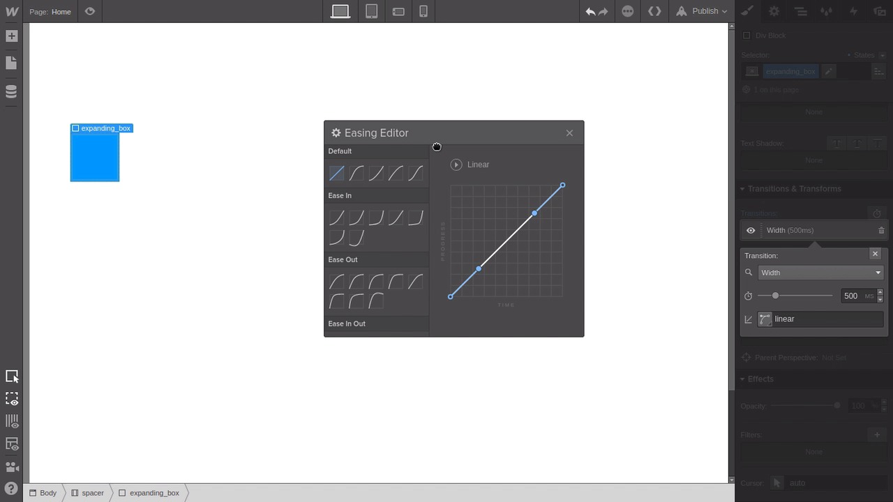
Hey, welcome back to a visual guide to CSS animation. In this lesson, we're gonna go through some of the settings that you can apply to transitions to control the way that they play out. So we're gonna be looking at two things. We're gonna be looking at duration, and we're gonna be looking at timing functions. If you still have anything in your page left over from the last lesson, just delete it. Everything except for the container that we set up earlier to push a little bit of space down from the top there. Then, we're just gonna drag in a div block. And we'll give it the class, expanding_box. Let's give it some color. And we're going to set its width to 70 pixels because when we hover over this we're gonna have this box expand. Now let's switch over to the hover state and we'll put the width up to 700. And then back in the default state, let's add a transition and this time we're going to apply that transition to the width property. When we hover over our box, it's gonna expand, and then when we take the mouse away, it's gonna shrink again. So we've got a working transition, but what if it's not quite right for our purposes? What if, for example, it goes a little bit too fast? Well, that's where the transition duration setting comes into play. So if we open up our transition again, you can see that there's a little clock icon here and that's where you can control the transition duration. When you're working in raw CSS, it'll just be the property transition duration with a hyphen in between. So let's make this transition take a bit longer. So let's just drag this slider up. And now when we hover, it's going at a much slower, smoother pace. Conversely, if you want it to go faster, then all you need to do is reduce that number. So the count is in milliseconds. So let's drag it back down again to about 100 milliseconds. So now our rollover effect is much quicker. So that's how transition duration works. The smaller the number, the quicker the animation is gonna play out, and the higher the number, the slower it's gonna play out. Now let's have a look at timing easing functions. Before we do that, let's just put our duration back up to about 500. Transition timing functions control how quickly your animation is playing at various points in the duration. So, does it play quickly at the start and slowly at the end, or vice versa? You can select a different timing function with this button here. And we're gonna start by selecting this flat diagonal line here. So this basically applies no easing whatsoever, everything is gonna be a consistent speed all the way throughout the animation. And now you can see that in action when we hover. As the box expands out, it stays the same speed from start to finish. Again, now let's try adding a timing function that's gonna give some variation. So let's choose one of these ease in timing functions. You can pick any one you like. Feel free to experiment. So what an ease in timing function does is eases into the animation. So it goes slowly at first and then it speeds up towards the end. When we hover, we can see that happening. You can see how it goes a little slower at the start and then it speeds up right towards end, and it does that in both directions. Now, let's jump in and apply an ease out function, which is the opposite to ease in. So this time it goes fast at the start and then it eases out towards the end. Now, when we hover you can see that it goes quickly at the beginning and then it slows as it reaches the end of the animation. There's a bunch of different prebuilt timing functions that you can use, but you can also do your own. You can either write the code for them, or in the case of web play, you can use this little graphical editor. So, let's put together a timing function that's just stupid, that you'd never actually use in a production site, just to show you some of the extremes that you can achieve with the timing functions. So let's drag this all out of whack, so we really have a curvy line here. Now when we hover, you can see this thing is boinging all over the place. So it's not just going in one direction with the animation, it's actually going back in the opposite direction to the way it started. So there's a lot of variance that you can get by tweaking these timing functions to your liking. So that is how transition duration and transition timing functions work. And we actually have another really great course on timing functions if you want to dig into more detail. I'll post a link to this course in the notes below this video, if you want to check that out, too. All right, so that covers pretty much everything that we're wanting to look at with transitions. But the other aspect of the CSS animation that we're gonna be going through in this course is transforms. So far, you've just been transitioning between regular CSS properties, like height and width and border and so on. But when you start to use transforms, you get a lot more power over how you actually transform your shape or your element from one state into another state. So in the next lesson, we're gonna go over what transforms are and we're going to create some examples so you can see how they work in action. So I'll see you in the next lesson.


