

- Overview
- Transcript
2.3 Transitions
Having already seen a basic transition in the first lesson of this course, let’s now dig deeper into what transitions are and check out a few of the effects you can create with them.
Related Links
2.3 Transitions
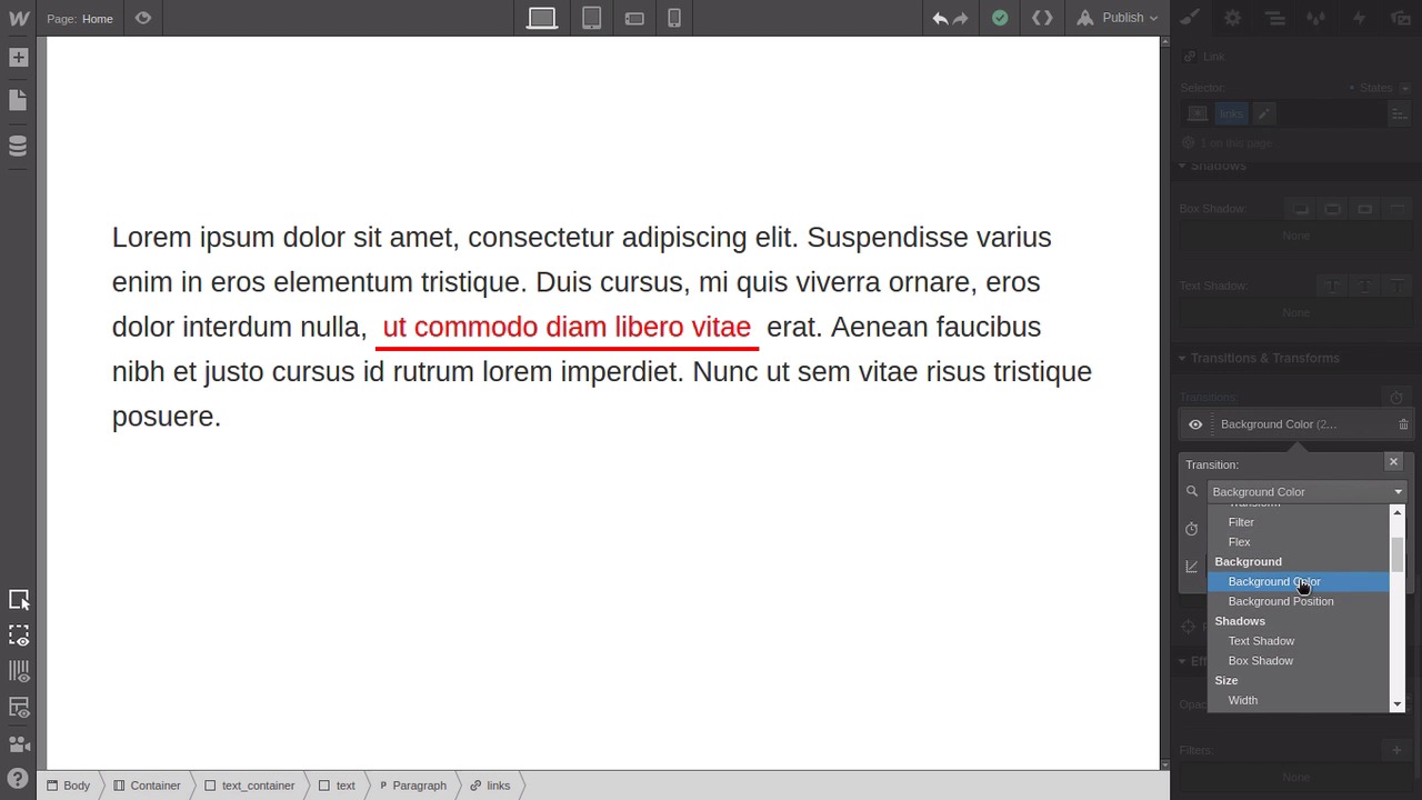
Hey, welcome back to a Visual Guide to CSS Animation. In this lesson, we're gonna go through and create three little mini projects so that you can get hands-on with transitions and see a couple of the different things that you can do with them. The first thing that we're gonna do is create a really cool effect where you can put an image in a page and have it be black and white by default, but then turn to full color when someone hovers over it. And this can be a really striking effect to use in things like image galleries, for example. We're gonna stop by dropping in one of these container elements that come stock with Webflow. That's just going to give us some automatic centering so that our image is in the middle. And from the media section here, we're gonna drag in an image. With the image selected, you'll wanna hit Replace Image and then just browse to one of your favorite desktop or wallpaper images, and then hit Upload. I'm just using an image here that I've got from unsplash.com. So if you don't have one handy, it's a really great site for getting really high quality images. So now we need to give the image a class name. We'll just give it image_effect. Then, we're gonna scroll all the way down to the bottom here to the Effects panel. And then down here where it says Filters, hit this little plus button. And then there's a bunch of different really cool filter effects that you can choose from. The one we're looking for is grayscale. So go ahead and apply that. As you can see that's made our image turn to black and white, and we're currently in just the default state in the None state. So what we're gonna do is set it so that the Hover state, the image is full color. So just like we've done a couple times so far, go up to the States drop-down menu and select Hover, then go all the way back down to the bottom to the Effects panel. And you can see here that we've still got the grayscale applied here. That's because that's being inherited from the default state to the Hover state. But we wanna overwrite the amount of grayscale that's applied when somebody is hovering over the image. So we select this filter, then we're gonna take this amount, drag it and move it from 100% all the way down to 0%. So then the grayscale filter is no longer applying itself. So our image is back to full color. Now we've got our two states and all we need to do is create a transition in between them. So in the States drop-down, go back to the None state. You can only apply transitions on the None state. Then go down to the Transitions area, add a new transition and this time the property that we're applying the transition against is the filter property, so select that. And now when you hover back and forth over the image, you're gonna see it transition beautifully from a grayscale image into a full color image and back again. Okay, cool, so that was the first of the three effects that we're gonna be putting together in this tutorial. When we reach the end of the video, I'm also gonna show you some more advanced versions of each one. So you get a bit of an idea of what you're gonna be able to do down the track. All right, so onto the next effect that we're gonna set up, so just delete everything that you added in here except for the container, you can leave that where it is. Now what we're gonna set up is a non-default link hover behavior. So as you know, when you normally set up a link, it has a standard underline. And what you'll normally do is, when you hover over a link, you might change the color, or you might show or hide that standard underline, but we're gonna do something a little bit different. Okay, so first we just need to do a little set up so that we've got a little container to put our text in with a link on it. So drop a new div box inside the container that we already have there. Give it the class text_container and then just drag this top bar here, which sits the top margin. So that we just bring that little box away from the very top of the viewport. Just to make it a little bit easier to see. Then drag and drop another div block inside the one that you just added and give this one the class text. And then inside that again, drag and drop one of these paragraph blocks. Now we need to re select the div with the class text, which is easy to do if you click in this tab here, and then you can just directly select the element that you're trying to target. We're gonna use this text class to style the paragraph that is nested inside it as a child. So in the typography section, we're just gonna bump up the size of this text to make it a little bit easier to see what we're doing. And then that's kinda cramped up the line height. So in the line height here, change this from this pixel value over to 1.6em. And by the way, that's why you never specify line heights in pixels. Because if you need to change the font size of your text then your line height's always gonna be out. Always use ems or preferably just use a number with no unit on it at all, just 1.6. Again now, let's set up the link that we're going to be working with our styling. So just highlight any bit of text that's in the middle of your paragraph here. And then click this little link button that shows up at the top left of the block. Now back in the Styles tab, we're gonna give our link a class. And we'll just use links. By the way, at this point you might be wondering why we've put in a whole paragraph of text and not just a link by itself. That's because when you're styling links you wanna know what they're gonna look like with text around them, because that's where their normally gonna be found. They're normally not just sitting in isolation, so you need to put them inside a paragraph of text so that you know how they're gonna look in practical application. So now, let's set up our default styling on this link. So we'll start by just setting the text code to a bright red, and then we're gonna remove the default underline, because we're actually gonna be adding our own. Now scroll down to the Border section and hit this bottom button here. That's what is gonna control the bottom border only. Then select this little solid looking line here that sets the border style to solid rather than dotted. And we're gonna up the width of the border to 4 pixels, and set it's color to red to match the main text. And we're actually gonna be giving this link a background color when we hover over it. And when that happens we don't want the text to be right up flush against the background color. So we're gonna add a little bit of space around it. So we're gonna put seven pixels of padding on the left and right sides and we're gonna put four pixels of padding above and below it. Now let's switch into the Hover state and set up our hover state style. So as I mentioned, we're gonna give it a background color. So just set the background color to that same bright red that we've been using so far. And then set the text to white, so it's still visible on the red background. And then finally, we're also just gonna change the color of that bottom border so it looks a little different. So you can change that to anything you like, but I'm going here with just a darker version of the red that we're already using. That's now our two states for our link and just as we've been doing so far, we're gonna switch back into the None state and apply our transitions. So this time we changed three properties. We changed the background color, we changed the color, and we changed the border color. So now we just need to apply our transitions for each of those three properties. Now when we hover over our link, you're gonna see that there's a pretty striking effect with our hover. And you can tweak that however you like, there's lots of different things you can do with this technique and it just helps to make your links stand out more and be a bit more eye catching. All right, so now we're on to our third effect that we're gonna be doing this lesson. So once again, just delete everything except for the container. And with this effect, we're gonna be setting up a hover on a regular button, just a little bit of set up again so that we have our button in a place that's easy to work with and see. So select the container that's still on the page, give it the class spaces so we can add some styling to it. And then we're just gonna add some margin st the top to push it down a little bit. And then down in topography section, we're gonna hit the center button. And that's gonna allow us to have the button that we're gonna be working on centered in the page. Now drag and drop a button element into that container. Just fill in the link field with the hash or just a Google address or just anything to fill in the placeholder. Give it the class button so we can style it. Bump the tech size up to 60 pixels. And we'll just change what it says, I'm gonna add click me. You can add anything that you prefer. And as you can see, it's looking a bit cramped around the edges now. Once again, that's why you don't use pixel values, you should use values for stuff like this. So we're just gonna change that to 1em of padding on all four sides. Now the way that this button looks right now is actually already how we want it to look in the default state. But we're still gonna have to add another couple of properties anyway. And the reason is when we hover over this button, we're gonna have a border appear and we're gonna have a shadow appear. You need to have whatever properties you wanna transition between on both states. So what we're gonna do is add the border and add the shadow, but then we're gonna make them invisible until you hover over them. The other reason that we're going to be adding the border and the shadow on the default state is that sometimes you can add a fix, or you're gonna change the layout or positioning of your button. So the border is gonna change the width of our button, and the shadow is gonna offset it a little bit. And we don't wanna have a awkward looking movement as you go from one state to the other. So down in the Border section, let's give this a border of 5 pixels in width, but then in the color selector here, we're gonna drag this alpha channel all the way down to 0. So now the border is there, but you just can't see, it's transparent. Then down in the Shadow section, we're gonna add a box shadow. Now the Hover state is going to inherit the shadow settings that we create here. So we're actually gonna set up this shadow the way we want it to look when we're hovering. So just mess around these sliders a little bit until you get it looking the way you think is nice. Then when you've got it how you like it, drag that color down to being fully transparent again so you can no longer see the shadow. That's our defaults state all set up, now so let's switch into the Hover state. First thing that we're gonna do is make that shadow visible again, so just go into the color picker for the shadow, and then just boost the transparency up until the shadow is looking nice. Then go up to the border and the color picker for that one. And then just boost the transparency up enough so that you have a bit of a subtle overlay color there. You don't want it super black. Just enough to give it a bit of a difference in color. And we're also gonna round off the corners in our hover state. So in the radius box here, just mess around with the number there until you feel that your button has a nice rounded shape. All right, so now let's switch back into the default state and add our transitions. We'll add a transition for the drop shadow, and then we'll also add a transition for the border property. And that border property is gonna pick up both the border color and the border radius. So it'll do both of those things at once. All right, so now let's go in to preview mode and see what the effect looks like. All right, pretty cool. So you hover over this and you can see the border changing and the shadow kicking in. Now, we're gonna add one more thing. And in this case, what we're gonna do is add a third state. We're gonna add a pressed state and we're gonna make it look like when a person clicks on this button, it's being depressed a little bit. So select the Pressed state from the drop-down list. And then down in the position setting, select relative. And that's what's gonna allow us to move the button a little bit when it's pressed. And we're gonna set both the top and left settings to 5, so that's gonna offset it by 5 pixels in both directions. And we're also gonna just change the background color here, we're gonna boost it up to a brighter color blue so that it looks like it's had a little flash of brightness when it's clicked on. Let's test that out. All right, so now when you click the button, you can see that it moves and it has that little flash of brightness. But we're gonna add one more transition so that color comes in a little bit more smoothly. Back in that default state, now add another transition, this time for background color. And now if we test one more time, you can see we've got all three states transitioning. We have our button changing shape when we hover, and then when we click, we have the background color coming in and the movement. And if you wanted, you could also add transitions for the top position and the left position. If you wanted a more gradual shift when you click on a button rather than an instant move, but that's a design choice so that's totally up to you. Cool, so that's all three of the different types of transitions that we're gonna go through in this lesson. And I mentioned earlier that I also wanted to show you some more advanced versions of basically the same things. This is a more advanced version of doing that transition from black and white to full color. So this is a Pure CSS Image Gallery. Then, we've got some extra types of custom link transitions that you can do, if you wanna make your links look a bit more interesting. And this is all still just using transitions. And then also some examples of different types of button transitions that you can do. There are so many different things that you can do with transitions with buttons, so these are just a few of the cool little things that you can adjust there. So if you're interested in digging a little bit deeper with this type of transition effect, then I'm gonna include some links in the notes below this video to the other courses of mine that you can do if you'd like to learn how to do each one of these examples. All right, so that wraps up the lesson on transitions. You've seen quite a few different things now that you can do with transitions on multiple different types of properties, but that's not where it ends with configuring transitions. You can also adjust some settings on each transition that you set up so you can control exactly how it plays out. And we're gonna go through how you can do that in the next lesson. I'll see you there.


