

- Overview
- Transcript
3.5 Plugins
Let's talk about plugins. These are JavaScript components which add extra functionality to Foundation. Let's start with a plugin called “Equalizer”.
Related Links
1.Introduction
1.1Welcome00:19
1.2What Is Foundation?08:09
1.3What's Changed Since Version 5?02:44
2.Working With Foundation
2.1Using Yeti Launch10:32
2.2Customizing Foundation03:51
3.Foundation's Awesome Components
3.1The Grid20:09
3.2The Navigation09:06
3.3The Containers13:05
3.4The Orbit Slider03:42
3.5Plugins13:24
3.6Libraries09:17
4.Conclusion
4.1Final words00:48
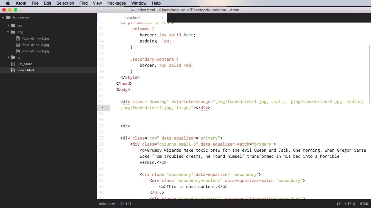
3.5 Plugins
Let's talk about plug ins, and these are JavaScript components that add extra functionality to foundation. Let's begin with a plug in called Equalizer. Equalizer is a very simple plug in that allows you to give multiple items equal height. So let's see a very simple example of this. Let's begin with a row, and let's say that inside we're gonna have three or four items, right? So we're gonna another div with a class of columns, and let's do small three, and inside we're gonna do a paragraph with some text. Now let's copy this and paste it three more times. In the second one, let's say that we're gonna have another paragraph, in the third one, we're gonna have a smaller paragraph, and in this one let's actually put an image, OK? So, it looks something like this. As you can see we have roughly different heights for each one of these elements. Now let's do a simple style here, so we can target the columns, and just do a simple border one pixel solid. So you can see what's going on here. Let's also add a padding to each one of them. All right, so as you can see, we have different heights. But what if we want the heights of these elements to be exactly the same? Well, we would start on the main, on the parent element, we would need to setup an equalizer group. For that, we will say data equalizer. And then on each of the smaller items that we want to adjust the height, we would set data equalizer watch. We'll do the same for the other three. And now we have the exact same height to all of these items. If I'm gonna go back here and I'm gonna add another paragraph, all of the columns will be updated automatically. Automatically. Now this is really, really cool. This actually is kinda hard to do in CSS, but with this plugin it's really easy. Now, you can also have an equalizer group within an equalizer group, so you can do nesting basically. For example, if I'm gonna go to the first column here, if you want, I can do another div with the class, let's say secondary. This is just a random class here. And inside, I can do another div for the class of secondary content, and then some content inside, and then I'm gonna set data equalizer to this, but we need to give it a unique ID if we're gonna do nesting. So I'm gonna say here secondary, and on the main one I'm gonna do primary. And you need to do the same on the equalizer watches, primary and here as well. And then on the secondary, we're gonna do data secondary watch, secondary. So now let's base three more of these, and let's add some more content like this, and let's check it out. Let's target the secondary content containers, and give them a border, so you can see that they have the same height. And that's how you use the equalizer plugin. The next plugin is called interchange. And this allows you to use media query to dynamically load different content based on the user's device. So on small screens for example you can load different images or different html, while on large size screens you can load something else entirely. So let's see how you would do that exactly. And let's start with a very simple example. For the image, instead of an src attribute, you'll do this data interchange and then you would do a list that consists of the path to an image. It's gonna be img food drink 1 JPEG, and we're gonna load this for small devices, and then I'm gonna load number two for medium devices, and load number three for large devices. Now, small medium large, these are predefined sizes in foundation. You can change them, however, by changing the breakpoints variable in SSIS. We're going to keep ours stock. So small means a maximum width of 40 ems, medium, maximum width of 64 ems, and large, maximum width of 75 ems. So now, if I refresh this, we're gonna have our first image. This is food drink three, because we are on a large screen. But if I change this, if I resize it, it's gonna change to image number 2, which is food drink 2. Of course this is a big, big image here, but you can see it here. And if I change again, it's gonna load food drink 1. That is very, very cool. Now, you would use this to send appropriate sized images to various devices. So, for example. On a smartphone, which has a very small screen, there's no point in sending a huge image. So you would do the image yourself and then send the small version. Same goes for tablets, desktops, and so on. Now, Images, as I said in the beginning, are not the only thing you can change. You can also use background images. So, instead of the img here, you can actually put div. And let's actually give it a class of demo bg, close the div, and right now it's not working because it doesn't have a height. So let's do demo bg, and let's go to height of 100%, a width of 100%. And a display of block, OK? So now we can see the background image will change, and there it is. >> A cool thing is you can also change the HTML of a specific container. So for example, let's comment this bit. And let's do a div. Actually, you know what? We're gonna copy this, because the markup is almost exactly the same. We're gonna have a div, and instead of these paths, let's do different ones. Let's do html slash partial1, or let's actually do small html. And we're gonna change the others to medium html and to large html. OK, so now let's create a new folder here called HTML. And inside we're gonna create a new file called small HTML. And we're gonna say h1, this is a small screen. Then we'll do medium, this is a medium screen, and then we'll do large. This is a large screen. Alright let's refresh. Now unfortunately, this doesn't seem to work with the html. Maybe it's just a bug. I don't think I'm doing anything wrong. The markup is correct, and I am loading all the necessary foundation files and plugins, but it just doesn't seem to work with the HTML. But it does work with the images. And, that's probably what you're gonna be using it for anyway. So, maybe until this course is released, the team at foundation would have fixed this small problem. Now finally, the last plugin I want to show you is called Sticky. And I did mention this when we were talking about the navigation, because Sticky can be used very nicely with a navigation pattern called Magellan. And let's see what Sticky does first, and let's actually delete this content so we have a clean slate to work on. Now, this plugin will make something stick basically anywhere you put. It's gonna stay there, and it's gonna stay there even if you scroll. So let's say, for example, that you have a very long page. Like this, for example. I have a couple of paragraphs here. And actually. What we're gonna do is use the grid system here. So we're gonna do a row. And on the right side here, we're gonna say div with a class of sticky. And this is some sticky content. Also here we're gonna say data sticky. And over here, we're gonna say data sticky container. So what this does is you have this content here and the sticky content on the right. And when I scroll, the content stays there. Now it goes away here because I'm reaching the end of my content here. So it goes back to its default position. But this is a great way to make a sticky element. Now, let's see how we can use this with the Magellan navigation. For that, let's go ahead and remove this bit here, and we're gonna make this even smaller. And we're going to align to the center. Let's actually put this in the row there. And let's create a couple of sections. So, let's say that these first two paragraphs are gonna be inside a div. With an ID of section one. These are going to be a div with an ID of section two, and the rest in an ID of section three. Now there is one other thing we need to add here. We need to set data Magellan target equals the same as the ID. Do the same for the others, and then for the sticky navigation we're gonna put something on the top. We're gonna do a div data sticky container, and then inside a div with a class of sticky, and we're gonna set data sticky to this one. And then we're gonna create the NAV, data Magellan, and then we can create a simple menu. So ul with a class of menu. And inside, href is gonna be section one. Section one, two, and three. And let's see if it works. OK so these are floated, remember? So they overlap here a little bit. It can be changed in CSS. Also, section one, section two will take you to this section here, and section three will take you to this section here. So if these menu items would have had an active class, you would see a change here in the link corresponding to section one. And when you scroll down to section two this will be highlighted, and the same would go for section three. And of course clicking one of these items will take you back to that particular section. And that's it for plugins. Now, in the final lesson of this course you're going to learn about the libraries used by Foundation. See you there.


