

- Overview
- Transcript
3.2 The Navigation
Let's have a look at the navigation components—and I say components because Foundation has a few simple examples which can be combined to give us more complex navigation patterns. Let's start with the most basic: the menu.
Related Links
1.Introduction
1.1Welcome00:19
1.2What Is Foundation?08:09
1.3What's Changed Since Version 5?02:44
2.Working With Foundation
2.1Using Yeti Launch10:32
2.2Customizing Foundation03:51
3.Foundation's Awesome Components
3.1The Grid20:09
3.2The Navigation09:06
3.3The Containers13:05
3.4The Orbit Slider03:42
3.5Plugins13:24
3.6Libraries09:17
4.Conclusion
4.1Final words00:48
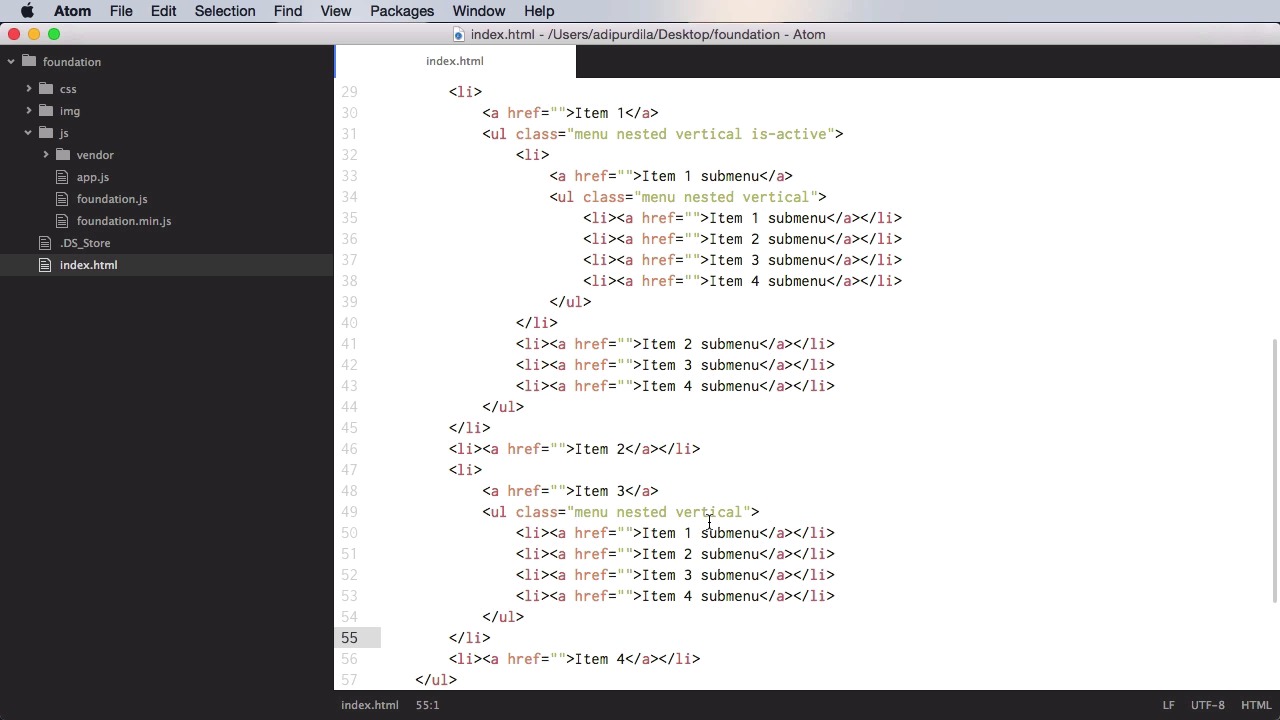
3.2 The Navigation
Let's have a look at the navigation components. And I say components, plural, because Foundation has a few basic ones t hat can be combined in order to form more complex ones. So, let's start with the most basic one, which is the menu. Creating a menu is actually very simple. You start with an ul, a class of menu, and let's add some list items with anchor text. This bit of code will generate this menu, now you have a several options for this menu. You can affect the item alignment by adding the class of align-right and now all of the items will be pushed to the right in reverse order. So we go from four to one and we can also create a vertical menu. So simply add the class of vertical, and now it's a vertical menu. This is very good for off canvas menus, or side bar menus, and stuff like that. You can also create nested menus. So, for example, if I were to copy this entire menu and paste it inside a list item. And just like this, and add the class of nested, we would create this bit. Now the menu component has three plugins or three modes, if you wanna call them that way. You can do drop down menus, you can do accordion menus, and you can do drill down menus. Now all of these three require JavaScript. So in order to make them work, make sure you have the JS installed for Foundation and inside app.js, make sure you are calling the foundation function, which initializes all of the JavaScript plugins. Now to create a drop down menu, let's start with this menu. We'll add the class of dropdown and in addition to that we'll add a data attribute, data-dropdown-menu. Now this will basically mark this menu as a drop down one. So now let's go ahead and actually create a submenu right here, and we're going to just give it the class of menu, and let's create an additional text here called submenu so we can differentiate between the two. So now we have the default menu, and then a sub menu. And of course, you can go even further. You can add this ul inside another list item here, and it's gonna create a sub menu. So you can go a couple of levels deep with this. Now, if you want, you can also make this entire menu into a vertical one. And it looks something like this. Although it doesn't look that good, yeah, you do have the option to do this. Now, the other type of menu is called drill down and it uses the standard menu syntax, all we have to change is the data attribute here. So instead of data dropdown menu, simply change to In data-drilldown, remove the dropdown from there and add nested and vertical to both of these submenus. All right, so now you have this. Notice the arrow is all the way out here, but if you click on the first item, it takes you to this bit. And you can go as many levels as you have in the menu and clicking on Back takes you to the parent element. Now the third type of menu is the accordion menu. And this only works of course on vertical menus. So a couple of things you need to do, ul class=menu vertical, or vertical menu, data-accordion-menu. And then let's say that you have yet another one on the third item here. Okay, so now, your menu looks something like this. Now let me just delete these first menus, so it's gonna be much clearer what's going on. Okay, so this is the first item. Click it and the menu is gonna collapse. Click it again and it's going to expand. Click this again and the submenu is gonna expand and clicking this will basically toggle it's submenu. So, this is an accordion menu. All right now, let's talk about some of the more complex components you can create around these menus. And the first one is a top bar. So with a top bar, let's actually start fresh here. With a top bar you start with a div, basically, with the class of top-bar. And then you have two components. You have a top bar left and a top bar right. So div with a class of top-bar-left+.top-bar-right. Now what you put in these is really up to you. For example, on the right side you could put a search or some contact information. And on the left side you can put a logo and maybe a navigation, a menu. So let's do a simple example on the left, let's do a drop down menu for example. We're going to start with an ul a class of menu and dropdown and inside let's put a list item. Let's say logo here, and then another list item where we're going to put an anchor tag. And that's gonna say Item 1, for example. And let's add a sub-item to this one. So we're do an ul.submenu.menu.vertical. And a couple of items there. And then maybe do another list item, we'll call this item, let's actually call this Item 2, and we'll call these Subitem 1, 2, and 3, and this Item 2. Now we do have to add a class to this list item has-submenu. This has to do with the styling inside the top bar. All right, and on the right hand side let's put just a simple text here that says Contact Information. This is just for demo purposes. Now, what you can do here is you can actually use a class called menu text, which styles the text differently inside the top bar. So let's do a span with a class of menu-text,and paste that in, and we'll do the same for the logo, so class=menu-text. All right, so now we have our top bar, but the problem is that we don't have the dropdown, so let's see, menu, dropdown. We forgot about the attribute data-dropdown-menu. All right, so there it is, the dropdown. Hover on it and it shows you. And then on the right side, you have the contact information. Now, when you resize this, the left and right sides of the top bar will actually stack on top of one another. Just like that. Now this span here doesn't have the correct sizing, so instead of span, let's use a simple div with a class of menu-text. And that's gonna fix the incorrect padding, and it's gonna position this in the middle of the top bar. Now, there is another component that can be used as a navigation, and that's called Magellan. And that allows you to create a navigation that will actually track the active section, the section that's in view, and it will highlight an item in a menu. I wanted to show this now but it's actually much better when used the sticky plugin. So we'll cover Magellan when we cover the sticky plugin in a future lesson. That's it for the navigation components. Now coming up we'll have a look at the containers. See you soon.


