

- Overview
- Transcript
3.3 The Containers
In this lesson we'll have a look at the components which Foundation calls “containers”. They're named this way because they contain other elements. Let's start with the accordion.
Related Links
1.Introduction
1.1Welcome00:19
1.2What Is Foundation?08:09
1.3What's Changed Since Version 5?02:44
2.Working With Foundation
2.1Using Yeti Launch10:32
2.2Customizing Foundation03:51
3.Foundation's Awesome Components
3.1The Grid20:09
3.2The Navigation09:06
3.3The Containers13:05
3.4The Orbit Slider03:42
3.5Plugins13:24
3.6Libraries09:17
4.Conclusion
4.1Final words00:48
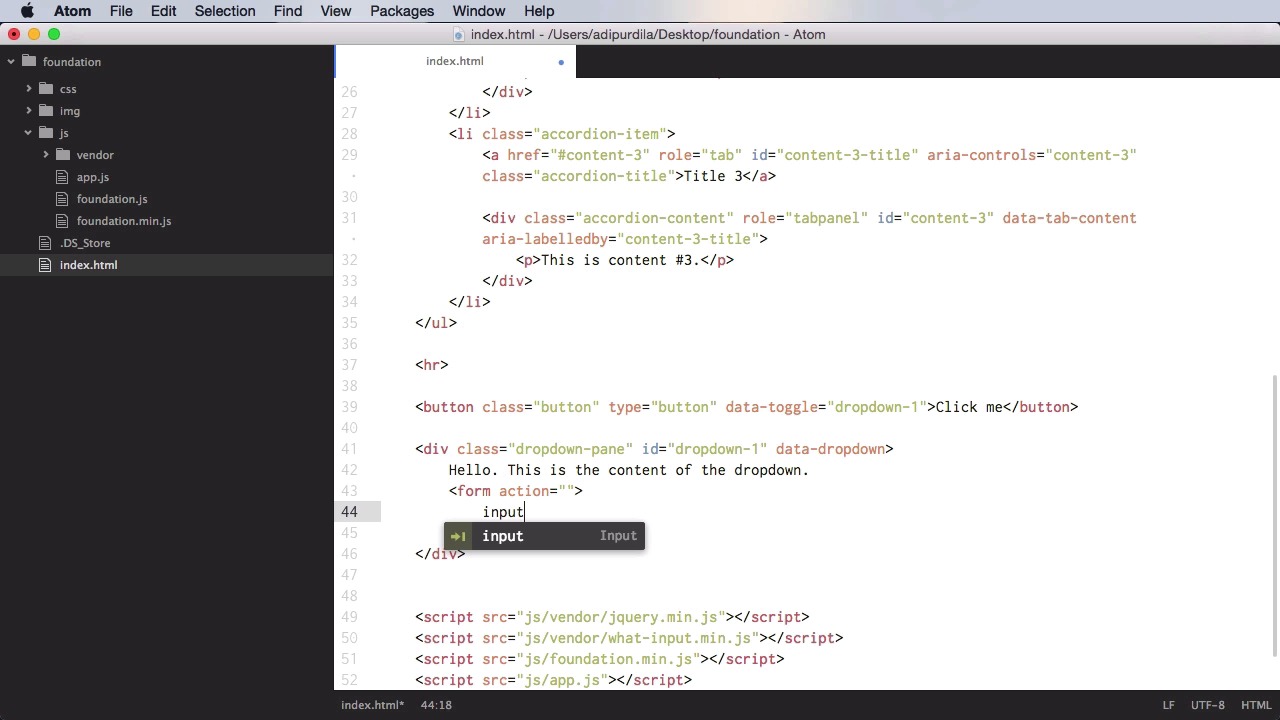
3.3 The Containers
In this lesson, we'll take a look at some components that Foundation calls containers. And they're called that way because, well, they contain other elements. We'll start with the accordion. Creating an accordion is very simple. You start with an ul or a definition list or a div. Basically, you can use any kind of element. But for the sake of this demo, we're gonna use ul because it has a very simple markup. So ul, you start with the class of accordion, and then you need to add a data attribute, data accordion, and then a role, we need to set this to tab list. Now inside, each accordion item is represented by, in our case, a list item. And we're gonna give this a class of accordion item, and then inside the accordion item you need an accordion title and an accordion content. We're gonna start with the accordion title, so we're going to have an anchor tag, we're gonna give it a class of accordion-title, and then for href we're gonna give it the ID of our content panel. So which content does this title correspond to? So in our case, we'll just say content-1 for example. Also, we need to add the role of tab, also, we need to give it an ID and we'll just say content-1-title. You can name this whatever you want, but make sure it's unique and for accessibility purposes, we're going to say aria-controls, content-1. And, of course, we're gonna say here Title 1. This is for the actual text that will be displayed. Next, on to the actual content. We'll start with a simple div here with the class of accordion contents and then we need to set a role of tab panel. We need to set the ID that we have here in the a href. So it's gonna be content-1. Then we're going to set data-tab-content and then again for accessibility, aria-labelledby content-1-title. So we're going to the id of the anchor tag. And for the content, well, we can have whatever you want. In my case, I'll just put a paragraph. This is content #1. So what you do now is you duplicate this list item, depending on how many accordion items you have. And the result is this. Title one, of course, you need to change in the actual titles here. So, first of all, I'm gonna have here, number two, and number three. Okay. So now, when you click one of these you're gonna toggle its content. If you want to make an item active, the first time, you need to add the class of is active to the parent list item, so let's say I want number two to be active from the start correct? So, I'll say is active and, number two is currently active. Now currently you can only show one content at a time. If you want to expand multiple items at the same time, you need to add up here to the main accordion parent, you need to set data-multi-expand is true. So that will allow you to expand all of the items if you so desire. Also you have the option to close all of the items. So currently, I need to keep one item open at all times. But if you want to close this as well, if you simply add here data-allow-all-closed true, all right? So this allows you to close all of your accordion items. And that's it for the accordion. Now let's talk about drop downs and you must not confuse drop-downs with drop-down menus. That is a separate plugin. For that, let's create some separation here, you start with a trigger. And the trigger can be a button, it can be a link, it can do this via JavaScript, if you want. But it's really easy to do this via simple HTML markup. So let's actually start with a button, a simple button, and we'll give it a class of button, or give it a type of button. And then, let's do for text, Click me. Now, you also need the actual content that's gonna be toggled. The dropdown content. So, you're going to start with a div with a class of dropdown-pane. Also you'll give it an ID. Let's say dropdown-1. Let's expand that. Also you'll set a data-dropdown to this and then inside we'll do the content of the drop down. All right now, finally you need to set a data toggle to the button. And you're gonna put dropdown-1, which is the ID of the target content. All right, so now, let's see, you have Click Me. You click it and you get the drop-down. Now what would this be useful for? Well, maybe you want a login drop down. So you click on the log in button and you get a log in form. Now, the thing is, if you put a form inside here, if you put an input, it's not gonna be focused from the start. So let's actually put one over here. So we're gonna have a form and inside, I'm gonna have an input type text, and we're just gonna leave it like that. All right? So as you can see, this is not focused. But I can go into my drop down pane here, and I can add another attribute called data, autofocus, set to true. So that will automatically focus the first input in that container. Now if you want you can also create a hoverable drop down. Which means you don't have to click the trigger to show the drop down, you simply hover your mouse over it. To do that, you simply go to the drop down pane here, and you add data-hover. Set that to true. So now, whenever I hover with my mouse, the drop down will be shown. Now, by default, this drop down is positioned below the trigger. If you want, you can also put it on the top or the right. You simply add the class of top to the drop down pane. Now it's on the top or on the right. And now it's on the right. Next up, let's talk about tabs. And tabs, I'm sure everyone is familiar with them, they can be used for switching between different blocks of content in the same container. So, let's start with an ul, with the class of tabs, and then in here, we're gonna say, data-tabs, and let's give it an ID, demo-tabs for example. And then inside, you would do the tabs titles, so list item with a class of tabs-title. And in here, you're gonna do an anchor tag. The href should point to the tab contents or the tab panels that we're gonna write down below. So let's say tab-panel-1 with the hash sign, we'll do Tab 1. Now let's copy this and let's do two more, tab two and three. And let's say that we want this first one to be the active one so we're gonna say, is-active. Now the next step is to write the tab content. So we're gonna start with a div with a class of tabs-content, data-tabs-content=demo-tabs. So what is this content or who is this content for? Well, it is for demo-tabs. In other words, what tabs are we associating with this content? And, in here, you just need as many items as you have tabs here. So we're gonna start with a div called tabs or with the class of tabs-panel. And let's give this an ID of tab-panel-1. We'll say this is tab 1. And then simply duplicate this. Paste it two more times, this will be number two, and number three. The first one should be active, so we're gonna add the is-active class to the tabs panel. And let's see it. So this is tab one, two and three. Now if you want you can make this into a vertical tab. Simply add the class of vertical to tabs and to tabs content. And it's going to look like this. Of course you can use the grid system to position the tabs on the left side and then use the remaining space for the tabs content. Finally, let's talk about a plug-in called off canvas. Very useful for any kind of content that you want to hide outside of your view port but which can be shown at the click of a button. It's mainly used for menus but as I said you can use it for any kind of content. Let's actually cut this, and we'll start with a div with a class of off-canvas-wrapper. Then inside you need another div with a class of off-canvas-wrapper-inner, and this will actually have a data-off-canvas-wrapper. And then inside these you're gonna have another div with a class of off canvas and one class for position. In my case I want it to be on the left side. And then, let's give it an ID. Let's call this off-canvas and also, it's going to have a data-off-canvas and inside here content off canvas. It's gonna be the content that's gonna be in that hidden container. Now apart from this, I'm also going to have a div with a class of off-canvas-content. And in here, let's actually put this first, data-off-canvas-content. In here we're gonna put the actual content of our page. The only thing that we need now is a trigger. And for the trigger, I'm just going to put something, let's put it on the top here. Let's put an h1 and we're gonna say, Hello, and we're gonna have a button, type is gonna be button. Let's also give it the class of button, and we're gonna specify a data-toggle=off-canvas. Which is the ID that we set here, and then open off canvas. So, let's give this a try. Hello, open off canvas, we click it and the content slides to the right showing the off canvas content. Clicking this again will actually toggle that. You can also have multiple menus. So you can have one on the left and one on the right if you so desire. And of course you need to have separate triggers for both of those. All right, that's it for the containers. Now coming up we'll have a look at a component that's used a lot in a framework, and that is the carousel, or the slider. So coming up we'll have a look at the orbit slider.


