

- Overview
- Transcript
2.2 Add the Site Title and Menu
We can now start adding content. We’ll begin by adding the site title along the top as well as the navigation menu.
1.Introduction
1.1Welcome to the Course00:37
2.Create the Main Design
2.1Set Up the Layout and Backgrounds20:54
2.2Add the Site Title and Menu06:42
2.3Add the Top Section Text and Button08:58
2.4Create Feature Icon and Text07:06
2.5Duplicate Features and Add the Final Button04:40
3.Create Additional Themes
3.1Create Document Styles11:03
3.2Recolor Backgrounds04:37
3.3Recolor the Title and Solid Button03:41
3.4Recolor the Icons and Hollow Button02:33
3.5Demo and Quick Notes on Additional Themes06:27
4.Conclusion
4.1Wrapping Up04:11
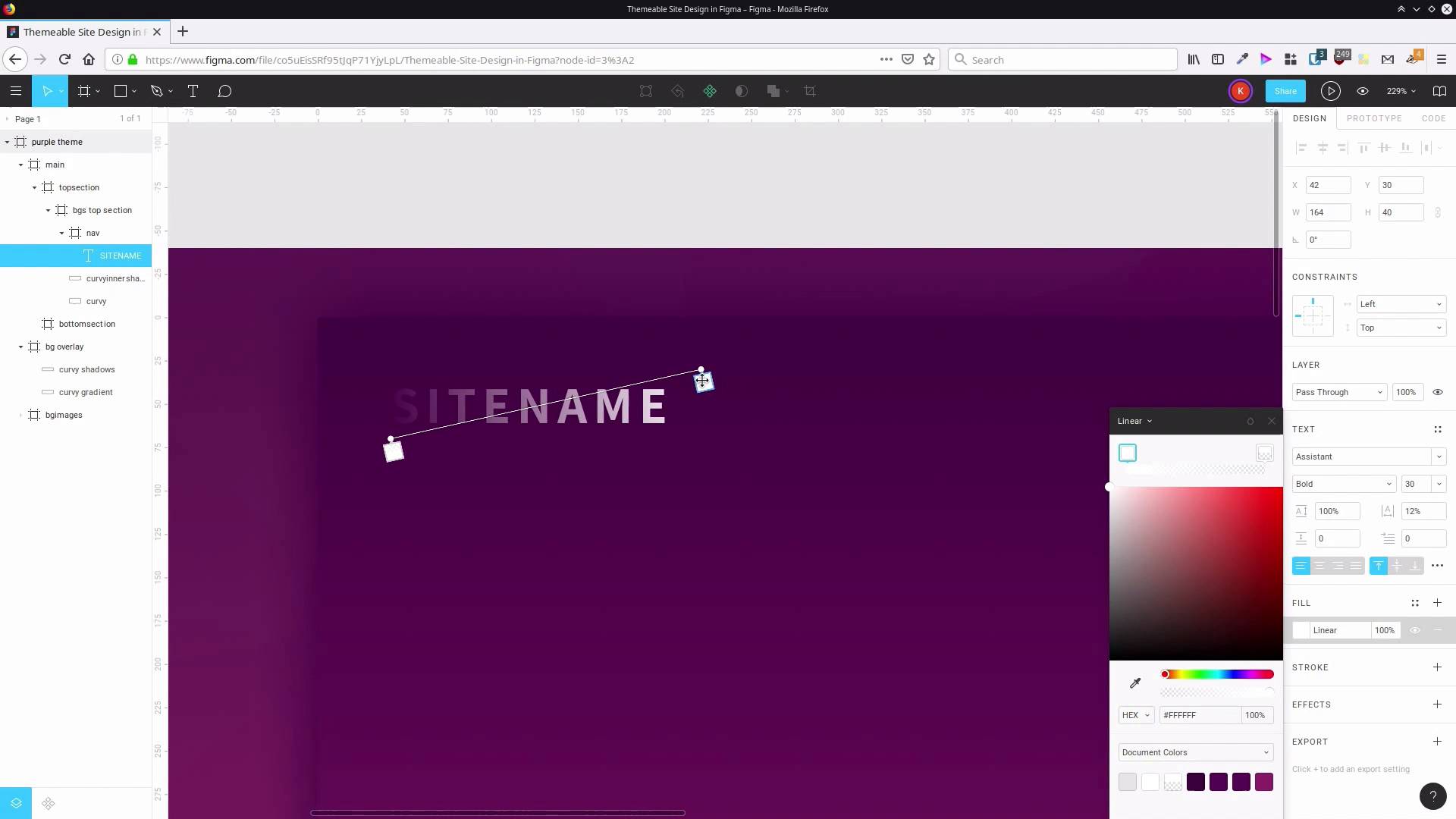
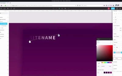
2.2 Add the Site Title and Menu
Welcome back to create a Themable Site Design in Figma. In the last lesson, we went through in setup our basic layer, and we set up some nice backgrounds, gradients, and we established our color scheme for this first design. Now we're ready to start adding some content onto the page. And we're gonna start by creating a nav section. That nav section is gonna have a side title and it's also gonna have a navigation menu. So the first thing that we're gonna do is grab the frame tool again and then inside the top section, We wanna draw out a new frame. Let's drag that so that it is aligned with the width about main section and so that it's aligned at the top. That's actually coming at -1 on the y axis so let's change that to 0. And with the height of this navigation area to be 100 pixels. We actually want this space to be transparent, so let's get rid of this background color by hitting this button here. And then let's rename our new frame to nav. So let's first start by adding in our site name. So we will grab the text tool and I'm gonna click in here. And because we don't really have any specific site that we're making this for, let's just use generic S-I-T-E-N-A-M-E, site name. And for now, let's just select all those letters and change that color to white so we can see what we're doing a bit better. Now, here are our text control properties. And in here, we can access almost all of the fonts that are available on Google Fonts. We're gonna choose one called assistant. So just start typing in assistant and that'll take you to the right spot. You can choose assistant. Now, obviously, this is quite a bit too small, this text. So we're gonna bump that up, To 30 pixels height. So just double click in the text size field and type in 30. We're gonna change the weight up to bold, and then these letters are a little bit cramped. So what we're going to do is drag this letter spacing here, out until we get to about 12%. And the reason that we created a frame here is because it' s gonna make it much easier for us to set up the alignment of the site title and of the navigation menu when we add it in. So because the site name is inside that frame, if we hit this button here, it has vertically aligned the site name inside that frame. So you pretty much want to use frames anywhere that you're gonna need to align items. All right, now, let's give it a bit of color. We're actually going to apply a gradient this just to make it look a bit fancy. And we're gonna use colors that are sampled from this part of the background image here. So we've got a whole bunch of dark colors here. These colors up here will contrast with it nicely. Again, you use any colors that you want. But if you wanna use the same colors as me, we're gonna click on here, change these to linear. And then we're gonna drag these gradient stops around to the top and out of the corners of the site name. So right about there, that'll do, this stops here. We're gonna set that, To the color FF017E. And then this other stop we're going to set to D2348f, and you're gonna need to manually increase the opacity up to 100% again. And then you might want to tweak the exact positioning of these gradient stops so it comes out just as you want it. And then to make sure that we have positioning that's consistent throughout this site, I'm gonna change this x-offset to 40 so that that's round. So now, if we select our frame and hit Shift+F2 to fit the frame, you can see that that gives us a nice contrast. But it also gives us a nice bit of a sort of shimmer effect by having that gradient color there. All right, now, let's go ahead and add in a navigation menu. This is just gonna be a simple navigation menu, just plain text. So grab our text tool, once again, and click inside here, and we're just gonna start typing out menu items. So home, features, pricing, and what we're actually gonna do is add some spaces in between here. What we want is a total of seven spaces in between each of these words so that gives plenty of open space for somebody to click on each of these menu links. So I've already prepared the text for this menu, so I'm just gonna paste it in. And then, just gonna drag this over. So we can see it a bit more clearly. Now, we can change up the formatting. First, we're gonna change this to white text. Obviously, we don't need it to be the same size as our main title. We want it to be a little bit less attention grabbing, so we're going to take this down to regular weight. And we're gonna reduce the text size to 20, and we don't need quite as much letter spacing either. So let's just zoom in a little bit so we can see this more clearly. A little bit of letter spacing will still be nice but we don't need as much so let's drag this down to 6% letter spacing. Now, as we did before, we can align this text vertically inside this frame and then we can push it over to the right. We don't want this to be flush up with the edge. We want it to have 40 pixels of space in between it and the outer edge, just like we do with our title. So we're gonna hold down Shift and hit the left button four times. All right, now let's go back out to our full view and have a clearer look. This looks pretty good, it's probably just a little bit too bright. It probably doesn't need to be quite so white. So what we're gonna do is select it again and let's change up the opacity on our fill. Let's drag this down, let's say, to about 75%. So that lets a little bit of that background color come through so it seems a little bit more blended in. But it's still clear enough for us to be able to read it quite easily. All right, so that is all we needed to do for our slide title and our menu. In the next lesson, we're gonna add one more bit of content into our top section here. We're gonna add some welcome message text around about here and we're gonna create a button that's gonna be a call to action button. And that's gonna sit around about here. So we're gonna go through that in the next lesson. I'll see you there.


