

- Overview
- Transcript
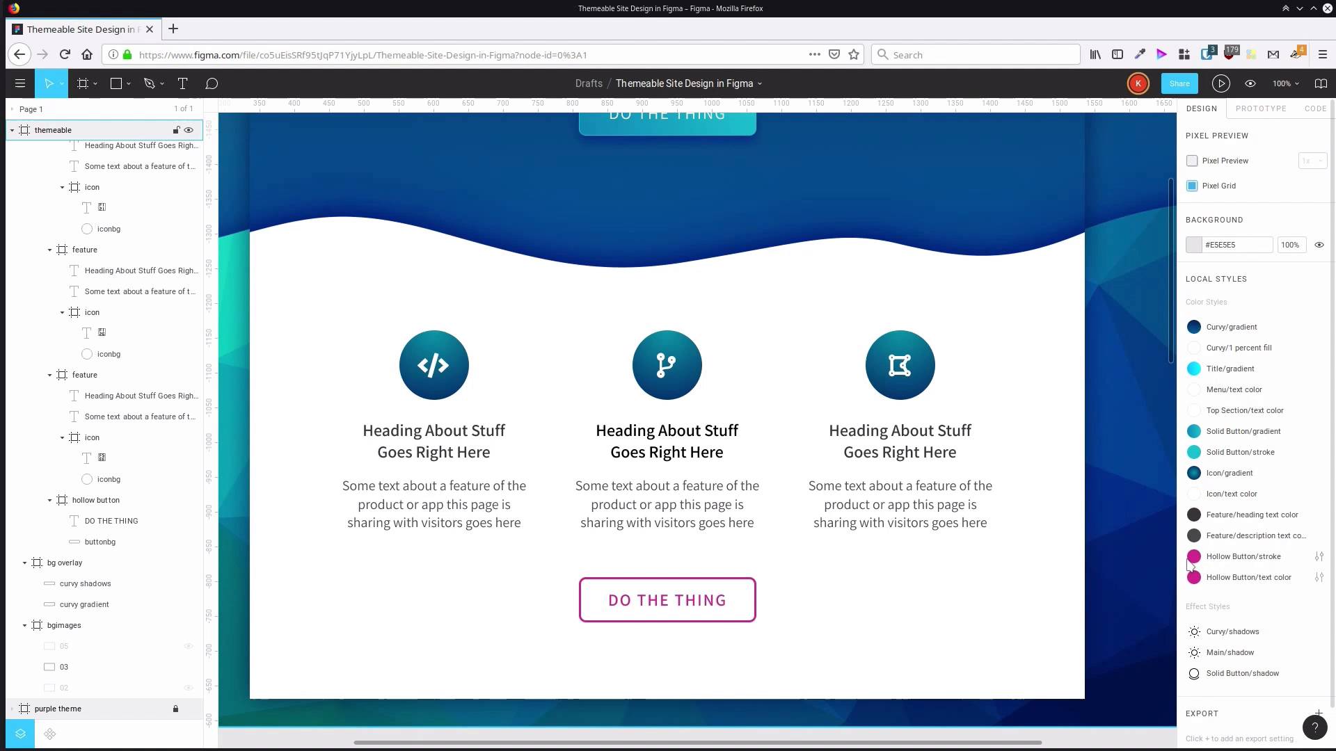
3.4 Recolor the Icons and Hollow Button
Our last area to be recolored is the feature icons and the hollow button in the bottom section of our design.
1.Introduction
1.1Welcome to the Course00:37
2.Create the Main Design
2.1Set Up the Layout and Backgrounds20:54
2.2Add the Site Title and Menu06:42
2.3Add the Top Section Text and Button08:58
2.4Create Feature Icon and Text07:06
2.5Duplicate Features and Add the Final Button04:40
3.Create Additional Themes
3.1Create Document Styles11:03
3.2Recolor Backgrounds04:37
3.3Recolor the Title and Solid Button03:41
3.4Recolor the Icons and Hollow Button02:33
3.5Demo and Quick Notes on Additional Themes06:27
4.Conclusion
4.1Wrapping Up04:11
3.4 Recolor the Icons and Hollow Button
Hey, welcome to back to Create a Themeable Site Design in Figma. We just have a little bit recoloring to go to finish this blue theme that we've been creating. We just need to recolor the icon backgrounds here and the hollow button colors as well. So we have our icon gradient fill here, so we're gonna go into our Settings again and we're gonna change up the colors that we're using in this radial gradient. Just like with the other things that we've done so far, you should be fine to just sample from a dark color to get one end of this gradient, and then sample from a light color in the background somewhere. And you're gonna get a pretty nice looking background for your icon. The colors that I ended up using, on the light end, I used 038EA5, and on the dark end, I used 02346D. Again, use any colors that you would like to in your own version of this design. And then, just to reiterate, you can see how when we change that one style, all three of our icons change up at the same time. And then finally, we just have two more colors left from our purple color scheme, the border here and this text. So we'll go into our hollow button stroke color. For this color, I would suggest sampling from something that you've already used in a button, or in your icon background. I ended up through that process with the color 16ABE5. And then the last thing that we have left is the text color here. For this one, you can sample the border color that you already added in, and then just adjust to make sure that that text is readable. Make it maybe a little bit darker if necessary. In my case, the code that I ended up using is 0BA8E4. All right, and there is our blue theme. So, once we had our whole system set up, and all of our styles in there, all we had to do was just go through and modify those styles, and it will update the entire design to the new blue theme. From here, when you want to create extra themes, there is one more set of steps that you need to go through. In the next lesson, I'm gonna show you what you have to do when you're creating your third theme, and any of the themes after that. So we'll go through that in the next lesson. I'll see you there.


