

- Overview
- Transcript
2.4 Create Feature Icon and Text
Moving into the bottom half of the site, in this lesson we’ll create an icon to represent a product feature, taking advantage of Figma’s built-in Font Awesome library. We’ll also add a little text to go along with our feature icon.
Related Links
1.Introduction
1.1Welcome to the Course00:37
2.Create the Main Design
2.1Set Up the Layout and Backgrounds20:54
2.2Add the Site Title and Menu06:42
2.3Add the Top Section Text and Button08:58
2.4Create Feature Icon and Text07:06
2.5Duplicate Features and Add the Final Button04:40
3.Create Additional Themes
3.1Create Document Styles11:03
3.2Recolor Backgrounds04:37
3.3Recolor the Title and Solid Button03:41
3.4Recolor the Icons and Hollow Button02:33
3.5Demo and Quick Notes on Additional Themes06:27
4.Conclusion
4.1Wrapping Up04:11
2.4 Create Feature Icon and Text
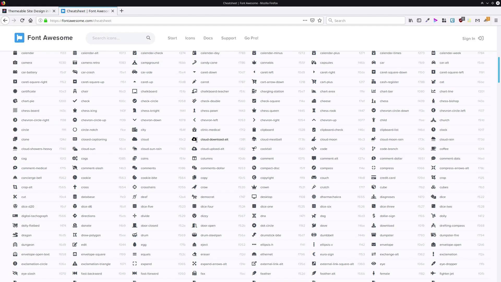
Hey, welcome back to Create a Themable Site Design in Figma. We've just finished adding the content to the top section of the site. Now we're gonna start adding content to the bottom section of the site. And what we're gonna be doing is creating a little feature section with an icon. And a bit of text to describe a feature of a product or service that's being sold on this page. So we're gonna have three copies of the same type of feature, each with a different icon. So we're gonna start the process by drawing out a frame to hold one of these features. And we're going to rename the frame, call it feature. Now, we're gonna change up its positioning, set it to 130 as the x-position and 90 as its y-position. We're gonna make it 280 pixels wide and 310 pixels high. Now, inside this we wanna create another frame to hold our icon. And we're making a frame to hold the icon for the same reason that we made a frame, to hold the button here. It just helps with alignment and resizing, if you need to do any of that later. So grab the frame tool again, draw out a square. We want this one to be 100 pixels wide by 100 pixels high. And then we can center it, that'll be centered relative to the frame that we've added it into. And we'll align it at the top, as well, with this button here. And then, let's rename that frame and call it icon. Now we're gonna add in a circle that's gonna act as the background for our icon. So, we're gonna grab the ellipse tool from here. And we'll just roughly draw out a circle inside that frame. And then, let's drag that out so that it's the same size as its containing frame. So that should make it come out as 100 pixels wide and 100 pixels high. I'm gonna give this a radial gradient so that it looks like there's a bit of light being cast on it from above. So we'll jump into our fill here, and we're gonna choose radial gradient. Let's add in our colors first. Like with all our colors, these are all picked from the background. So, let's set the first color to 8B286E. The second color is actually modified a little bit just to make the hues work together nicely. And that color is 3A235D and then we'll just bump up that opacity again. So let's zoom in so we can see what we're doing a bit better. And we're gonna drag this stop up here, so that it snaps right at the top of this shape. And that gives us that look like there's some nice warm light coming down on this shape from above. And let's rename this and we're gonna call it icon BG. Now we're ready to add the actual icon in, and what we're gonna do is use Font Awesome. Font Awesome is actually integrated into Figma so it makes it really accessible to just put almost any type of icon that you need into a design. So because Font Awesome is made up of letters, we're gonna use the text tool. We're gonna click here in the middle to create a text field. And then up here, we're gonna change this font and we're going to look for Font Awesome five free. And then while we're here, we're gonna change this to white. We'll change the size to 36 and now all we need is an icon to put in there. So in the notes below this video you'll find a link to this Font Awesome cheat sheet. And the cool thing is you can just find any icon that you want here. Use your mouse to just highlight that icon. Then you can copy and paste it directly into any text field that you set up in Figma to be using the Font Awesome font. We are gonna use an icon called courage, that's it right here. So we're just gonna grab that, control c to copy. And then in here, paste and there's our icon and it's that simple. So now we're just gonna click on the canvas to get out of text editing mode. We're gonna make sure that this is set to be center aligned and align to the middle. So both horizontally and vertically, and now we can center in both directions relative to the frame. So that's all we need to do to set up that icon, that makes a pretty efficient process to do that. The next thing that we're gonna need in our feature is a heading. So inside our feature frame again, grab the text tool and just draw out a little box. And we'll just add in some placeholder text, heading about stuff goes right here. So now we wanna go back to our assistant font. We're gonna change this down to semi bold. We still want to have some boldness to this heading so that it stands out from regular text, but not too bold. We'll drop the font size down to 24. We'll reset that letter spacing back to zero, we don't need any extra letter spacing on this heading. And then we just wanna drag out the width of this text box so that everything fits on those two lines. And now we can center that text. And we'll probably just drag it down a little bit. So that it has a little bit more space between it and the icon. Now we also need to put a bit of regular text down here. So let's shortcut the process and just duplicate that text. And then I'm just gonna drag down the bottom edge until it snaps with the parent frame, and do the same thing with the top edge. Then we'll change it down to regular font way. We'll decrease the font size to 20, and we're going to set the alignment to be at the top. Let's actually drag that down a little bit more, we need a little bit more space between the heading and this text. Now we'll just put in a couple of lines of placeholder text. So some text about a feature of the product or app this page is sharing with visitors goes here. And for this text, I think we can drag this out to be the same width as the parent frame. Let's drag that out till it snaps. That's looking just about right. And probably, I think give this a little bit more space vertically. You just sort of eyeball this until that looks comfortable to you, comfortable to read, and then there we have our first feature. We're almost done setting up the content for the site now. There's just one more step, in the next lesson, we're gonna go through and create two more copies of this feature and change up the icon. And we're also going to add in another button. It's gonna be like this call to action button up here, but we're just gonna change the colors so it works better on this light background. So we're gonna step through those things in the next lesson. I'll see you there.


