- Overview
- Transcript
3.3 Recolor the Title and Solid Button
Next up in the recoloring process for our second theme are the site title and the solid button in the top section.
1.Introduction1 lesson, 00:37
1.1Welcome to the Course00:37
2.Create the Main Design5 lessons, 48:20
2.1Set Up the Layout and Backgrounds20:54
2.2Add the Site Title and Menu06:42
2.3Add the Top Section Text and Button08:58
2.4Create Feature Icon and Text07:06
2.5Duplicate Features and Add the Final Button04:40
3.Create Additional Themes5 lessons, 28:21
3.1Create Document Styles11:03
3.2Recolor Backgrounds04:37
3.3Recolor the Title and Solid Button03:41
3.4Recolor the Icons and Hollow Button02:33
3.5Demo and Quick Notes on Additional Themes06:27
4.Conclusion1 lesson, 04:11
4.1Wrapping Up04:11
3.3 Recolor the Title and Solid Button
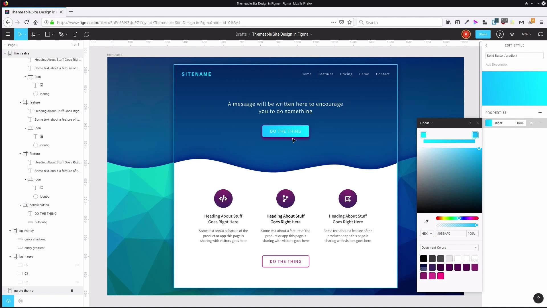
Hey, welcome back to Create a Themable Site Design in Figma. In the last lesson, we started working with the document styles that we've created to modify the color scheme into a blue themed version of our design. In this lesson, we're gonna go through and do recoloring on the site name, and on the solid button. So click outside of the frame to make sure we have nothing selected which gives us access to our local styles. And here is the gradient that we have applied to our title. So we're gonna go into that, open up the color picker, and we're gonna start modifying those colors. And just like we did with the purple color scheme, with the background, we sampled from this sort of area in the background color. We want the foreground to be bright and more luminous, so we're gonna sample for those colors up around here. So for the dark color, we'd probably go with something around about like this. And then the lighter color, would be somewhere probably around like this. You can see that right away we've got a nice luminous look on the site name, and a good contrast with the background. But if you would like to use the exact same color codes that I'm using, then for the dark color, I'm using 0DB4FC, and for the light color, I'm using 01F0FF. So that is the title, all taken care of. Now we need to modify the colors that we're applying to our solid button, here. So first up, we're gonna change the gradient. So we have solid button, gradient, jump in here and we would probably use pretty much the same colors that we're using in our site name. In a lot of cases, it's gonna be fine to just sample directly from the site name to get both of the colors. In this case it is a little bit too light. Sometimes you might wanna sample a color and then, perhaps drag down into a different part of the picker until you get to a good color. For me, after messing around with the colors for a little bit, I ended up with 12B7CD on the light color. And on the dark color, 0981B4. So that gives us a decent level of contrast between the light text and the darker-colored background, while still giving us a luminosity to also contrast with the darker blue background that surrounds the button. So, our next solid button style that we need to change up, is the color of the stroke. With this one, again, you could just sample directly from the top corner of the button, and that is gonna give you a pretty nice color. In my case, I ended up with the stroke color 12B7CD. And then we have just one more solid button style to modify and that is our shadow which is down here. So we're gonna open up the properties and this is where you could do something like sampling the shadow color that we already have down here. And then adjusting that until you get it just perfect, the shadow color. So that's already pretty good. The code that I ended up with was 013386 And now we have the whole top section of the site completely re-themed into a blue color scheme. Now all we have to change up for the rest of this blue theme is the color of our icons and the color of this button down on the bottom here, and we're gonna do that in the next video. I'll see you there.


