

- Overview
- Transcript
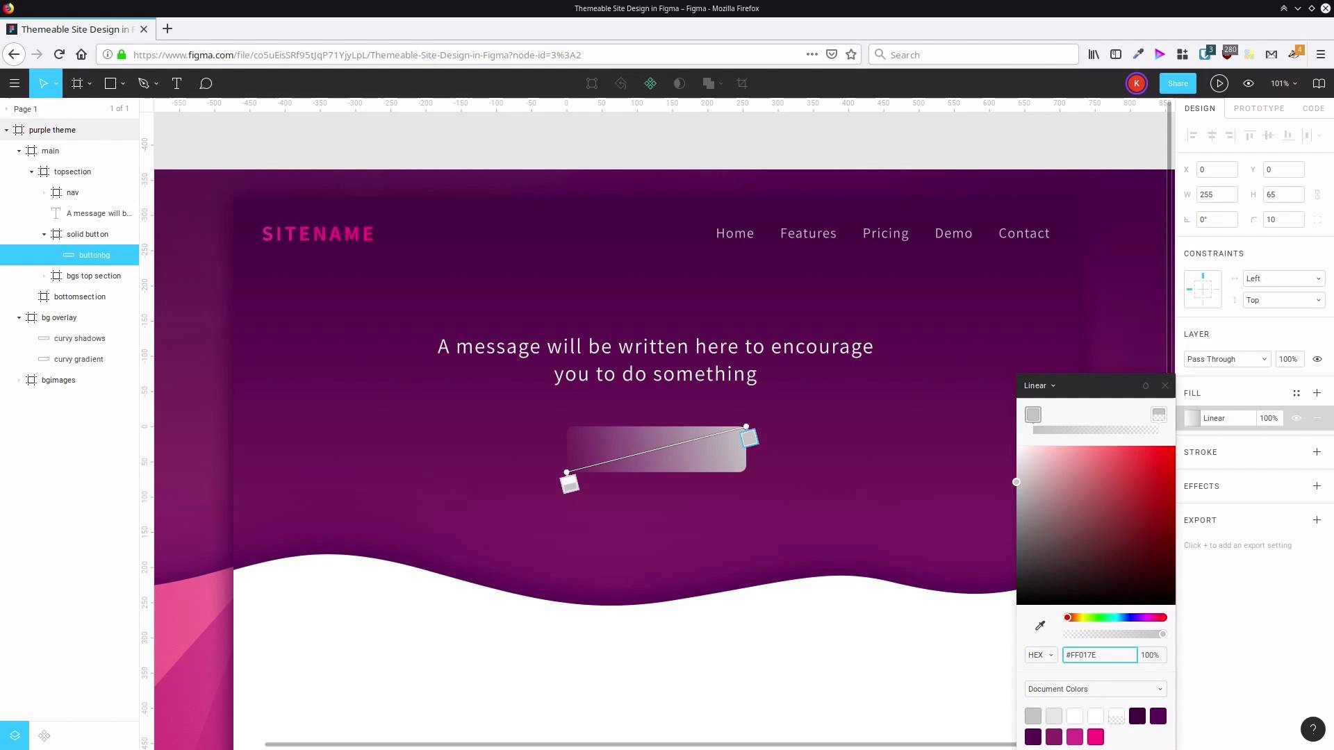
2.3 Add the Top Section Text and Button
To round out the top section of our website design, we’ll add a little welcome text and create a call to action button.
1.Introduction
1.1Welcome to the Course00:37
2.Create the Main Design
2.1Set Up the Layout and Backgrounds20:54
2.2Add the Site Title and Menu06:42
2.3Add the Top Section Text and Button08:58
2.4Create Feature Icon and Text07:06
2.5Duplicate Features and Add the Final Button04:40
3.Create Additional Themes
3.1Create Document Styles11:03
3.2Recolor Backgrounds04:37
3.3Recolor the Title and Solid Button03:41
3.4Recolor the Icons and Hollow Button02:33
3.5Demo and Quick Notes on Additional Themes06:27
4.Conclusion
4.1Wrapping Up04:11
2.3 Add the Top Section Text and Button
Welcome back to create a site design in Figma. So if I will set up our basic layout, our backgrounds, we've set up our navigation bar with our site total in our menu. Now, we're on to adding a little bit of welcome text into the top section and also a button that can be called the Action button. So we're gonna grab the text tool and we're going to select, actually look. This navigation bar has accidentally been put inside the backgrounds frame so let's just drag that out and put that up here. Okay, so now we're gonna drag out a box for this text to go into. That has put itself inside that Backgrounds top section again, drag that out so it's where we want it to be. Now in here let's add in a little text. So we're adding some text that says, a message we've written here to encourage you to do something, just some placeholder text. Now we can go ahead and style it. So let's use the same font that we did before up here. That's actually automatically selected for us, which is good. So we already have the assistant font applied. Now let's set that to wide. I want that to be quite a bit bigger so it's more readable. So we're gonna bump that up to 30 pixels. We don't need to modify the letter spacing here. We'll just leave it at default. But what we do want to do is center the text with this button here. And now, we want to change the size of this box so that it's not forcing this text under three lines. Two lines will be plenty. So just click out of the text box, to deselect it. Now let's drag, and see what we get, a nice sort of a shape to this text. We drag it out to there, that's pretty good, letting encourage go onto the top line. Gives us a nice kind of a triangular shape. It'll act as kind of an arrow that's gonna to point at the button below it. It's just a little trick. You can use the shape of things in your design to guide attention to where you want it to be. Now we're gonna hit this button here to vertically align our text. And we're gonna position it on the y-axis at about 190 pixels to give us plenty of room to put our button down here. Let's actually zoom in a little bit, so we can see what we're doing more clearly. So that's our welcome text sorted out. Now we're gonna add in a button. Usually you probably start a button by drawing a rectangle in my software, but in this case it's easier to start by drawing a frame. And you'll see why in just a moment. So once again we'll grab that frame tool and we're gonna just drag a rectangle here. For some reason that's obsessed with putting things inside this frame, let's drag that out. This is gonna be a solid colored button as opposed to a hollow colored button we're going to do later. So let's say in this frame solid button and we're going to set its width to 255 pixels and its height to 65 pixels. And then let's align that shape. And on the y-axis we're gonna set it to 325 pixels. And we don't need this background color because we're gonna be adding our own background image inside here. So let's just turn the background off. Now we'll grab our rectangle tool and inside this frame, let's drag out a rectangle. And we're gonna resize it so that it snaps to the edges of the frame that we just drew and then we're gonna give it round corners. Up in this box here, we're entering the number ten, so that's gonna give us a radius of ten pixels on those round corners. So if I just deselect, you can see we've got these nice round corners now. Now I wanna add a bit of color to this shape. Actually, let's rename the shape first to button background. And once again here, we're going to use a linear gradient with colors that are sampled from a background image. So click the little color box here, change it to linear gradient. We're going to do that same type of diagonal gradient that we did with our site name. So just drag each of these stops so that it snaps on the opposite corners of the frame. Now for our first color, we're gonna use FF017E. And for our second color, we're gonna use D2348F. And once again, we'll need to drag that up so that it's fully opaque. Now I'll show you something cool that you can do if you do put your background inside a frame like this. Up here we have these constraints. If I set the constraints horizontally to be left and right and I set these constraints to be top and bottom, that's gonna tell this shape that all four of its edges have to stick to the outside of the frame. Now, if I change the size of the frame, then the whole, Then the whole background image is gonna change its size along with it, and it's going to keep the corners at the same radius. So that makes it really easy to subsequently create all different widths of buttons, so you can change as the size of the label text is different or as you just need different size versions of that button. Now we're gonna go ahead and add some text. Grab our text tool, drag a box out inside the frame. And we're gonna do the same thing again. With this button we want it to encourage somebody to do something. So just put some text on there, do the thing. Let's format our text. Select all the letters, and we are gonna go with white for the text again. We stick with the 16 font at regular weight. But we are gonna reduce the size down to 24 pixels. And we're gonna change the letter spacing to 8%. Now, we can make sure we are controlling the alignment of the text. So just click away to get out of text editing mode. Drag the edges of the box to snap to the frame. And now we can set the text by default that's set two lines to the top. We're gonna set it to align to the middle, and we're gonna do the same thing without constraints up here, set both to be all the way around the edges. So left and right, top and bottom. And now, once again, if we change the frame, the whole thing is all gonna stay perfectly aligned and very flexible. So that really enhances your ability to reuse that button over and over again. So now we've got just a couple more things to do with our button. We just wanna decorate it a little bit more, make it look a little bit more interesting. So we're gonna add a nice stroke around the outside of our button background here, so let's select that rectangle again. Let's add a stroke with this button here. And once again, we're gonna use a pinky-purply color sampled from the background. This time it's gonna be FF017E. And we're gonna leave that stroke three aligned on the inside, so it doesn't add any extra width to our button, and also it keeps it inside the frame, that stroke. That gives a nice little kind of a glow around the outside there. And then the last thing that we wanna do is add a drop shadow here for a couple of reasons. One, to help to separate the button from the rest of the graphics around it. And two, to make it sort of come forward, make it appear closer to the user. That's another one of those things you can do to help guide attention in the design. So I'm gonna select the solid button frame and we're gonna add an effect here. I believe that's set to drop shadow and we'll open up the settings for the drop shadow. I wanna blur this shadow out by 15 pixels. We're gonna offset it vertically downwards by 10 pixels. So we put 10 in this y field here. Once again, we wanna have the opacity set all the way up to 100%. The black is too stark, we don't want that. We want it to mesh in with all the rest of our colors. So we're gonna set this to another purple color. It's gonna be 5c0d55. So now that looks more like the kind of color that would naturally fall on a purple surface in real life. So that completes the design that we needed to do for the top section. That whole area is finished. We've got our site total and menu and welcome text and our button. Now we are ready to add some content into the bottom section of the site. We're gonna be creating a bit of content that you see quite frequently at sites like this, and that is a little icon to represent a feature that our product, or service, or app might have that you're trying to sell. Then we'll have a little heading and a little bit of text under that to describe that feature. So we'll create that in the next lesson. I'll see you there.


