

- Overview
- Transcript
4.1 Wrapping Up
We’ve reached the end! Let’s wrap up “Create a Themeable Site Design in Figma” with a quick recap of everything we’ve learned.
1.Introduction
1.1Welcome to the Course00:37
2.Create the Main Design
2.1Set Up the Layout and Backgrounds20:54
2.2Add the Site Title and Menu06:42
2.3Add the Top Section Text and Button08:58
2.4Create Feature Icon and Text07:06
2.5Duplicate Features and Add the Final Button04:40
3.Create Additional Themes
3.1Create Document Styles11:03
3.2Recolor Backgrounds04:37
3.3Recolor the Title and Solid Button03:41
3.4Recolor the Icons and Hollow Button02:33
3.5Demo and Quick Notes on Additional Themes06:27
4.Conclusion
4.1Wrapping Up04:11
4.1 Wrapping Up
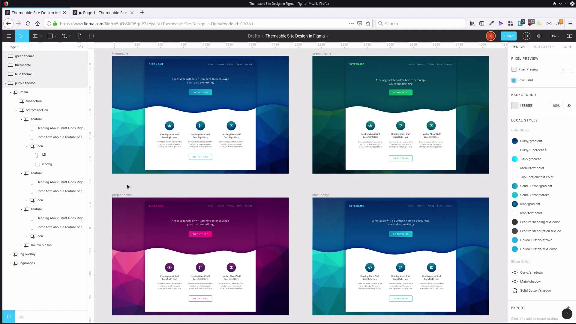
Hey, welcome to the final video in create a themeable site design with Figma. You should now have everything you see on the screen right now. You should have your themeable base that you used to create all the different color schemed or themed versions of your site, and the three different color schemes that you went through and made. A purple one, a blue one, and if you also went ahead and did the third one, the green color scheme as well. Couple of key points to touch on, in the design phase, probably the best tip, I think for working with Figma, is to really lean heavily on the frame system. So we use the frame for the top section of our site. We used frames for the navigation section, frames to contain our buttons. Because when you combine those frames with constraints and with alignment tools, makes it a lot easier to control the layout in the design that you're putting together. Another one of the best tips I think is to take advantage of font awesome in here. When you're actually exporting your site, you might not want to use font icons in place of SVG. SVG can be a lot more efficient. And on that note, if you do want to export icons as SVG, then you can select the icon, right-click on it, go Copy as > Copy as SVG. And then you have the SVG code to generate that icon without needing to go back on Font Awesome. And when you're going through and you're setting up your first round of coloring, it can be a massive time saver and can really help move things along quickly. If you pick out an image that's gonna sort of form a centerpiece of the site, whether it's in your content, or in our case, in the background. And then use colors from that to help drive your site design. When you're doing themes and designs for commercial clients, often the image that you're gonna use for that process would be the company's logo. You can get the logo in for sample colors from that and use that logo to also inform the kind of style, and look, and feel that you have in the design too. For the theming portion of the process, remember that after you make your first design, duplicate it. Don't modify your original, make a copy of it, and then go through in the duplicate and that's where you go ahead and you create all of your local styles. And on that note, remember that you can get them all grouped together by giving them a category name, followed by a slash and then the style name. And that makes it a lot easier, When you wanna apply a style, everything is going to be broken into categories, so that makes it a lot easier to find what you're looking for. Once you have your styles in place, then whenever you wanna create a new theme, a new color scheme version, all you have to do is go through and modify these styles. And as long as you have them applied properly throughout your design, then you're gonna be able to change every use of that gradient, every use of that color scheme at once. But we kept things fairly simple in this design. But when you're working with a design that's a lot more in depth, a lot more elements, then when you change a gradient, you're not gonna be seeing just three icons changing. You're gonna be seeing 50 icons changing at once. And when you change a text color or fill color, you can be changing pages and pages and pages of coloring all at the same time. So when you start to create those larger designs, those larger documents, that's when the system really becomes helpful. Now, another note is that you can also create styles for your typography. So if we wanted, we could have also had these different themes change, so that instead of using the Assistant font, they used the Roboto font, or something along those lines. Anything that you can create a style for in Figma then becomes something that you can modify for a different theme version of your original design. So that takes you through the entire process. We've got our three color schemes, and now you know how to use the styles that are built in to Figma to your advantage. I hope you picked up some interesting points from this course. And I hope that everything we've covered helps you to get more out of your designs in a more efficient way in the future. So thank you so much for taking this course, and I will see in the next one.


