

- Overview
- Transcript
3.1 Create Document Styles
With the bulk of our website design done, we can now start the process of creating differently themed versions. Our first step will be to take the design work we’ve already done and capture it in Figma styles.
1.Introduction
1.1Welcome to the Course00:37
2.Create the Main Design
2.1Set Up the Layout and Backgrounds20:54
2.2Add the Site Title and Menu06:42
2.3Add the Top Section Text and Button08:58
2.4Create Feature Icon and Text07:06
2.5Duplicate Features and Add the Final Button04:40
3.Create Additional Themes
3.1Create Document Styles11:03
3.2Recolor Backgrounds04:37
3.3Recolor the Title and Solid Button03:41
3.4Recolor the Icons and Hollow Button02:33
3.5Demo and Quick Notes on Additional Themes06:27
4.Conclusion
4.1Wrapping Up04:11
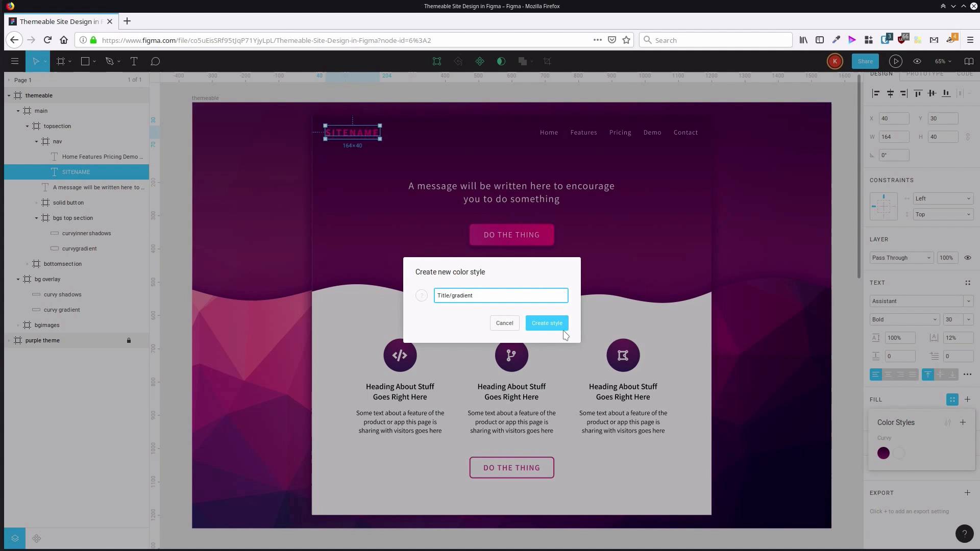
3.1 Create Document Styles
Hey, welcome back to Create a Themable Site Design in Figma. In the first section of the course we went through and we created this design that you see on the screen here. In this section of the course, we're going to build up our theming system and then we're going to use it to create another two color scheme versions of this main theme. The way we're gonna do that is by leveraging Figma's built-in document style system. So the way we're gonna get started is by duplicating the design that we already did. So we're just gonna select the top level frame and hit control d. Zoom out so we can see both of these. And what we're gonna do is create all of our document styles in one of these frames here. And then that is gonna be the version that we modify whenever we wanna create a new color schemed version of our design. Our purple color scheme is already exactly how we want it. So we wanna have that duplicated and sorta put off to the side and unchanged. So what we're actually gonna do is just lock one of the frames that we have on the canvas already. And then the other one, we're gonna rename this to themable. Now let's hit shift two to zoom in onto that. Actually, you know what, let's separate them a bit more so that we can make sure we see the difference between one and the other. So let's just drag this one way up out of the way. Now, what we're gonna do is start working through each one of the items that we have in our document. Wherever we're using color and wherever we're using an effect, a shadow, and we're gonna save that out as a document style. So let's begin by saving out the gradient and shadow that we apply to our curvy shapes in the background here. So hold down control so we can direct select. We're actually, we're gonna start with the gradient. We're gonna work from the bottom, and then we're gonna work all the way up. So over here, you can see we've got our linear gradient fill. So save that out as a style. We're gonna hit this little button with these four dots. Now we can hit the plus button to add this as a style to this document. And now we give it a name. When you start to add a whole bunch of styles in here, they can start to get disorganized and it can be hard to find the one you want. So there's a trick that you can use to help group up similar styles or styles that need to be categorized together. You create a category title, then you add a slash and then you add the name that you'd like to give the style that you're saving out. We're saving out the styles that we're applying to our curvy shape. So I'm just gonna say curvy, and add a slash and we're gonna save this out as gradient, cuz this is the gradient we're applying to our curvy shape. Now we're gonna go up to the shadows here. We've got our 1% opacity fill here, we'll do the same thing here. Add that, let's say curvy, and we'll just call this 1% fill. And then we wanna save out our shadow that we added as well, so we'll just do the same thing again. Hit the plus button and say curvy shadows. Now, if we just click outside this frame so that we don't have anything selected, you can see here are the local styles for this document. And here are the two fill styles that we just saved out and the effects styles. This is the exact same gradient that we have applied to the background shaping here. So now what we're gonna do is jump into our main section. Let's actually call that curvy gradient. And we're just going to go into the saved fill styles here and apply that gradient that we just added. So you don't see any change because it's the same gradient. And then we're gonna do the same thing with the inner shadows. Apply our shadows here and the 1% fill. So now, if we edit this style it's gonna affect every shape that has that style applied to it. So I'm just gonna show you really quickly. We're in the local styles section, which is what you get if you don't have anything selected on the canvas. And if I hit this little button here, I can edit that gradient. And now if I change that color, you can see that it's affecting. Both of the places that this style is applied and that's gonna be how we create our whole themable system. So just undo that, put that back to how it was for now. I'm gonna go through and create all the rest of the styles that we need. Actually I said we'll go from the bottom up, but what we'll do is we're gonna work our way down physically from the top of the site, so it sort of makes logical sense that way. All right, so the next thing we've got is the shadow that's applied to our main section here. So, here's our effects, do the same thing again. Add that shadow, give it a category title and name it shadow. Next thing that we've got is our site name in here. You can actually save out all of the typography settings that you have for a particular bit of text as a document style as well. But we're just gonna be focusing on the colors for this purpose. But the principles that you use here, you can apply them to the typography in just the same way. What we are going to save out for this is the gradient that we have applied to the title. So the same thing again. This time we're going to give it the category name title and we'll just say gradient there. Then we've got our menu, we'll just save out the fill color that we have here. So, menu text color. Next up our message here, just gonna do the same thing for each thing. Top Section. Text color. And you can sorta come up with your own naming protocols here, whatever works. Here we've got the solid button effect so, Let's save that out as solid button shadow. And sometimes you're going to see, just let me close that down. Sometimes you're gonna see when you've selected a frame like I have here. You'll see a stroke showing up here and what it's actually doing is pulling in some of the styles from child elements. This stroke is actually applied to the rectangle inside here. That can be a little bit confusing at first, so you just kinda have to recall where you actually applied your strokes and fills and what not. So in this case we are gonna save out the fill of this as well. So we're gonna say solid button fill. Actually sorry, no, just thinking of what we've done so far, we'll call this gradient. And we'll save our stroke, solid button stroke. That's everything for our top section. Now we move down to our icon section here and hold down control. And click here, grab our radial fill here. Gonna say icon, Gradient. And select our icon. Icon slash, this is actually text, so we're gonna call it text color. And we'll grab. You know, before we actually say about this text color, I think we need to change it a little bit. Right now it's just jet black, but it could probably be a little softer. So I think we're gonna change that color. And we're gonna change that up to 383838. And while we're here, we'll save that out as a style. And we'll say feature, this is the group name, heading text color. We're gonna change the text color of the regular text as well. I think we'll go with 494949, and we'll change that color out as well. Save it out rather. Feature description text color. Then we can select both of our headings and we can apply that same style that we've just created. You see how everything has grouped up here according to the categories that we've been adding in. And then if we hover over, we can see the name of the individual style. So heading text color there and, Oops, And then description text color here. I accidentally deselected that. So that's that text area taken care of. And we should also go through and apply the same styles that we used here, that we applied to our icon, apply them also to these two icons. So we're gonna hold down control to direct select and then hold down shift as well, so I can direct select two object at once. You can see here both icon backgrounds are selected. And then, let's apply our icon gradient to both of those. And that means when we change that style, all three icons will change as well. And then for good measure, we'll do the same thing with the icon text, which is here. And then we just have one more element to save, we need to save the stroke of our hollow button. So we're gonna say hollow button stroke And the color for the text. So the same thing, one more time, hollow button text color. So now, we have a style for everything that we've added into the site, every element. And whenever we change the colors that are in any one of these styles that we've just set up here and here, that's going to affect the entire site. So to apply a new color scheme, all we have to do is go through and modify these styles. It's a little bit like CSS styles in a website, where if you change the properties that are contained in a particular class, then it allows you to restart the entire site. So that's what we're gonna start going through the process of doing now, going through and recoloring this site. We're gonna start by recoloring the backgrounds. So the curvy elements that we created in the first lesson of the course, so we're gonna do that in the next lesson. I'll see you there.


