

- Overview
- Transcript
2.1 Set Up the Layout and Backgrounds
In the first part of the course, we’ll be creating the main site design. We’ll start by establishing the basic layout and color scheme and building in some interesting backgrounds.
Related Links
- Creating Low Poly Backgrounds Course on Envato Tuts+
- Polygonal Backgrounds Pack
1.Introduction
1.1Welcome to the Course00:37
2.Create the Main Design
2.1Set Up the Layout and Backgrounds20:54
2.2Add the Site Title and Menu06:42
2.3Add the Top Section Text and Button08:58
2.4Create Feature Icon and Text07:06
2.5Duplicate Features and Add the Final Button04:40
3.Create Additional Themes
3.1Create Document Styles11:03
3.2Recolor Backgrounds04:37
3.3Recolor the Title and Solid Button03:41
3.4Recolor the Icons and Hollow Button02:33
3.5Demo and Quick Notes on Additional Themes06:27
4.Conclusion
4.1Wrapping Up04:11
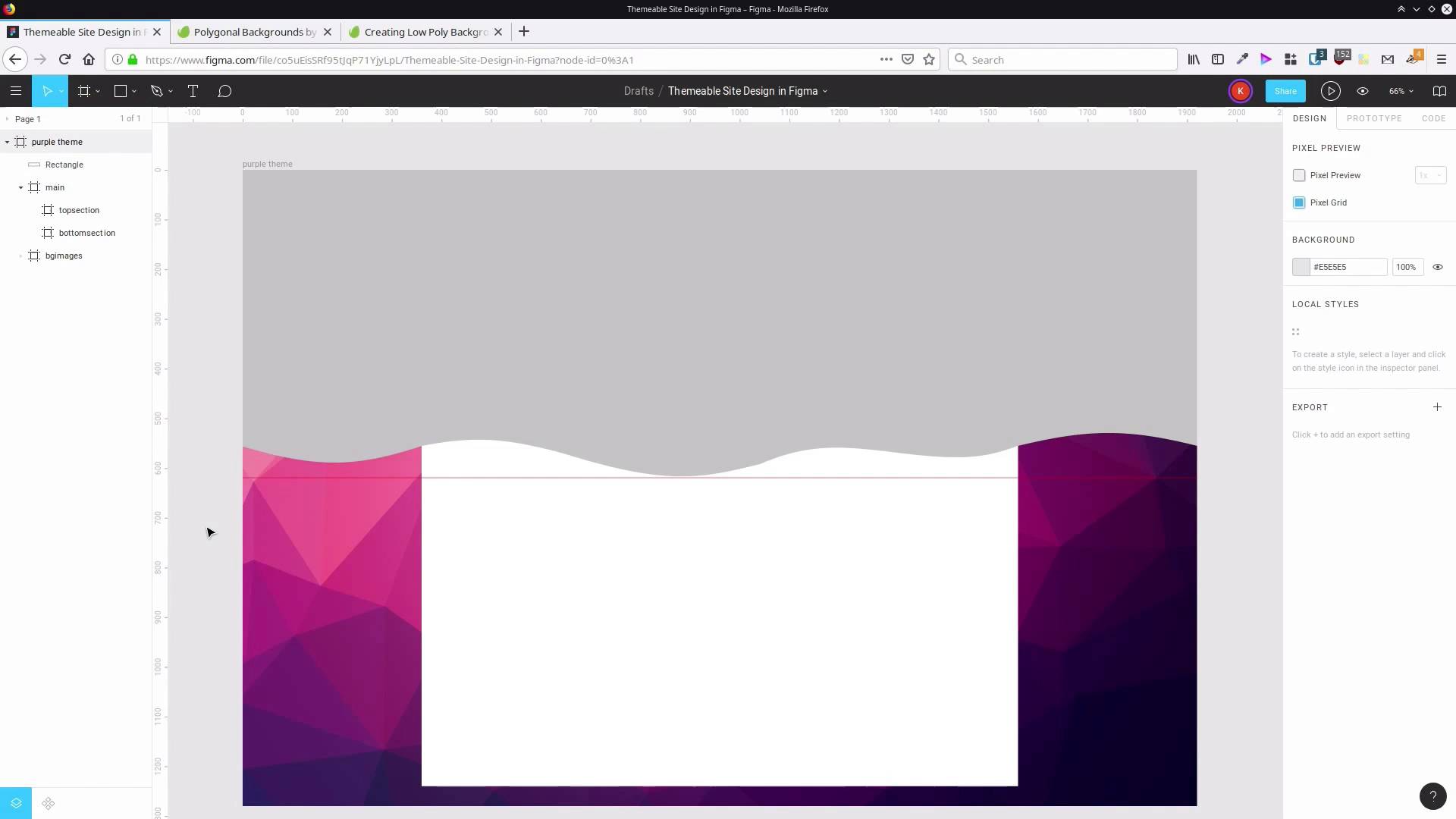
2.1 Set Up the Layout and Backgrounds
Hey I'm Kezz Bracey for Tots Plus. Welcome to Create a Themeable Site Design in Figma. This course is gonna have two main sections. In the first section, we're gonna go through the process of actually creating the design, and in the second part we're gonna go through applying a theme to that design. It's gonna allow us to produce different color scheme versions of the same original design. In this first lesson, we're gonna begin by setting up the basic layout of the design, and we're gonna add in some interesting backgrounds and colors. All right, so the first thing we're gonna need is just a frame to hold our overall design, so we're gonna grab the rain tool up here. Draw out a rectangle, you know that's fairly messy because what we're then going to do is make sure the frame is selected, and then we're going to enter the specific values that we want for our width and height. So in this case, we're going set the width of this frame to 1920, and then we're going to set the height to 1280. I personally like to start with a canvas that's about the width of a typical monitor which tends to be 1920, it's most common width at the moment. We're not actually going to into responsive design in this course because we are focusing on how you can make a themeable design so, we're just gonna be working on the desktop layout version of this particular design. If you wanna be particular, you can also set the origin points of this frame to 0 and 0, if you just wanna make it all nice and neat. And then we can Shift+2 to have that frame selected, and have it centered on your canvas, and zoom to a level where everything fits. Now, the next the thing we're gonna do is add in some background images. Another thing that can be really helpful is to pick some of the main images that you're gonna use in a design, and then use those images to help inform the color scheme choices that you make for a design. Sometimes, if you start with a color scheme first, it can be more difficult to find images that work in with what you've done. First, we start with an image can help give you a bit of direction and inspiration. We are gonna be working with this Polygonal Backgrounds from invary elements. There are a bunch that are all different colors, so that’s really perfect for creating a design that’s gonna have different color schemes. If you don't have an elements membership, then we also have a tutorial on how you can make your own low poly backgrounds, so that's another option that you can follow along with there. If you do have elements, go ahead and download this package. And when you extract it, you'll see these images. We are going to be using The 02.jpg image, 03 and 05. We're gonna create a different color scheme later on, to match each one of these background images. And we're gonna add those into our Figma design. Figma actually makes adding images in a really straightforward process. So, what we're gonna do first is actually rename this main frame. The first thing that we're gonna do is gonna be a purple colored look, so we're going to say purple theme for our main frame. And now inside here, we're gonna create another frame. We're gonna set that to 0 and 0 for its origin points, and then I'm gonna set it to the same height and width because this frame is gonna be used to hold the background images that we're about to add in. So 1920, about 1280, and I'm gonna rename this to PG images. And I'm gonna have my File Explorer opened up over the top of Figma, and all I have to do is drag and drop. And that's gonna automatically bring in my images, and now I can just move those inside this BG images frame. Now these are all a little bit large at the moment, so we're gonna bring them all up. So 0 and 0 is their origin point. And we want their width to be 1920. We want their height to stay at whatever it needs to be, so we're just gonna constrain these proportions by hitting this little lock button here. That's gonna make sure that we maintain the same aspect ratio. And then we're gonna change the width to 1920, and now that brings all of our images into be the same size as the frame that we're working on. So we are gonna start with the purple background, and that is 02, so we're just gonna hide the other two that are on top of it for now. So now the next thing that we're gonna do is add in another frame, and this frame is gonna hold the main section of our website. Let's just close that down for now. We're gonna add in a new frame, inside here. And we're gonna call it main. I've accidentally put that inside the BG images frame. We don't want that, we want that to be on its own level. This frame, we want to be 1200 pixels wide, by 1200 pixels high. And we want it to be centered both vertically and horizontally, so we can just hit this button here to vertically center it, and then this button here to horizontally center it. And now inside here, we want two more frames. We want a frame to control the top section of our site design, and another frame to control the bottom section of our site design. So we're just gonna grab the frame tool, draw our frame in here. And we'll just messily draw another frame in here. We'll just adjust them after the fact. So we've got this frame. I'm just gonna drag this up. This is our top frame. It makes sense to kind of have your frames cascading in your layer panel, in the same order that they do on the canvas. We're gonna call this one top section. Called this one, bottom section. We'll position it at 0 on the x and y axis. We're gonna make this 1200 pixels wide And 580 pixels high. So this is gonna be kind of our header area. Looks like I must have incorrectly entered the size for the frame up here. Yeah, because I must have inadvertently constrained the proportions. We want this width here to be 1200. Now I'm just gonna horizontally center that again. Okay, so now that's much better. That fits in nice and snug. And then our bottom section, in this case we want its x position to be 0, but we want its y position to be 580. So it begins right when our top section stops. The width will be 1200 pixels, so that it's full width. And then the height will be 620 pixels, and that's the remaining area in this frame. So now we're gonna start adding a little bit of color, a little bit of interest into the overall site background, and also the background of our top section here. What we're gonna do is make a sort of a wavy shape, that goes over the top of the background image. But also, sort of continues through this top section of the site. So to help us make sure that the shape that we're gonna create looks like it continues, all the way through this area. We're going to add in a guide. So we're gonna drag down until we get a guide, that lines up with the top of our top section here. And then what we're gonna do is grab the rectangle tool, and we're just gonna draw a rectangle that comes to this ruler that we just added in. Let's drag that inside our purple theme frame. That make sure that that's gonna clip off anything that's outside of that frame. Now, let's just select this and resize it so that it fits snugly in this space. And now what we're gonna do is convert this shape, so it has some waves that run along the bottom. So with the shape selected, we're gonna hit this button up here, Edit object, and we're gonna add in a few extra nodes along the bottom. So we're gonna make sure we have the pencil selected. And then what we're gonna do, is start by adding a couple of nodes that line up to the left edge of the canvas. So we do that by hovering over the bottom edge of the shape. You'll see the pen tool has a little plus sign underneath it. Then we'll click. Now, when you drag out, it's not gonna know if you wanna keep adding more lines associated with this node. So to avoid that and just leave that one node added into the shape, hit Esc. And we're gonna do the same thing over on this side, click and then hit Esc. So by having these nodes here, we're gonna make sure that we have full control over exactly how the curves run through this space. Now we're gonna do the same thing here with a couple of nodes to line up with the edge of the main section of the site. So click, hit Esc. Then same thing over here, click, Esc. Then we need three along the middle here, so one, two, three. It can be kinda messy with this cuz you're gonna be able to move all of these nodes around and adjust them after the fact. Now, I'm gonna grab the Move tool and I'm gonna do just that. I'm gonna move this node up a little bit to about here. Gonna do the same thing over here, this node can come up to here. I'm gonna move this node over so it's just a little bit off center. Gonna grab this one and just bump it up around here or so. This one, just gonna drag this up to around about here. This one is somewhere around here. And finally, this node can go to around here-ish. Now I'm gonna grab the Bend tool and turn these into a continuous sort of a bendy shape. So I'm gonna bend this up here. This can come down a little bit, go up here. Down here. I'm gonna bring this down until it just hits the bottom of our section here, where our ruler is. And we'll drag this one up a little ways. And then this one can come down. And now we’re getting a nice smooth shape along here. So hit Done and take a clear look at the shape that we have. That’s not too bad. It’s a little bit sharp, this bend here is a little sharp. So what we can do, double-click to go back in, select this node. And then up here where it says no mirroring, we're gonna change that to mirror angle. Now we just have to grab one of these handles and move it a little bit, and that snaps. So you can see how those two lines are straight with one another now. That will help to smooth out that bend. You can go through and do the same thing with the other nodes as well, if you would like. So now we have a shape that we can use to overlay on top of the background, the site background. And we also have a shape that we can use in the top section of our main site. So let's start by dragging this down below the main area, so we can't see it over the top any longer. And let's actually put this inside a frame, just to help keep things organized. So let's drag this new frame down here. We're gonna call it bg overlay. Put our new image inside that. Now in the new frame, let's just get rid of this background. And actually temporarily, let's just hide that main section so we can see what we're doing with this shape here. What we're gonna do is color this shape so that it matches our purple look in the background here. We're gonna use a gradient that runs from top to bottom. And then this is something we'll be able to recolour later in our differently themed versions. So I'm gonna go to the Fill here, click this color picker and change it to a linear gradient to be used as the fill. The second node on these gradients is always set to be completely transparent, which is kind of awkward. It would be good if you could change that to be always opaque. And now what we can do is sample colors from this background image to create the gradient fill that we're gonna use here. So we'll start by selecting this first node, which will be the top color of the gradient. And then we can choose this color picker. Let me just move this over here so we've got full access to every part of the site. And then we can just go around here until we find a color that we like for each one of these nodes. So you can see how there, that is giving us a color for our overlay that blends in with the background image that we've chosen. So I've spent a little bit of time already choosing good colors to work with this gradient here. And the color that I went with for the top is this color, 400440. And for the bottom, I went with 8C2569. Now, with that rectangle selected, we also wanna make sure that the top of this gradient is aligned with the very top of the screen here and the bottom is aligned with the ruler that we added in before. So just double check and make sure that that's the case. And now to make sure that this doesn't look quite so harsh when it hits the bottom here, we're also gonna add in some shadow effects. To do this, we're gonna need to use a separate shape, and you'll see why in a moment. So what we'll do is actually duplicate this shape. So to help us tell the difference, we're gonna call this shape, we'll rename it to curvy cuz it's a curvy shape. And we'll call it curvy gradient. We wanna duplicate it, so select it and hit Ctrl+D. Now this top shape. Let's rename this to curvy shadows. And we're gonna delete this fill. And then what we're gonna do is add a new fill. We're gonna set it to be the color white, but we're going to drop the opacity down all the way to 1%. And the reason that we've done that is because if you don't have some type of fill on a section, then any shadows that you add in are gonna be set to be invisible. So the shadows rely on there being some kind of fill. So we've made that as close as possible to an invisible fill. So now that we've done that, we can start adding in some shadow effects. So we'll hit this plus button here to add a new effect. We're gonna change it to inner shadow, and then hit this little button here to give us access to the parameters to control that shadow. What this first layer of shadow is, we're gonna add a couple to be quite subtle. We want it to give us a blending from one color into another. So we're gonna blur it out by 25 pixels. We'll leave the x position at 0, but we're gonna change the y position of the shadow to -10. You'll see when we do that, this raises the shadow up. So -10 means going 10 pixels upwards. So that's raised the shadow up quite a bit. Now, we're gonna change the opacity to 100%. So that's quite dark. And now for the color, we're gonna use another color that I've sampled from the background image. You don't have to use the same colors as I'm using here. Feel free to use any colors that you want to make this color scheme your own version. But what I'm gonna be using is the code 570A53. So now that gives us that nice, blurred graduation of color. So that's starting to look pretty cool already, but what we're gonna do is make that even more subtle, a color transition. So we'll select this shape again. We're going to add another effect. And select that and just drag it down. We want this one to be underneath the first one. Change that to inner shadow again. Open up the settings. This time we're gonna blur this shape out by 150 pixels, so it's gonna go up quite a long way. I'll just bring that up to 100% opacity again, so you can see what we're doing a bit more clearly. So you can see that's bringing quite a bit of color in. We're gonna change the Y position to -10 again, so that it lines up with our bottom shadow here. And here again, we're gonna use the same color, 570 A53. So it's that same color that we used on more compact shadow, but because it spread out more, it makes it looks softer and lighter. And the reason that we have a separate shape of this shadow and this gradient is because we don't necessarily want the darkness of that shadow coming in at the top of our section up here. So with this, what we can do is hit edit object and drag these corners up. So the effect of that shadow that added in is not seen across the top here. So we're not seeing that 150 pixels worth of shadow. And by the way, that's also why we have these extra nodes off to the side here. So that the shadow that we added in is only seen along the bottom, giving us that gradual fade in with our color. So that's our original shape. And that’s our shadow shape to make sure that we’re controlling exactly what’s going on with this color gradation here. Now, we wanna take these same shapes and use them in our main section as well. So let’s make another frame inside our top section, we’ll just draw it out and this time, let's just drag the section. So that it locks in to be the same size as the top section. Then to make a duplicate of the two curvy shapes that we just made, so we'll just select them both and hit Ctrl+D. Now, I'm gonna drag them into the frame that we just made. And at the moment, if I click away, there's no change to show you that we have two different shapes here. So what we're gonna do is select the curvy gradient shape, click here to open up the gradient modification tool. And we're gonna drag this stop down until it lines up with the top of our section. So they can see that our gradient is starting at an earlier spot, so let's differentiate it from the rest of the shape. There's still another couple of steps that we're gonna do to make these things look different. We're also gonna select these two shapes that are in our main background overlay. And we're gonna move them up a little bit, so it gives us a little bit of an offset. So just hit the arrow key to move it up, just a few pixels. So probably just about 5 pixels will do, so that you have something like that. And then the last thing that we're gonna do is add a drop shadow around our main frame. So let's select the main frame, we're going to go down to Effects, hit the plus button to add an effect. Leave this one set as drop shadow and open up the settings. Now, we wanna blur this shadow out by 40 pixels. We don't want it to be offset, we're gonna set this to zero, so that the shadow is radiating in all directions from the main section equally. We're gonna bump the opacity up to 100% again. And now, we're gonna use a purple color, so that it fits in with our whole scheme. And again, this color is sampled from the background, the polygonal background. We're going to use 400440, so now, that helps quite a bit, that shadow being in there. But we're gonna do one more thing to help differentiate it just a little bit more and to help accentuate the effect of our polygonal background. We'll select our bg-overlay frame, which is gonna affect both of those background shapes, and we're gonna go here to this layer section. And we're gonna set the opacity to 90%, so that they're slightly see-through. So now, we can see a bit of that polygonal shape coming through from the background, so that helps to blend it in. And now, we have quite a distinct differentiation between the background section here and the foreground section here. So now, that completes the setup of the main layer and of the backgrounds. We're actually done with this guide here, so you can just drag and drop that off the screen to get rid of it if you want. And now, we're ready to proceed with the next section of the design, that is adding in a site title. We'll be adding in a title up here and we're also gonna add in a navigation menu on the right side here. So we'll step through that in the next lesson, I'll see you there.


