

- Overview
- Transcript
2.5 Duplicate Features and Add the Final Button
To wrap up the bottom section of the site, we’ll create two extra instances of our feature area, and we'll add a second call to action button.
1.Introduction
1.1Welcome to the Course00:37
2.Create the Main Design
2.1Set Up the Layout and Backgrounds20:54
2.2Add the Site Title and Menu06:42
2.3Add the Top Section Text and Button08:58
2.4Create Feature Icon and Text07:06
2.5Duplicate Features and Add the Final Button04:40
3.Create Additional Themes
3.1Create Document Styles11:03
3.2Recolor Backgrounds04:37
3.3Recolor the Title and Solid Button03:41
3.4Recolor the Icons and Hollow Button02:33
3.5Demo and Quick Notes on Additional Themes06:27
4.Conclusion
4.1Wrapping Up04:11
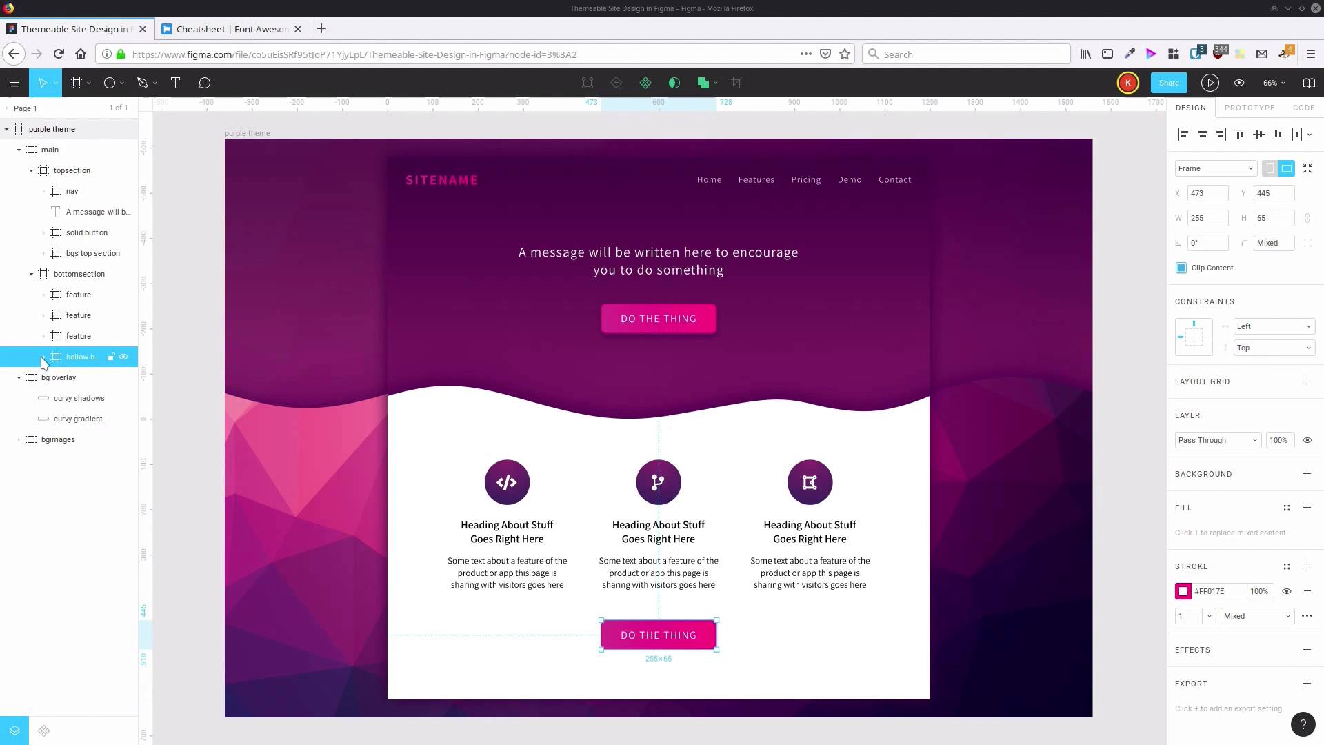
2.5 Duplicate Features and Add the Final Button
Hey, welcome back to create a themeabile site design in Figma. In the last lesson, we set up this cool little feature area here, with an icon. Now we just need to make two more copies of that feature and change the icon that's being used there. We can leave the placeholder text as it is, it's just placeholder, so it doesn't really need to be rewritten for the purposes of this design. So all we're gonna do is just grab this feature. Just select the frame and then hit Ctrl+D twice. Then let's drag out, Our duplicates, so they spread out a little bit. And then we'll select all three, go up here, and choose Tidy Up. And to make sure things are vertically centered, we can just drag until we see that red line pop up, so then that layout is all taken care of. Now we just need to find two different icons to go into each of these spots here. So we're gonna go back to the cheat sheet and we're gonna use code branch on the second one. We go back into Figma, and if you hold down Ctrl, then you can directly select an item that you click on. Double-click to edit it and just paste in our new icon. Now we're gonna do the same thing for the next one, this time we're gonna use an icon called draw polygon, which is here. Copy that back to Figma, Ctrl+Click, double-click > Paste. So now we have all three of our feature icons in place. There's just one more step to take, and that is to create another button to go in this bottom section here. So let's just collapse these, and what we're gonna do is go up to our Solid button. Hit Ctrl+D to duplicate it. And then we're gonna drag that group down into our bottom section. Now, hold down Shift and then hit the downwards arrow. So we bring our button down here, where we want it. And now we can change up the coloring that we're using here. First we're gonna rename this so it says Hollow button, We don't really need a drop shadow on this anymore, so we're gonna eliminate that. Now let's open this up, gonna go to our button Background that we created earlier. We don't need to fill in this, we're just gonna have this be our white, see-through area, ao we'll delete that fill. Instead we're gonna have a more prominent stroke to give the button style. So we gonna add in the color D2348F so we have sufficient contrast. It needs to be a little bit darker, given there's a white background. And we're gonna change the width of the stroke up to three pixels. So now that stands out quite well from the background. And our text is still white at the moment. So to enable us to see it, we're gonna set it to the same color that we just added to our stroke. We're just gonna click on the color picker, and paste in that hex code again, D2348F. And now, because it's still got a regular font weight, it's a little bit hard to read on that lighter background. There's a lot of color contrast here that makes this light text quite easy to read. But we're gonna make this text down here more easily readable by changing the font weight out to semi-bold. So now, that button's all done and the extra features are all done. Hit Shift+0 to see your design at 100% of its normal height and width if you want to see how things are actually going to look in full resolution. Or again, select the frame and press Shift+2 to see everything that you've done so far. So that is our basic design, complete. If you're doing a fully fledged site, you would definitely do a lot more different types of content. But in the next section, we're gonna be going through and setting up this design so that it's themeable. So that we can change the color scheme to multiple different color schemes on the same design. So for that reason, because we are gonna be changing the color scheme, I didn't want to put too many features in, so that you didn't have to go through and change too many things in order to see how this process is gonna work. So I mentioned in the introduction to this course that the way this theming system is going to work is by using Figma's in-built document styles. So, in the next section of the course where we start the theming process, the first lesson is going to go through and save out all of the design that we just did into individual styles that can be reapplied to other elements. So we're gonna go through that in the next lesson. I'll see you there.


