
 Lessons: 12Length: 2.3 hours
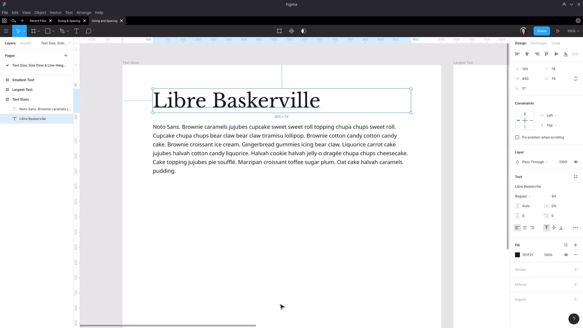
- Overview
- Transcript
3.1 Establish the Smallest and Largest Text
Now that we have our fonts selected, the next step is to start establishing the sizes at which they should be used. We’ll first establish the size for our largest and smallest text, ensuring there are no heading sizes too extreme for the design or too small to act properly as headings.
Related Links
1.Introduction
1.1Web Typography Basics in Figma00:44
2.Font Selection
2.1Font Classifications16:30
2.2Font Combining16:47
2.3Font Stacks15:42
3.Text Size and Size Flow
3.1Establish the Smallest and Largest Text13:31
3.2Create a Size Flow14:42
4.Line-Height and Margins
4.1Line-Height and Rough Spacing08:04
4.2Planning Element Margins27:30
5.Additional Spacing
5.1Indentation, Letter Spacing, and Drop Caps08:33
5.2Style Modifications: White Space08:02
5.3Style Modifications: Site Layout05:26
6.Conclusion
6.1Wrapping Up01:56
3.1 Establish the Smallest and Largest Text
Hey, welcome back to Web Typography Basics in Figma. In the last section of the course, we went through the process that you can use to select fonts that work well in your design. And now we're gonna move on to controlling the text size and the flow of different sizes that you apply to the fonts that you have selected. So we've been going through and applying these techniques to these two fonts that we talked about earlier in the font pairing section. So we're gonna be using Libre Baskerville for our headings, and we're gonna be using [INAUDIBLE] sans for our default text. So I've just created a new document in Figma. I've set up a new frame. This is 1050 pixels wide by 1200 pixels high. What we're gonna do is work up our text sizes in a layout that's gonna be fairly relevant to most websites, a fairly common width. Though in this case, I've sized the text boxes to be 850 pixels wide. That's both the default text and the heading text, both of those boxes 850 pixels wide centered inside this prime. And we're going to be creating text sizes for our default text and each of our six levels of headings. Obviously in a design there can be all kinds of different texts that you need to style but these are always the common elements. And they are a good place to start laying down the foundation for your typography's text sizing. And there are a couple of different schools of thought with how you should approach deciding what different sizes to use for different elements you need to create your typographic design for. But before we get into that, I'm just gonna touch on some of the most common mistakes that you see come up in typography design. And we're gonna keep avoidance of those mistakes in mind as you make a decision on what sizes to use. So I'm just gonna rattle off the list really quickly, and then we'll reference these mistakes again as we go through implementing the methods that we'll be using. So one, one of the most common mistakes is having you're heading one be far too large so it ends up too big to get anything more than a couple of words into a headline. And it forces itself onto too many lines. Now on the other end of the spectrum, it's also quite common to see the smallest size heading be too small. So the h6 level heading, sometimes you'll see it come up looking too similar to default text so it's too hard to tell it apart from default text. In some cases, I've even seen designs where the h6 heading Is smaller than the default text itself, then that doesn't really make sense for a heading style. Another problem that can commonly come up is having headings be too similar to one another. So it's too hard to tell the difference between one heading and the next. Another thing that can catch you is not factoring multiple lines into your design decisions when you're creating heading styles. As you can see on the screen now, we have that Libre Baskerville heading in there. But how's it gonna look when it gets pushed onto two or three lines? We have to make sure that we test that as part of the design process. Another thing that can come up and does come up often is when a design hasn't considered putting two adjacent headings. So for example in h1 and in h2 or in h2 and in h3 right on top of each other. So for example, when the end user of the site is creating an article or a blog post, they might want to have a section of their article titled with an h2 element. And then they might wanna break it into multiple h3 sections. And if you haven't considered how that h2 and h3 element look when they're stacked on top of each other, then you can end up having them too crowded with one another, pushed too far apart. Whatever the case may be, you can end up with a situation where it makes it hard for the end user to create the kind of structure in their writing that they're trying to put together. And then finally, another thing that happens often is not accounting for the amount of space that needs to be led between headings and paragraphs. So you have to get the spacing right for headings, stacked one on top of the other. And you also have to get the spacing right for those headings stacked on top of the paragraphs of text that they're introducing. Now that sounds like a lot of stuff, but what this all really comes down to is just designing for realistic content rather than just controlled dummy content. As much as you can, you should try to simulate the way that your typography is gonna be used when someone's producing real content with it. And that's what we're gonna be doing as we go through and set up our text sizes and the flow between those text sizes in the section of the course. And one of the methods that you can use to decide on the text sizes to use in your typography is by incorporating a modular scale. In a nutshell, you take a particular number, say 1.2, you start with a base size. And then you keep multiplying a font size by that number, that 1.2 or whatever other factor you're using to get a smooth grade from your smallest text size up to your largest. So there's an article linked in the notes below this video. If you're interested in that approach, then have a look at this article and it will get you started on using that technique. You can also visit the website modular scale.com and it shows you an example of how a ratio can be applied to make a modular scale. So with this example, we have a ratio of 1.5. This might represent your heading one tag, heading two, three, four, five, and six. And then this would be your normal size text. And with this, this is probably gonna be a bit too large for heading texts so you would probably wanna use a ratio a bit more like, say, 1.2. However, that said, we are not gonna be using this particular method in this lesson. Instead, I'm gonna take you through the method that I have found has worked best for me over the years. And the reason that I've found that it works best is that sometimes I find that you need to have a little bit of wiggle room depending on the specific fonts that you're using, and the kind of content that you're designing around. Different fonts come in at different sizes, looking good at different sizes or bad at different sizes. And the type of sizing that you wanna create can vary dramatically depending on the type of content that you're gonna be presenting. So the approach that I use is very straightforward. First, I figure out what the largest size text is that this design will work well with then I figure out the smallest sizes of text. And then I just eyeball all the sizes in between either of those two points. And I find that taking that hands-on approach and tweaking things until they look right gives me better results that can adapt to the requirements of the specific design that I'm working on. All right, so first up, we're gonna see what a logistics will look like using this Libre Baskerville font. Now I mentioned earlier that we've already set this up to be working with an 850 pixel width of text. And that is the width of the text that you see on the Tuts+ website. So right from the start, incorporating real world factors right from the beginning of our typography design. And the biggest text that we're gonna be using on a regular basis in our site is gonna be the h1 element. So we need to ask the question, how will the h1 tag be used in this site? What kind of content do we expect to see it holding? And then we can choose the appropriate size for it. So I'm gonna grab this element, copy in, and paste it into this extra frame that I have set up over here, which is the same size as the first frame. And then, I have a collection of headlines that are pulled off of Tuts+ so that we're working with real headlines. So I'm just gonna copy and paste those into four textboxes using the Llibre Baskerville font. So here are our four headlines and now we need to tweak the size that we're applying to this headline so that it suits the kind of content that we're working with. To make that easier, first we're gonna create a text style. So instead of modifying all of these elements at once, we can just modify the text style and affect them all simultaneously. So I'm gonna grab the first element here, hit these four little dots, create a new text style and call it Heading 1. And then we're gonna apply that style to the other elements. Now if we wanted, we can just leave this content as it is. Actually let me zoom to a 100% so you see the proper size. And on some sites, this font size would be perfectly fine. However, what we're going to do is the same thing that the Tuts+ website does. And we're gonna create a text size here that allows all of these headings to be readable on two lines. So that just makes it a bit quicker and easier for someone to read the whole headline. So we're gonna go into Heading 1 style. You can hit a drop down list to choose from these preset sizes and you can manually enter a size but the easiest way to fluidly adjust a text size is to hold down Alt. And then you'll get a little two-way error, that will appear over the top of the text size. And now you can slide that down or up to increase or decrease the size of your text, and that has these three headings on two lines, This is our longest headline now. So we're gonna get it down a little bit smaller. And what we're gonna do is go with 52. So with that size, it's nice and readable. We can feed a good bit of content on two lines. It still looks sharp. It's still clearly a heading. And now that gives us the upper end for our font sizes. Now we're gonna do the other end of the spectrum, and we're gonna establish the smallest font sizes. So there's two font sizes that we're gonna get set up here. We're gonna get the font size going for the default text and for the h6 heading. So grab our block of text over here, drop it into another frame for our smallest text. And as it happens, we actually already have a really good text size for this. Generally speaking for the size of viewports that you are working with today, you're going to want a font size that's either 16 or 18 pixels. This is a font size that works well for large monitors with lots of space so that you don't end up with text that's too tiny to read on a large monitor. And inversely, it also works really well on small screens like phones and tablets. Again, because it maintains its readability, even in that small amount of space so it works on both ends of the spectrum. And because that part is pretty straightforward, it doesn't really give us the best, small and anchor to a spectrum. That's what we're gonna set up the h6 size as well. So let's just grab, actually grab this one because it's the longest of our heading so then we can make sure that we're accounting for multiple lines. As I said earlier, one of the most common mistakes is not properly accounting for multi-line headings. And then we're gonna paste this in here. Now we need to detach it from the Heading 1 style. And now we're gonna give it a new style. This I'm gonna call it Heading 6. I'm gonna move this down cuz you almost never have a section of text that starts with a h6 straight out of nowhere. It will almost always be the case that you have an h6 tag coming after something else. So it's normally used in the middle of content, so we've got our longest heading there. And then we'll also, we'll put in our shortest one, And accommodate both long and short headlines. And now we'll start the process of adjusting. So I've clicked on the canvas to deselect everything which will show the text styles for the document. And I'm going to go into Heading 6 and, once again, hold down Alt and start decreasing the size. Actually it looks like we haven't applied, sorry, this is actually that reminds me. Something to be aware of in Figma, if you do copy and paste text from one text box into another, it will carry across the text style. So you might have to manually apply the text style that you're actually wanting to work with. Okay, so we are back in editing Heading 6. And then we're gonna start shrinking down our text, And just gonna remove all of these out so we keep things being closer together like they would be in a real site. And what we're trying to do is see just how small we can get this text and have it still be recognizable as a heading. So we definitely don't want it to go down to 18 pixels on the size because that's the size of our regular text. It's then gonna be too hard to differentiate our heading from our text. So we wanna go at least to 19. That's the smallest we ever wanna go. And right now, if we were to just leave that heading as it is, that's not a clear enough distinction between the heading and the regular text. But this is where it can be a good idea in your smallest probably two or three fonts to have a heavier font weight. So we had our Heading 1 set to regular font weight, but we're gonna set our Heading 6 to bold. So now, there's just enough difference between this text and this text. That if you see this in the middle of an article, you know that that is a separator that the portion of text you're just reading is over and now you're into a new section. So now we have established both ends of the spectrum. This is the biggest that we want our text again for our Heading 1 element and this is the smallest that we want our text to get for our Heading 6 elements. And now the next thing to do is create a flow of heading sizes in between that h6 and h1 element. And that is what we're gonna do in the next lesson. I'll see you there.


