
 Lessons: 12Length: 2.3 hours
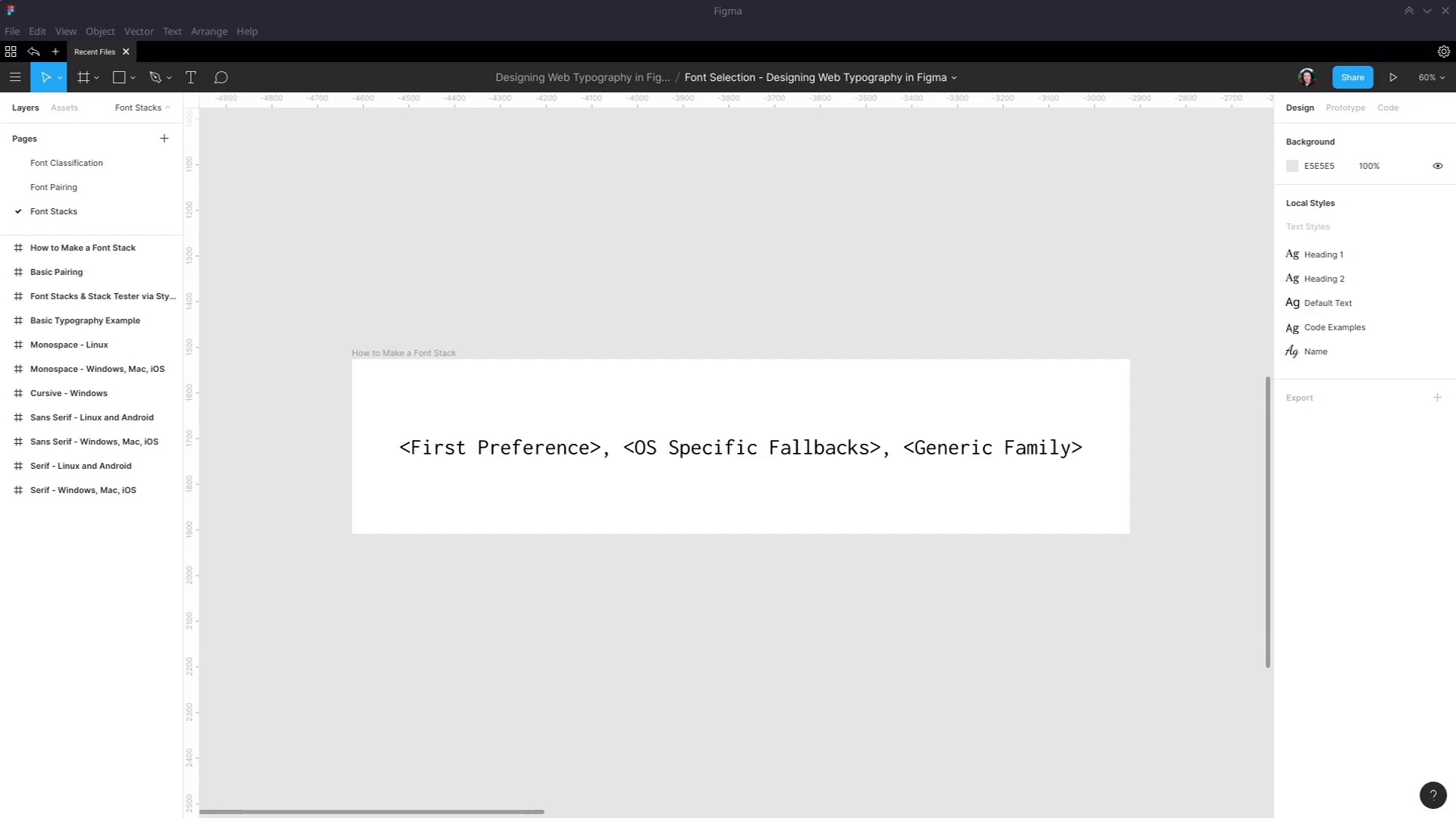
- Overview
- Transcript
2.3 Font Stacks
On the web we can never be 100% certain that our preferred fonts are going to successfully load for the end user. In this video we’ll take a quick look at incorporating fallback font stacks into the typography design process.
Related Links
1.Introduction
1.1Web Typography Basics in Figma00:44
2.Font Selection
2.1Font Classifications16:30
2.2Font Combining16:47
2.3Font Stacks15:42
3.Text Size and Size Flow
3.1Establish the Smallest and Largest Text13:31
3.2Create a Size Flow14:42
4.Line-Height and Margins
4.1Line-Height and Rough Spacing08:04
4.2Planning Element Margins27:30
5.Additional Spacing
5.1Indentation, Letter Spacing, and Drop Caps08:33
5.2Style Modifications: White Space08:02
5.3Style Modifications: Site Layout05:26
6.Conclusion
6.1Wrapping Up01:56
2.3 Font Stacks
Hey, welcome back to web typography basics in Figma. In this lesson, we're gonna look at the last part of selecting fonts, and that is making sure that you have your fallback set up, just in case your first preference doesn't load. When it comes to loading your fonts into a design, that's gonna be done with CSS. The font family is gonna be specified, but in CSS, you can specify more than one font. Rather, you can have a comma-separated list of fonts, and they're ordered by preference. So if the first one doesn't load, it will try to go to the next one, the next one, and the next one, until it reaches something that it can definitely load into the page. There are basically three ways that a font can end up getting loaded into a website. The first is web fonts, which are what you will tend to prefer, because you're gonna get more interesting, generally higher-quality fonts by using web fonts. The second is operating system-specific fonts, so fonts that are pre-installed on a given operating system, such as, for example, Arial on Windows. And then the third is just a generic font family. We talked about the different font classifications that you have in typography. Well, a generic font family in CSS is very similar. And when you provide just a generic font family name, instead of a specific font family name, like Open Sans or Arial, is it just defers to the operating system's default. So if I just say, load up a generic serif font, then the font that will appear in the page will depend on what that operating system has set as its default serif font. So the generic family names that you have available are serif, sans-serif, and monospace, all which you're familiar with from our earlier a lesson on font classifications. You also have cursive, which is the name that you'll use for script or handwriting fonts, and then you also have fantasy. However, I would recommend steering clear of using that generic font. Because as you can see, sometimes the generic fantasy font on an operating system might just be a set of glyphs that will give you nothing readable as a result. This actually does have readable text in it, if I copy and paste it into a text editor, you can see that it's real text. But that doesn't help me very much if I'm using the fantasy generic font fallback, and all I get is glyphs. So you pretty much just want to work with these four generic families. So you can see an example of a basic font stack right here. We have font-family CSS property, we then have a font family specified, and then we fall back to a generic font. And the way that you should structure a font stack like this is with this basic recipe. First, you put your first preference for your font, so that will be the web font that you've just selected, typically. Then you should put a fallback for each specific operating system that you need to support for your project. So that means you're probably going to wanna think about Windows, Mac, and iOS. It's also actually quite easy to think about Linux and Android, because they have the exact same fallback font that you're always going to want to use. I'll talk about that in a moment. And as for ChromeOS, don't worry about ChromeOS, because honestly, the whole system is web-based anyway. So if they can't load a web font, they probably can't load your whole page anyhow. So after you've specified a fallback font for the operating systems that you need to support, then you add in your generic family. Okay, so before we start to actually construct some font stacks, the first thing we need to know is, what fonts can we use for operating specific fallbacks, anyway? Unfortunately, at the moment, if you just do a general search online, a lot of the information that you find about reliable operating system fallback fonts is really out-of-date. So to help you avoid that whole minefield, I've gone through and found for you some up-to-date fonts that you can be confident are going to be available on every installation of the major operating systems that you wanna think about. And there are links in the notes below this video to where this information comes from. So we have the official list of fonts that are included in Windows 10. We also have the official list of fonts that are included in MacOS and in iOS. Unfortunately, this page isn't super helpful, because none of the examples have any CSS applied to them to show you what those fonts look like. So instead, you can use the site iosfonts.com on your iOS device. And then that will allow you to see what each of these fonts actually look like, to help you pick one out that is most similar to the font that you're providing a fallback for. For the Linux fallbacks, I just personally compared three different distros, to see which fonts were installed across all of those distros. And for Android, there's only one system font installed anyway, and that is the Droid family, with Droid Serif, Droid Sans, and Droid Sans Mono. And it just so happens that this is also the font family that's reliably installed on Linux. So basically, your fallback that you're always gonna include which will cover you for Linux and Android is the Droid family. For Windows, Mac, and iOS, there's actually quite a lot of crossover. So if you use these font fallbacks for serif, sans-serif, and mono fonts, then you're automatically covered for Windows, Mac, and iOS. So for serif fonts, we have Times New Roman, Palatino Linotype, and Georgia. All three of these are installed on current versions of Windows, iOS, and Mac OS. For sans-serif, we have Arial, Verdana, and Trebuchet, again, installed across all three operating systems. And for monospace, we have Courier New, which is also installed across all three operating systems. Now for a script fallback, there isn't one that's commonly installed on both Windows and Apple products. However, for Windows alone, you can use Segoe Script as a fallback. For Apple products, you can use Bradley Hand, which is this font here. However, I don't have and can't get a copy of that font to install on this machine. So to give you a look at the font itself, this is how it appears. If you wanna see what it looks like, then just open up this iosfonts.com page on an Apple device. And then unfortunately for Linux and Android, there isn't one singular font that's always going to be installed. So for that, just fall back to the cursive generic font family. Okay, now let's see how you can use Figma to put together font stacks and test them out on your design. We're gonna start with one of the pairings that we looked at in the last lesson. We're gonna use Libre Baskerville and Noto Sans. So let's just start by grabbing some of that text, and then here, I have an empty frame. It's just 1,000 pixels wide, and I'm gonna drop in some of this text. Just gonna position it 100 pixels from the edge, I'm gonna stretch the width of this text box out to 800 pixels, so we can get a look at how this text appears. Now, what you can do inside Figma is take advantage of the in-built text styles functionality. So let's say this is my main heading style, what I can do is select this text, go into this text box over here, hit the button here with these little four dots. And I can make a new text style. So I hit the + button, I give the new text style a name, I'm just gonna call it MyHeadingStyle. And now, I'm gonna create a few different instances of this piece of text. So I might just say, Something Different, and we'll just have one more with, Something Else. Now, what I can do is modify the settings of the text style I just created to test out the different fonts that I might like to use as a fallback. So here I can refer to my serif fonts that I know I have to choose from as operating system level fallbacks. I know with certainty that I can use Times New Roman, Palatino Linotype, or Georgia. And by the way, you can use any operating system level font that you want. This is just a quick and easy selection that you know you can always go to. But feel free to go to the full list of fonts that are available for you on Windows, Mac OS, and iOS. And then choose any of them, and test it out in the way that I'm about to show you. So looking at this selection, I think the most similar to Libre Baskerville is going to be either Times New Roman or Georgia. So we go back to our text, we click just anywhere on the canvas to deselect everything. And here we can see the text styles that we have set up, here's my heading text style. I can click this button here to go into its settings, and now I can try swapping out different fonts. So let's try Times New Roman, so we'll find Times New Roman, and we'll change it. And then you can see that all of the instances of a heading have changed their font. And this is how you can try out the different fonts that you might wanna use as a fallback. So we've tried out Times New Roman, it doesn't look that similar to our Libre Baskerville font, so let's try Georgia instead. Okay, now that's a lot more similar than Times New Roman. So now we know that that's gonna be the fallback font that we wanna use in case Libre Baskerville doesn't load. So then you can go through the same process however many times you need to for the different operating systems that you're targeting. And you can construct that font stack. So let's have a look at a complete example that I prepared earlier. Okay, so here I have a Libre Baskerville heading, this one is saved up with the style Heading 1. We've got a normal text using Noto Sans, which is saved out as Default Text. Got a code example here using Console Latha, and this is saved out with the style CodeExamples. Got a smaller heading saved out as Heading2, this uses that same default text style. And then down here, for a signature, I'm using Dancing Script, and this is saved out with the name style. And now over here, I've created a complete font stack plan. And this is gonna be a reference for the person who's gonna be coding up your design. You'll be able to group up all the different typographic styles that are using the same font. And this will do two things. It'll act as a tool through which you can easily test out your fallbacks. And it will let the person who's coding up this design see at a glance which fonts they need to put into the CSS. So we've provided the web font name, we've provided the font that should be used for Windows, Mac, and iOS fallback, which is Georgia, as we just tested out. We provided the name that should be used as the Linux and Android fallback, which will be Droid Serif. It's always Droid, this is a serif font, so we're using Droid Serif. And we've also provided the generic family name that should be used here, again, it's a serif font, so we're using serif. And then just for good measure, we put the whole thing together in a nice little copy and paste bit of text that the coder will be able to just put directly into the code. So then that does two things. It streamlines their job, and also allows you to make sure that no matter what, your design is gonna come out looking exactly how you planned it. So let's have a look at the process by which you might use this font stack plan to test out the fonts in your typography. So here we are defining the style that should be used on default text for paragraphs, there's a little bit of a description as well. First up, we're providing the generic family that should be used, then we're providing the web font. And if we click on this text, we can see the Figma font style that this is associated with. So we have the default text style, And in this case, we know it's Noto Sans. The first thing that we would need to do is find a Windows, Mac, and iOS fallback that as closely as possible matches our Noto Sans So we would refer to our quick list, or go and find a similar font in the list of officially supported fonts. We know we have Arial, Verdana, and Trebuchet to choose from. So we go into our default text, we try out the different fonts that we have available to us. After trying them all, we find that Verdana gives us the closest match. So then in our line here, we type in the font name that we wanna use as the fallback, and we style this line with that font. So there's a preview on the page of how that font is going to look. Then we do the same thing here, we style this line with Droid Sans as the fallback. And then we add in all of the font names that are gonna form a part of this stack into our little bit of copy and paste text below. And then, just make sure that when you're done, you go back into your text style that you're been experimenting with, And you put it back, To your first preference font. And then all of your typographic designs will go back to being the way that you prefer them to be. Okay, so that is how you construct a font stack. And it's how you plan and test the font stack using the text style tools that are available to you within Figma. And that also completes the font selection stage of our course. In the next stage of the course, we're gonna start looking at text size, and the flow of text size throughout your typographic design. There are a few different schools of thought on how you should decide what your text sizes should be. I'm gonna show you the way that I prefer that I have found works practically. It's a straightforward method, it doesn't abstract too much into the theoretical. And it allows you to create text sizes for your typography that will work in a real world setting. So I'm gonna show you that process starting in the next lesson, I'll see you then.


