
 Lessons: 12Length: 2.3 hours
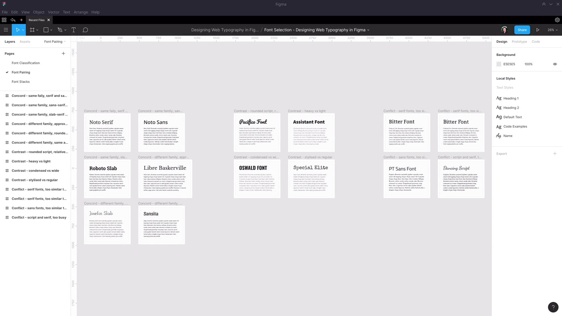
- Overview
- Transcript
2.2 Font Combining
While you can certainly base your typography around the use of a single font family, multiple fonts can often be combined to create a more standout style than using one font alone. In this lesson, we’ll learn the principles of successful font pairing and the types of font pairing you should try to create.
Related Links
1.Introduction
1.1Web Typography Basics in Figma00:44
2.Font Selection
2.1Font Classifications16:30
2.2Font Combining16:47
2.3Font Stacks15:42
3.Text Size and Size Flow
3.1Establish the Smallest and Largest Text13:31
3.2Create a Size Flow14:42
4.Line-Height and Margins
4.1Line-Height and Rough Spacing08:04
4.2Planning Element Margins27:30
5.Additional Spacing
5.1Indentation, Letter Spacing, and Drop Caps08:33
5.2Style Modifications: White Space08:02
5.3Style Modifications: Site Layout05:26
6.Conclusion
6.1Wrapping Up01:56
2.2 Font Combining
Hey, welcome back to Web Typography basics in Figma. In this lesson, we're gonna learn about a few methods that are available to you to help you make sure that when you're choosing two different fonts to use together on the same page that they work well. And again, we're gonna be working to implement a tutorial that is on the Touch Plus website. This one is titled A Beginner's Guide to Pairing Fonts. The key points that this article gets across to us is that there are three different ways that fonts can be paired together. The first type of pairing is Concord pairing. This is when fonts have concordance, they have some similarities to them that enable them to work together. The next type of pairing is Contrast. In this case, fonts have things that are different and it's the contrast between those differences that makes them work together. And then the third type of pairing is Conflict. This is the type that you want to avoid. This is where the similarities or the differences between those two fonts actually make them clash with one another, and now they don't work. So we're gonna talk about how you can make sure that your fonts have concordance, contrast and not conflict. To do that, we're gonna go through a few different examples of each of these types of pairings and we're gonna start with concordance. This is typically the easiest type of positive pairing to find. And we're gonna go through six different types of concordance that you can look for this. This first one is when you find two fonts from the same family. What you see on the screen here is two fonts, from the Noto font family. We've got Noto Serif, in the heading and Noto Sans in the regular text. When you have two fonts, that are from the same family, you can almost guarantee that they're gonna have similar traits and that those similarities are gonna give them harmony. In this case, we've got Serif in the heading and Sans-Serif in the regular text. But when you are working with the same family, it will almost always work equally well, flipped around the other way. So in this example, we have Noto Sans and the heading and Noto Serif in the regular text, and both of these options work just as well as the other. And that said, you're not restricted to just using Serif and Sans fonts from the same family. Often there are other categories of fonts within the same family. For example, we have Roboto here which has a sensor version. We have an irregular text, but it also has a slab version that we see in the header. In this case, you probably wouldn't want to flip them around, because normally not going to want to use a slab font in the normal text. But when we have the slab font from the same family as the regular text, you can see that a lot of the letters are similar. So they small or is exactly the same is this small or the shape of the a here is roughly the same as the shape of the a here. So that gives us that harmony and that concordance that ensures that these fonts work well together. If you're working with fonts from Google Fonts, it can be kinda tricky to know which ones have different versions within the same family. It's kind of something that you just end up being familiar with just by using Google fonts fairly regularly. But what you can do, let's say you know that you are gonna be using Roboto, then you can just plug the font name into this search, and then you can see all the other versions of that font that are available, or from within Figma. When you're using the drop down, select here to find your font, you're going to see if there are other fonts with the same family because they're gonna be listed right next to the font that you're currently using. If you're working with local fonts that you're getting from elements, then one of the things that you can do is just start by checking the Selif box. And then you know that you're looking for serif fonts, you've refined that down to serif. But if you see a font on the thumbnail that has sans serif on it, then you can assume from that it must have both Sans and Sans Serif fonts. So for example, this font here is showing us a Serif font. So if we open it up and we look closer, we can see that, yes, this has both Serif and Sans Serif variants. If you want to refine these results down even further, then it can help to search for the word family. Because designers who have created multiple fonts all in this same family will often use that word in the name of their font. So that's brought up this one here, for example, the Jovial font family, which gives us these three Sans serif fonts, and these three Serif fonts. Then the next type of concordance that we're gonna look at is where we have different families, but what we're trying to match is the approximately width of the letters that are used in these different families. So for example here, I started with the font Libre Baskerville. I knew that I wanted to find a Sans Serif font with letters roughly the same width as this Libre Baskerville font. So, I basically just look closely at the width of these letters, went to Google Fonts, refined it down to show me only Sans Serif fonts. And then from here I expanded the font properties, and then activated this width slider to help me try to find a width approximately the same size as the letters that I'm targeting with my heading. So now if you look at these letters here, this o, you can see that this is more sort of squashed up than o that we looked up in Libre Baskerville. Part of this is not an exact science it's just making your best judgement call. So then I expanded the width a little bit, started looking at these o's in these fonts and now that is around about the same width as this shape here in Libre Baskerville. From here, I selected this Noto Sans font. But really you could pick any of these fonts, they all have the same width and they would work just as well for pairing with this font. The other way you can go about it is if you start the font selection process by refining the width first. So right now I have Sans Serif fonts only selected with this width here. Now if I wanna find a serif font that goes with it, I can just come up here and switch the refining and to serif only. And now we can be fairly confident that based on with all of these fonts will go well with Noto Sans and hold, here is Libre Baskerville Which we just matched with. The next type of concordants that we're looking at is where you have letters that have roughly the same type of shape. Some letters are very straight up and down, they really make an impression with vertical parallel lines. Other fonts have very rounded letters. So with this pairing, I started with Josefin Slab. And notice that these letters was very round. So I then said about trying to find another font that would give me very round letters very clean, just like the Josefin Slab font. So to do that I knew that I would have the best chance of having really rounded letters be the Serif font. Serif font tend to be a little bit more narrow, so I refined down to Serif fonts are only now. If you're observant, you've probably already noticed that the font that I'm using has popped up here. But I'll still take you through the process that I went through to refine things down anyway because you're not always gonna have something pop up that's useful immediately. And to make sure that I was gonna get those rounded shapes so use the same technique as we just did a moment ago, went into font properties and use the width of bumped up slightly to make sure that we would get that wider, rounded shape. And from there select the Raleway font, because of these options it was the roundest and the cleanest font which would match it well with the Josefin Slab font. And you can see here that another option would also have been Montserrat. So either of these two looking very similar to one another, would work just fine with a font like Josefin Slab. And then there's one more type of concordance tha we're gonna look at, and that is looking for fonts that are created by the same author, different font authors have different styles. Just the same way as a musician will have a recognizable style from piece to piece, often so will a font author. So this pairing I went to Google and in Google Fonts I brought up that font. It this shows you the author name, and you can then highlight that name, copy it and paste it back into the search. And it will show you all of the other font families that are created by the same author. From here, I can see the Sansita font that we're using as a header, and I can also see a bunch of different fonts that would be perfect for use in regular text. But this one in particular stands out as being stylistically similar to Sansita and you can see that in this example here. If you're working with the font from elements and you wanna see other fonts that author has created, all you need to do is just click on the little link here and that will take you to a display of all the creations of this author, which you can then refine down to fonts by clicking the link in the top here. And then you can see all the different fonts that they've created. And then you can find one that's a match for the font that you're working with. Now we're gonna look at contrast pairings. Contrasting is where you take two fronts that have distinguished different elements and you use that contrast to help you make a good pairing. In an example before, we showed how if you can get two fonts that have almost identical rounding on their font then that makes a good pairing. Conversely, if you get two fonts that are different enough in how round or how narrow their letters are, then that can also make a good pairing. This example, we have the Pacifico font. And this font is characterized by its very rounded flowing style. So to contrast with this, we can look for a font that doesn't have that very rounded style that instead has a lot of focus on those vertical parallel lines that I mentioned earlier. So if you look through this Heebo font, you can see that it really has a strength in those vertical parallel lines. It's not a very wide font, so you don't get those perfectly round circles throughout this font. So the contrast between the two helps to make a nice pairing. The next type of contrast that we're looking at is a contrast between Heavy versus light. So here, we have this Assistant font which has a really nice extra bold style, and we're pairing that with the Quicksand font that has a really nice light style. As far as the shape of these two fonts go, we actually have concordance, so you can have both of these things in one font pairing. The shapes of the font a Concord and but we're making sure that we using something else to create contrast here. So we have that very heavy heading contrasting with the very light body text. Okay so the next step of contrast that we're gonna look at is condensed versus wide. Earlier on we tried to match the width of our heading and a irregular text. In this example we're doing the opposite. We have Oswald font, which is a condensed font. A condensed spawn is deliberately designed vave narrower letters than most of the fonts. And then in our regular text we're using the Montserrat font which is quite a wide letter. And to find these two to contrast with one another, I can use that with slider on Google fonts. I started by finding a nice condensed font and then I pump that with slider up. As far to the right is I could go, whilst still giving me a font that was gonna be legible and readable for regular text. And then, we have just one more type of contrast that we're gonna look at, and that is a stylized type of font versus a regular type of font. There is another type of font. That you can refine into on both Google Fonts and elements. In Google Fonts that is the display type so I just uncheck these to show you. And these are fonts that are heavily stylized really only to be used for headings. They're not strictly contained to any of the classifications that we described earlier. Even on the screen here you can see that we've got a Serif font here, a Slab Serif font here a Sans Serif font here. What differentiates these fonts is that stylized nature. Uninvited elements you'd find this type of font by refining down to decorative fonts. So these are, generally speaking, designed time to be used on things like your main site header, they're probably not gonna be something that you would use in the middle of an article, for example. So this pairing, I've picked a stylized font from Google Fonts, this Special Elite font, it's not designed to be readable. It's not designed to be legible. It's just designed to look interesting. And then in contrast with it, I've used probably the most regular font that exists and that is Open Sans. This fonts is used everywhere, it's almost ubiquitous. If you've been online in the last five years, you've almost certainly read lots of sites using this font. So that's about as regular as it gets. Okay, so we've talked about concordance and we've talked about contrast. So what makes conflict what makes a bad pairing? In a nutshell, it's when you have two fonts that are not similar enough or different enough. They're somewhere in the middle, so they don't have either concordance or contrast. So, lets look at a couple of the ways that conflict can happen. Here we have two Serif fonts, and these have neither concordance nor contrast. They're both Serif fonts. They're relatively similar. However, they're just different enough that it kind of makes you pause for half a second as you go from reading the heading to reading the regular text. In order to make a pleasant reading experience for your visitors, you want to try and enable reading to be as automatic as possible. And part of making an automatic flowing reading experience is to make sure that the reader can just intuitively recognize the letters as quickly as possible. So by having these two fonts that are similar, but not the same, you're making the visitor process two things that look like they should be identical but they're not quite. So it's a small thing but it's gonna be just enough to cause a little bit of discomfort when a person's reading. This is another example of the same thing. Once again, we have two serif fonts. They are two similar to create any contrast but they're two different to have concordance. This is an example of the same thing but this time with Sans Serif fonts. You can have sans serif fonts that have nice conflict or concordance. But as you can see in this example, we have two Sans Serif font that once again, are too similar to have contrast but too different to have concordance. So for example if we look at the letter a here we have this shape, but if we look at the letter a here, we have this shape. So just adds in the extra bit of sluggishness with instantly recognizing the glyphs within the font. And then the last type of conflict that I'm going to talk about, this one's probably not as distinct as the other ones were just looked at, but something to think about anyway. With this conflict we just have too much going on. You remember in our example of contrast here, we had a decorative font, a stylized font. So to make sure that we're not overloading the person with a lot of extra information to read, we pair this with a very regular font, something that's very familiar, and very easy to read. In this example, we have the opposite. We have a stylized heading, but then we have a fairly heavy serif font that sort of puts a lot of ink on the page, so to speak. So there's just too much going on with this pairing, it's too busy. If you wanna have an ornate, stylized heading like this, then go for something a little bit more reserved to pair with it. All right, so that gives you a set of methods that you can use to find good font pairing. To recap and just give you a quick list that you can refer back to, for concordance look for font families that have multiple different categories within them such as Serif, Sans Serif, Slab Serif. Look for fonts that have letters with approximately the same width. Look for funds that have approximately the same sort of shape, so either rounded or quite vertical in parallel. And look for fonts that are created by the same author and hence have a similar style to them. For contrast, try pairing rounded fonts with relatively straight fonts. Pair heavy fonts with light fonts. Pair condensed, narrow fonts with wider fonts. And pairs stylized fonts with more reserved regular fonts. And the way to avoid conflict is to make sure that you go all the way towards concordance or all the way towards contrast. Don't end up in a place in the middle where you have neither. Okay, so that wraps up everything that we need to cover about font combining or pairing. That should give you a whole bunch of tools that can help you with the font selection process. The next thing that we're gonna look at is setting up font stacks. Once you've selected your fonts, they're the first preference that you would like the viewer to see when they come and visit the site that you have designed the Ttypography for, but things can go wrong. Sometimes the person might have an issue with their internet connection. The server that is loading up the web font might have a glitch. So it's always a good idea to have a full back plan in place as well that you've also given design consideration too. So we're gonna look at how you can create what's called font stacks, where you decide not only the fonts that you want the user to see, but also the fallback fonts that you want the user to see if something goes wrong and your first preference fonts aren't loaded up. So we're gonna go through how you can do that in the next lesson. I'll see you there.


