- Overview
- Transcript
6.1 Wrapping Up
Let’s go over a quick recap of what we’ve learned and talk about what you might like to do next.
1.Introduction1 lesson, 00:44
1.1Web Typography Basics in Figma00:44
2.Font Selection3 lessons, 48:59
2.1Font Classifications16:30
2.2Font Combining16:47
2.3Font Stacks15:42
3.Text Size and Size Flow2 lessons, 28:13
3.1Establish the Smallest and Largest Text13:31
3.2Create a Size Flow14:42
4.Line-Height and Margins2 lessons, 35:34
4.1Line-Height and Rough Spacing08:04
4.2Planning Element Margins27:30
5.Additional Spacing3 lessons, 22:01
5.1Indentation, Letter Spacing, and Drop Caps08:33
5.2Style Modifications: White Space08:02
5.3Style Modifications: Site Layout05:26
6.Conclusion1 lesson, 01:56
6.1Wrapping Up01:56
6.1 Wrapping Up
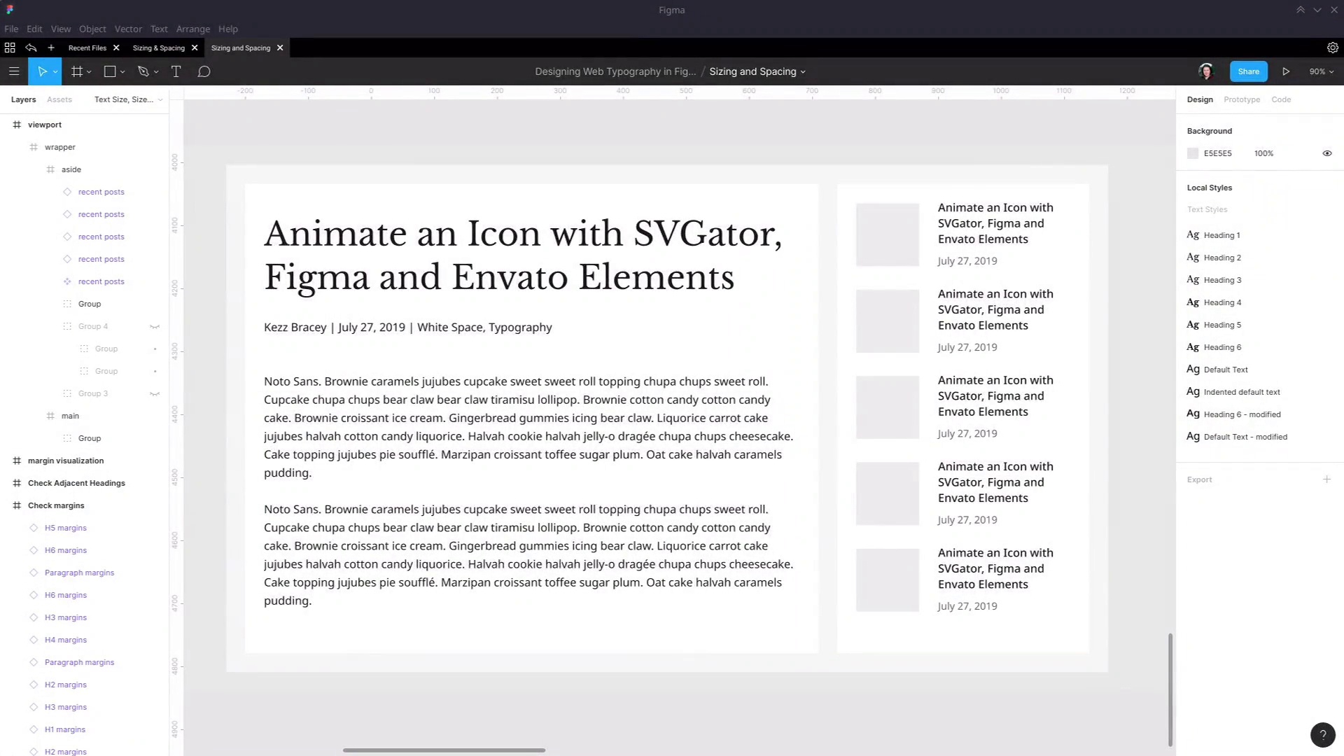
Hey, welcome to the final video of Web Typography Basics in Figma. We've gone through a really solid overview of all the most important fundamentals to typography. So we covered font selection, we looked at all the different classifications of fonts, how you can combine them together well so that they don't clash. And how you can create font stacks so that there are fallbacks in case your first preference web font doesn't load. We looked at how to set up text sizes and create a flow of text sizes, and we did that in a really practical way. We looked at spacing, starting with line heights on all of your most important text elements and margins. And then we looked at some additional spacing that you might wanna work with, like paragraph indentation, letter spacing, and drop caps. As well as the scenarios in which you might need to create overrides or modifications for your styles. Such as when you need to strategically use white space and when you need to create adjustments for layout specific typography. And this course was actually the first in a two-part series. Wanted to get you started with the basics so you have the most important information already under your belt. In the next course, we're gonna move on to some more advanced topics. We're gonna look at the things that you need to change up to make sure that your typography is responsive to different viewport sizes. We're gonna look at how our color and accessibility factors into what you're doing with your typography. And then we're gonna look at some Elements specific typography, like what you need to consider when you're creating links and block quotes and preformatted code, and things to that effect. And once again, we'll be putting it all together in Figma in a way that lets you get a really great plan designed for your typography before you hit the browser. But done in a way that is going to work equally well in the browser as it does within the design document. So I hope you've enjoyed this course, and I hope you learned a ton and that you're now feeling really well-equipped to create excellent typography for your web designs. Thank you so much for taking this course, and I will see you in the next one.


