
 Lessons: 12Length: 2.3 hours
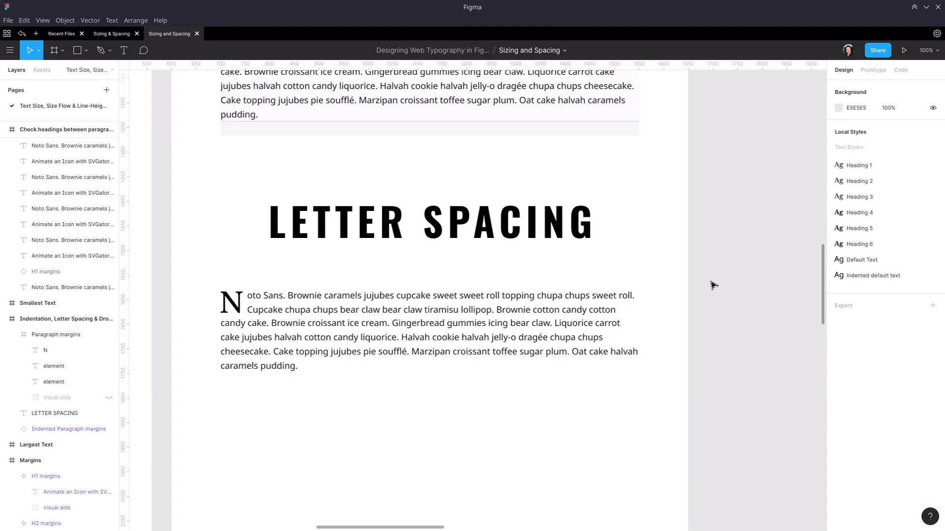
- Overview
- Transcript
5.1 Indentation, Letter Spacing, and Drop Caps
We’ve now covered line-height and margins, but there are more spacing settings to consider with typography. In this lesson we’ll cover letter-spacing and paragraph indentation.
Related Links
1.Introduction
1.1Web Typography Basics in Figma00:44
2.Font Selection
2.1Font Classifications16:30
2.2Font Combining16:47
2.3Font Stacks15:42
3.Text Size and Size Flow
3.1Establish the Smallest and Largest Text13:31
3.2Create a Size Flow14:42
4.Line-Height and Margins
4.1Line-Height and Rough Spacing08:04
4.2Planning Element Margins27:30
5.Additional Spacing
5.1Indentation, Letter Spacing, and Drop Caps08:33
5.2Style Modifications: White Space08:02
5.3Style Modifications: Site Layout05:26
6.Conclusion
6.1Wrapping Up01:56
5.1 Indentation, Letter Spacing, and Drop Caps
Hey, welcome back to your Web Typography Basics in Figma. In the last lesson, we finished what I would call the core, the most fundamental features of setting up all of your typographic design elements. Now, we're gonna look at some additional spacing settings that you can change up in the form of indentation, letter spacing, and adding in drop caps. Okay, so first up, I'm gonna show you how to handle paragraph indentation in Figma. And what we're gonna do is create a second alternate version of this default paragraph that we have here. So we're gonna have duplicate it, that will give us another copy of this component. But we don't want it to be exactly the same, because we want to have indented text in it. So we're gonna detach this instance so it no longer gets modified when we change the original component that we're working with. We will rename its parent frame to make sure that we keep it obvious that they're different, so we'll just call it Indented Paragraph. And now in here, right now we're using a fixed style, that default text style that we set up earlier. And the paragraph indentation settings are in here, so we need to detach that style. And now we're free to change the paragraph indentation, which we do with this field here. Now we can just slide to indent the text however much we want. And we're gonna go with a 40-pixel indentation. Now we can make a new style so that if we wanna do any more paragraph indentation, we can. And we'll just call that Indented default text. Now I'm gonna turn this into a new component, one that we can switch at will with our original paragraph component. But there's one small change that I need to make first to make sure that switching will work. I'm going to rename this element in our original component to just element. And then rename this and create a new component out of this one. And the reason that I made that change is, if you make sure that all of your elements here have the same name as an alternative component that you might wanna switch in and out. Then it will allow the system to preserve whatever differences you have between these two components. Now we can go over too one of our example paragraphs that we created over here, let's say this one. We can right-click, choose Swap Instance, and now we can choose Indented Paragraph margins. And now it swaps in that component that we just created. So I'll just put that back and then instead, We're gonna put out a paragraph in this new frame so we can work in a fresh space, To go through each of the examples that we're about to work with, okay? So that covers how to use paragraph indentation, and while we're at it, how to swap components in and out. Next, I wanna show you working with letter spacing in Figma. And one of the times at which letter spacing can be the most useful, that is changing the amount of spacing that's between each letter, is when you're working with a big, thick, often condensed font. And you just need a little bit more breathing room in there. So I'm gonna jump in here, so let's add in a new text box. And by the way, you'll see this is just grabbing our last used style. So we just wanna detach it from that, and it's actually preserved some of the setting, too. So let's just get rid of that indentation that we put in there before, fix up the positioning. And now let's add in some text, I just want it to say LETTER SPACING. And then we're going to center it horizontally and vertically. Now, for the font, I want to apply a font called Oswald, which is a nice, big, condensed, chunky font. I'm gonna set it to be bold, and I'm gonna bump the font size up to 80 pixels. So that's a great-looking fun. But as you can see, the letters are pretty close together, there's not a heap of room in between. So sometimes it can give you a really nice effect if you add in some letter spacing, so let's select our text again. And now that we can look down in this field here, this is where we can set up our letter spacing. So let's just drag it up basically just until we like the look of what we have. I think about 12% is really cool for a really bold, distinct, eye-catching kind of a look. So I'm just gonna drag that down a little bit here and now gonna use this cool heading to lead into a new paragraph. This time, gonna change it up again and design a drop cap. Now, unfortunately, there's no automated way to create a drop cap style in Figma. What we want to do is simulate the effect that you would get with the CSS property initial-letter. This is an article that we have on Tuts+ about this property. So if you wanna read up on that, I'll link to this in the notes below this video. As you can see here, we have a few lines that are all indented to make space for that leading letter. So what we're gonna do to manually recreate that drop cap is grab one of our regular paragraphs. We're gonna have to detach the instance. For now, we don't need to have the visual aids on, so we'll turn those off. And we're actually going to duplicate this paragraph, so we'll duplicate that. And now we're just gonna hide one of these elements. The next step is to create the single letter that's gonna start our paragraph. We'll grab a text box and draw enough space for just one single letter. Our paragraph right now starts with the letter N, so let's put the letter N in there. And now we need to style up this letter. We know that we're already working with Libre Baskerville as our main heading throughout this design so far. So let's just detach that style, grab the Libre Baskerville font here. And then we are going to bump it up to a font size of 56. And the reason that we've gone with 56 is because that is about the right height to line up with two lines of text here. Now we'll just change up the box a little bit, we'll line it to the middle, just make it a little bit easier to work with. So now I'm gonna position this so that its left edge is aligned with our paragraph here. And then, gonna select the paragraph and shrink its width so that it has enough breathing room for this drop cap to fit in. Now I'll move the drop cap down to where it's actually going to sit in the text. Zoom back out to 100% with Shift + 0. And just make sure that looks about right, which it does. Actually, no, probably that could come back just a smidge. Now I'll delete that first letter cuz that's being replaced with our drop cap. And now we no longer need this text here anymore. So we're going to cut that out and then just shrink this text box to the correct size. Now we'll turn back on our second text box, paste in the text that we just took out of the previous text box, and then, We want to bring the top edge of that text box down so that it makes it look like this is all one paragraph. Now we'll just grab the frame that this is all sitting inside of and just rename it to Drop caps so it's clear what we're working with here. And then the drop caps stylistically work very nicely with the indented paragraphs that we just created a moment ago. So let's just put in a couple of those and see how they look, turn off those visual aids. There we go, so now we have a really nice flow going from the bold heading, the letter spacing to add drop cap paragraph, down to our indented paragraphs. Okay, so that's how you can work with paragraph indentation, letter spacing, and how you can set up drop caps using Figma when you're putting together your typography design. We just have two more lessons to cover, where I just wanna take you through a couple of modifications that you might find yourself wanting to make to your headings and to your default text depending on different things that are going on within the site. And the first of those reasons for creating modifications or overrides to be topography settings that you've set up so far is to strategically make use of white space to communicate when two items are related to one another. So we're gonna go through that in the next lesson, I'll see you there.


