
 Lessons: 12Length: 2.3 hours
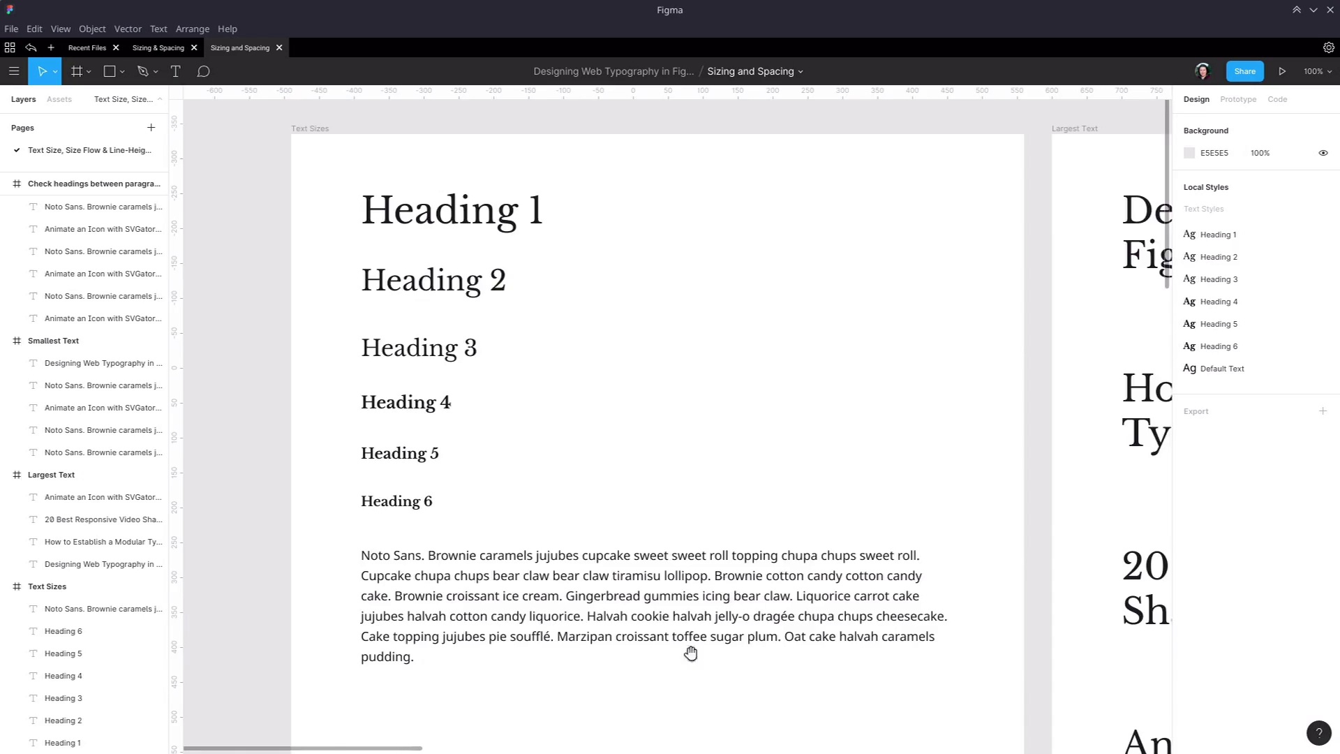
- Overview
- Transcript
4.1 Line-Height and Rough Spacing
With all our essential text sizes set up, it’s time to start adding in the spacing elements of our typography, beginning by setting appropriate line-heights for each of our major text elements.
1.Introduction
1.1Web Typography Basics in Figma00:44
2.Font Selection
2.1Font Classifications16:30
2.2Font Combining16:47
2.3Font Stacks15:42
3.Text Size and Size Flow
3.1Establish the Smallest and Largest Text13:31
3.2Create a Size Flow14:42
4.Line-Height and Margins
4.1Line-Height and Rough Spacing08:04
4.2Planning Element Margins27:30
5.Additional Spacing
5.1Indentation, Letter Spacing, and Drop Caps08:33
5.2Style Modifications: White Space08:02
5.3Style Modifications: Site Layout05:26
6.Conclusion
6.1Wrapping Up01:56
4.1 Line-Height and Rough Spacing
Hey, welcome back to web typography basics in Figma. You now have all of your sizes, setup, typography. And the next thing that you need to do is make sure that your line heights are set up correctly as well. We're separating these lessons just to help keep things clear. But in practice, it's actually a better idea to try to set up your line heights and your text sizes at about the same time. Because you'll sometimes find that changing the text size changes what you want the line height to be and vice versa. But we're just doing it separately for the sake of covering one concept at a time. So the first thing that we're going to do is look at the line height of our default text. Now I actually already set a line height on just this element because, to be honest, I'm kind of a stickler for good line height. And I just don't like looking at the default height that's put on here, which normally in the line height field, you're just gonna see the word auto. But this is too cramped. There's not enough space in between these lines for that reading to be comfortable for the eye. You need to have a little bit more space than that. And the way that you want to measure line height should be as a multiplication of the size of the individual letters. So you could, if you wanted, put in a specific pixel height in here. So it could be 28, for example, but that's actually not best practice, and that doesn't relate very well to how things are actually going to be written in code. In code, as long as best practices are followed, line heights are always written as a factor of the text height. But Figma gives you the ability to use a percentage, so that is what you should use in this line height field. And generally speaking, with default text, anything between about 1.3 and 1.6 is about the right ballpark that you want to aim for. I personally like 1.6 as a factor. So to do that in Figma, just add 160%. So that's not a huge change, but it's enough to make sure that it's easy on the eyes to read those paragraphs. And once you have your line height, then you can kind of start roughing out the amount of space that should be in between elements. Because line height is going to push out the amount of space that's around an element to begin with. And then margins are gonna add even more space on top of that. So you get your line heights right first, then you set up your margins. Now that we know that we have the right line height for our paragraphs, instead of having single paragraphs in our last testing frame here, let's make sure that we have two paragraphs stacked one on top of the other in every case. So for now, just put these paragraphs roughly however far apart, you think looks right, okay? So now you should have all of you double paragraph setup. And just as a hint, if you're having trouble kind of getting that nice and evenly distributed, to help get the ball rolling you can also select one of your text objects here. Go into the Layers panel, hold Shift, then select the last of your text objects to make sure you have them selected inside the frame. And then you can go up to the top right and choose continue distribute vertical spacing. And then that will help you to start getting closer to the amount of spacing that you want between each of these elements. All right, so now let's start looking at our line height. As a general rule, you'll find that you're all good to have a smaller line height on your largest headings and a large line height on your smallest heading. And the reason for that is having that line height increase as the font size gets smaller gives you a more consistent amount of spacing in between lines across all of your headings. If you use the same line heights on the big letters as on the small letters, then the gaps for the small letters will seem too small. So just like we did with the text sizes, we're pretty much just gonna kinda eyeball this. So let's select our heading one element and go in an edit its style. And you don't even need to hold down Alt to activate this slider. It just activates by itself if you put your mouse over the little icon and left. So now let's drag. Give it a little bit more breathing room, and we're actually gonna go straight to 133% here, so one-and-a-third. That works really well on this heading, and generally speaking, it's not a bad number to use for your larger heading sizes in general. Now we'll do the same thing for our heading 2. Edit that, and we're just gonna go with the same size for that one, so 133, there we go. So now that has a nice amount of breathing room. You're trying to make it so that it's easy for the eye to travel from one line to the next. You don't want someone to have to move their eyes too far to go to the next line. But you also don't want to make them struggle to differentiate one line from the next. All right, so next up heading 3 element. This is where we're gonna want to start increasing our line height a little bit, and I'll show you why. So if we just go to 133, now you can see that it looks a little bit funny. This looks more cramped then these two. So we need to increase that line height a little bit more. So instead, we're gonna go up higher. Now, that looks about right. There's still a little bit less space in between these lines than there is between these lines, but it doesn't look cramped anymore. So let's just round that off to 150. Now move on to our heading 4 element. So we know we're gonna need at least 150 for this one. And that's still looking a bit too cramped. So let's go up a little bit higher. I think that's about right. So again, roughly the same space in here as there is in here, just a tiny bit less. And let's round that off to 170. And that is a good amount of space. And because we didn't change our font sizes dramatically on our other headings, that is probably gonna work just fine for the other headings too. So let's edit our heading 5, we'll just go to 170 on this as well. Okay, that's all looking good. And then we'll do the same thing for our heading 6. We're just adding 170%. And there we go, so now that is a really nice set of line heights. You can see that everything is starting to breathe really well, and everything all looks good. Next are the type of elements that it's gonna need to work in with. Now here is where you can start to sort of tweak the amount of spacing that you have in between each of your elements here. Just kinda starting to get a rough idea of how far apart you want these things to be. But when it really comes down to it, you're going to need to have specific numbers on your margins. So if I highlight this whole heading, you can see how high an individual line is. So each line takes up that bit of extra space depending on what we set the line height to be. And then the margin is gonna be the amount of extra space that goes above and below this element. And if you really want to have full, proper control of your topography, you're going to want to plan out that amount of space as part of the design process. If you want, you can just approximate any design and then hand it off and let the coder make the decision on what margins they feel should be implemented. But if you wanna have full control of the entire design phase, then you can go through, plan out your margins, and make sure they're all working the way that you want them to work. So in the next lesson, I'm gonna show you how to use some of the inbuilt Figma tools to plan out crisp, perfectly spaced margins. So for that, I will see you in the next lesson.


