
 Lessons: 12Length: 2.3 hours
- Overview
- Transcript
5.2 Style Modifications: White Space
Sometimes creating your fundamental styles is not enough to complete your typography in itself. There are some circumstances in which you will need to modify your styles to create overrides, such as when you want to make strategic use of white space.
Related Links
1.Introduction
1.1Web Typography Basics in Figma00:44
2.Font Selection
2.1Font Classifications16:30
2.2Font Combining16:47
2.3Font Stacks15:42
3.Text Size and Size Flow
3.1Establish the Smallest and Largest Text13:31
3.2Create a Size Flow14:42
4.Line-Height and Margins
4.1Line-Height and Rough Spacing08:04
4.2Planning Element Margins27:30
5.Additional Spacing
5.1Indentation, Letter Spacing, and Drop Caps08:33
5.2Style Modifications: White Space08:02
5.3Style Modifications: Site Layout05:26
6.Conclusion
6.1Wrapping Up01:56
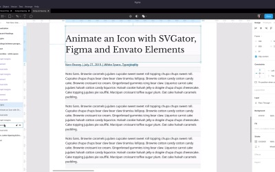
5.2 Style Modifications: White Space
Hey, welcome back to web typography basics in Figma. As you know, we've already set up all of the default styles for heading tags and paragraphs. But there are gonna be times when you wanna adjust those defaults, modify those styles, and create different versions or implementations of those same elements. There are a couple of different reasons you might wanna do that, and one of the main ones is that you can make strategic use of white space in your layouts. With this lesson, we're building on some of the concepts that are introduced in this article on Tutts Plus, Invisible Forces, Spacing and Shape. As always, there is a link to this article in the notes below this video so you can give it a read yourself. So we have a look at this section here, it illustrates really clearly how if you put items closer together, they're perceived as being related like these boxes here. And if you separate them, they're perceived as being in different sections. And one of the places where you might find that you wanna use white space like this is as part of your typography. And specifically, in this example, we're gonna be looking at how you can utilize these techniques when you have something like a headline and then some meta text that's related to that headline before proceeding on to the body of the article. So this tutorial on Tutts Plus is giving us some guidance on how we might like to set up spacing in between each of these elements, and that's what we're gonna implement in some style modifications or style overrides in the design that we have so far. So here, I've set up something similar to what we just saw in the example tutorial. We've got our headline, and we've got some meta texts. So just the kind of thing you would expect to see on a blog post. An author name, a date, and a couple of tags or categories. And then, immediately following that, some paragraphs of text. Right now, these are just default elements. So we have paragraphs with the default amount of margin above and below. And we have an h1 element, again with the default amount of margin above and below. But if we turn off these visual aids, We can see that with the defaults, it's not very clear that this meta text is attached to this heading, and that these paragraphs I've grouped up together all being part of the body content. So we are going to change up the way that margins are applied to this meta text, and also to this main headline. So let's go ahead and turn all those visual aids back on again. And then, the first thing that we're gonna need to do is decrease the amount of space that we have here in between the headline and the meta text. We wanna bring them closer together so that it's clear that these two things are related to one another. And by the way, both of these elements have been detached from their source components, so they just sitting there by themselves. They won't affect anything else when they are modified. So go ahead and recreate this layout. You just need to adjust the size of the paragraph box for the meta tag that you set up here so that everything is down to one line instead of a several line paragraph. Okay, now, referring back to the article that we're working with for our recommendations here, it gives a pretty clear indication of a good amount of space that you can put in between a headline and meta text. And that is just to use the exact same amount of height that the meta text itself is taking up. So if we go back to our design, we already know that we have set up an amount of margin above this paragraph that's equal to one line, because we did that when we were setting up our default paragraphs. If I hide this heading, then we can see that's already the amount of space that we have above here. But right now, if it's used against this heading element, because the heading element has the larger bottom margin, it's just gonna shut down our paragraph's top margin. We can prevent that behavior from happening when it comes to coding up this design in the browser by just making sure that the heading one element doesn't have a margin larger than our paragraph's top margin. So what we're going to do is actually completely remove the bottom margin from this modified heading element. So for the moment, let's just hide this meta text. Actually, let me just rename this element. Let's make it clear what we're working with there. So right now, we have this heading set up that if I change the height, everything stays vertically centered. But because I want to trim off this whole bottom margin, I'm gonna change the constraints so that everything stays perfectly still and we can shrink the height of this box and just clip off that whole bottom margin. So I'm gonna go in here and select the element. And instead of having it anchored to the center, I'm gonna anchor it to the top. And then, in the visual aids, I'm gonna do the same thing with the element area, anchor it to the top. Now, I can drag this up, and it's just going to snap right to the bottom of that element area. And we can see that now when the coder comes to turn this into a live site, they'll know to only include a top margin and to leave the bottom margin out completely. Now, we can turn our meta text paragraph back on. And now, it has the larger margin. So now, we can move it up, and it's gonna snap into position and automatically give us a gap in between these two elements that's equal to the height of our meta text line. Then, the next thing that we wanna do is create more space in between the meta text and the first of these paragraphs. These paragraphs are already the right amount of distance between one and the next, we just need to have the right amount of distance between the first of the paragraphs and the meta text. And for this text, seeing as we're already using multiples of our normal paragraph line height to space things apart, we're gonna make it straightforward and just have two rounds of that same height. So two lines in between the meta text and the first paragraph. So we can get our paragraphs in position easily enough by just selecting them all and dragging down until it snaps. Because we still have this margin here at the bottom of our meta text at its default height. But as you've already learned, right now, if this were to be deployed as it was, only one of these margins would actually maintain its effect. So what we're actually gonna do is increase the bottom margin of this meta text so that it comes all the way down to the start of this paragraph. So we're just gonna do the same thing again, that we did with this element where we jump in, select the element, anchor it to the top, select the element area of visual aid, and anchor that to the top also. And now, we can select our whole frame, drag the bottom down. That's actually gone one pixel too high. So just change it to 1.15. And now, we have the proper representation of what the margins should actually be on both of these elements. So let's turn off the visual aids on each of these. And now, you can see that that's much better. And normally, with meta text in a blog design or something similar, you would actually change up the color, you might change the weight to be even further, distinguish it from the rest of the text. But even without that, even with the exact same font size, color, and everything as the rest of our text, but using white space strategically here, it makes it clear that these two elements to be looked at together, and then these elements are to be looked at together. All right, we just have one more lesson left in the course, very similar to the one that we just covered, where we're looking at overrides that you might you like to add into your typography depending on some site-specific elements. In this case, we're looking at style modifications that you might need to include for site layout specific details. So we're gonna check that out in the next lesson. I'll see you there.


