


- Overview
- Transcript
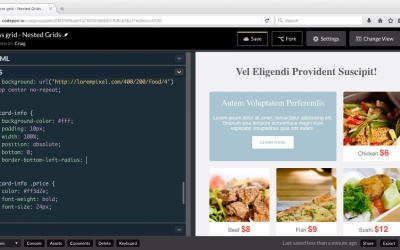
3.3 Alignment and Justification
Let’s now create a third level of nested grids within our card system. We’ll then examine how to use the align-self and justify-self properties to adjust the placement of our text.
Related Links
1.Introduction
1.1Introduction00:40
1.2Using Firefox Nightly03:15
2.Project 1: Simple CSS Grid Layout
2.1Basic HTML Setup for Grid Layout02:37
2.2Creating a Simple Layout Using Column Spans09:21
2.3Creating a Simple Layout Using grid-area08:20
3.Project 2: Intermediate CSS Grid Layout
3.1Looking at the HTML04:43
3.2Nested Grids08:19
3.3Alignment and Justification06:06
3.4Finishing Up02:30
4.Project 3: Advanced Grid Layout
4.1What You Will Be Building09:26
4.2Flexbox Menu02:09
4.3Laying Out the Main Grid09:04
4.4Styling Cards09:49
4.5Laying Out the Archives02:52
5.Conclusion
5.1Final Thoughts00:31
3.3 Alignment and Justification
Hello and welcome back. In this lesson, I want to continue working on our cards by finishing up the styling for the individual cards. What I want to do here is I want to put the text here at the bottom of the cards. And then I want to align the text inside those boxes a little bit differently. So you can find the URL for the starting pen here in your course notes. And once you've opened that up, go ahead and click on Fork to create a new copy, and we'll be working with this new copy in this lesson. So in our CSS, I'm gonna scroll down to the rule for the individual cards which has a class of card singular. We've got a background color of white a border radius of four pixels and then I want to set the position here to relative. And the reason for that, is I wanna take these boxes of text. And I want to align them with a position of absolute to the bottom of these sections,the bottom of these cards. So let's jump back into our HTML very quickly and look at our cards. So we have card one for example. And this one does not have the text we're looking for, so we're just gonna move down to card two. So in card two you'll notice as a class of card as well as a class of card two and then inside that we have a div with a class of card-info. Inside the card-info div we have we have two spans one with a class of name one with a class of price. So those are the class names we're gonna be working with in this lesson. So let's jump back into our CSS, and let's continue. So again here's the individual card class, if we scroll down we see the rules for the individual cards. But then we see the card-info rule which is what's giving these boxes a background color of white. And under the price class inside card-info, that's why we're giving that price that orange-ish, red color. But now I want to basically nest another div inside of this card-info area in order to align our text how we want it. So I'm going to give it two separate columns and we're gonna use a couple more grid layout properties to push this text over where we want it. So we're gonna go inside the card-info rule first which again contains that entire white block of text. And the after we set our width to 100%, we're going to apply a couple more rules here. So first of all, I'm going to set the position to absolute because I want to again nudge this down to the very bottom. And since the parent container now has a position of relative we can do that very easily by setting the bottom value to 0 and that will nudge it down to the bottom. Now that I've done that, I wanna round off the bottom left and bottom right corners, but not the top left and top right. So we're gonna do a border bottom left radius and set it equal to 4 pixels. And I'm just gonna copy that and do a border bottom right radius of 4 pixels. And that should round off the bottom left and right corners and that looks good. So then, the next thing I want to do is I want to set up this card-info as a grid system. So we're gonna set its display to grid and we're gonna setup two columns for it. So, we're gonna setup the same grid template columns property that we've used before and this is gonna be two equal sized Columns. So we're gonna use that same fractional unit again instead of both to one. So as you can see that spreads them apart a little bit but it still doesn't get us exactly what we want. First of all I want this text over here on the left to be all the way to the left and I want the price to be all the way to the right. Secondly, I want this text here on the left to be vertically centered. Right now, it's kind of pushed up towards the top because the price text is a lot larger than the text here. So we're gonna use a couple different properties to do that, and we're going to, first of all, create a new rule for .card.info .name. And that name class is the class that's applied to the name of the food itself, so it's gonna be this text on the left of those smaller grid systems. So what I wanna do is I wanna use the justify self and align self properties to move this text around where I wanna it to be. So the justify self property will tell us where to place this text horizontally. So I'm going to point to justify-self and set that equal to start. And that's gonna move it over to the left edge of that particular grid cell or grid area. The align self property or just likely justify-self property except it works vertically. So if we want to center a line this vertically, we're gonna set a line self to center. And now we can see that the text is vertically centered inside this area which does a lot towards making this look better. So then we can go into the rule for the price which is the text over here on the right, the red price text, and I'm gonna set justify-self here. Remember justify-self is going to be your horizontal alignment, and if we set that to end then it will nudge it all the way over to the right. And then we're gonna do the same thing with aligned self-feeding that we probably don't need to because it's the larger piece of text so it's already vertically centered. But I'm gonna to do it anyways, and we're gonna set a line self to center. And there we go, so now, we have our cards set up like we want them. So let's Save our changes. And in the next lesson, we'll finish up this particular project by styling our second row down at the bottom. So thank you for watching, and I'll see you then.


