

- Overview
- Transcript
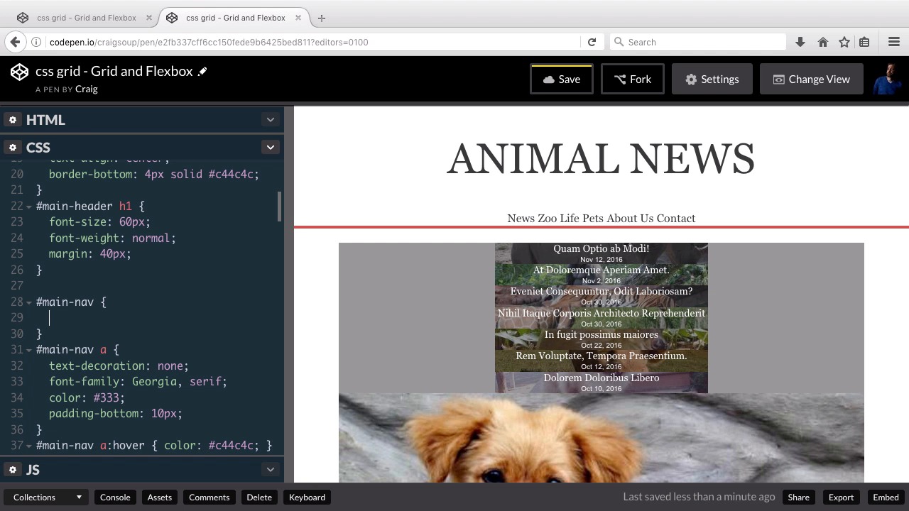
4.2 Flexbox Menu
We’re now going to step outside of Grid for a moment, instead using Flexbox to lay out the main navigation.
Related Links
1.Introduction
1.1Introduction00:40
1.2Using Firefox Nightly03:15
2.Project 1: Simple CSS Grid Layout
2.1Basic HTML Setup for Grid Layout02:37
2.2Creating a Simple Layout Using Column Spans09:21
2.3Creating a Simple Layout Using grid-area08:20
3.Project 2: Intermediate CSS Grid Layout
3.1Looking at the HTML04:43
3.2Nested Grids08:19
3.3Alignment and Justification06:06
3.4Finishing Up02:30
4.Project 3: Advanced Grid Layout
4.1What You Will Be Building09:26
4.2Flexbox Menu02:09
4.3Laying Out the Main Grid09:04
4.4Styling Cards09:49
4.5Laying Out the Archives02:52
5.Conclusion
5.1Final Thoughts00:31
4.2 Flexbox Menu
Hello and welcome back. In this lesson, we're gonna get started on the CSS for our third and final project. And we're gonna tackle our main navigation first. So we're not even gonna be dealing with the CSS grid layout here, we're gonna be dealing with flexbox. So I wanna start by forking our starting pen, and you can find the URL for the starting pen in your course notes for this lesson. So we'll click on Fork to start with a fresh copy, and then we'll get started. So as a review, we have this nav element near the top of our HTML with an ID of main-nav. And then each of the items inside that are going to be individual anchor tags. So that's what we're gonna be styling here. Let's jump into our CSS and if we scroll down a little bit, you'll see that we already have a rule for the main-nav anchor tags just to style the hover effect and things like that. Let's move just before that and let's create a separate rule for the #main-nav element itself. So it's an id of main-navs, so we're using #main-nav and again this is going to use flexbox. So we're gonna set our display here to flex. And if you want more information about flexbox, if you've never used it before, you can search for that on Tuts+ and there's plenty of information for it out there. And then I'm going to use the justify-content property to space these items out individually, and what I'm gonna set it to is space-between. And that'll set the space between these items to an equal distance. And then the last thing we need to do here is set the width to the same width as our container below it. So let's just jump down to the next line. We're gonna set our width to 740px. And then we need to center it, so we're gonna set our margin to 0 auto, and that gets our main navigation unit where we want it to be. So now that we've got our main navigation out of the way, in our next lesson, we'll move forward with the rest of our site. So let's Save our changes, and I'll see you then. Thank you for watching.


