

- Overview
- Transcript
4.4 Styling Cards
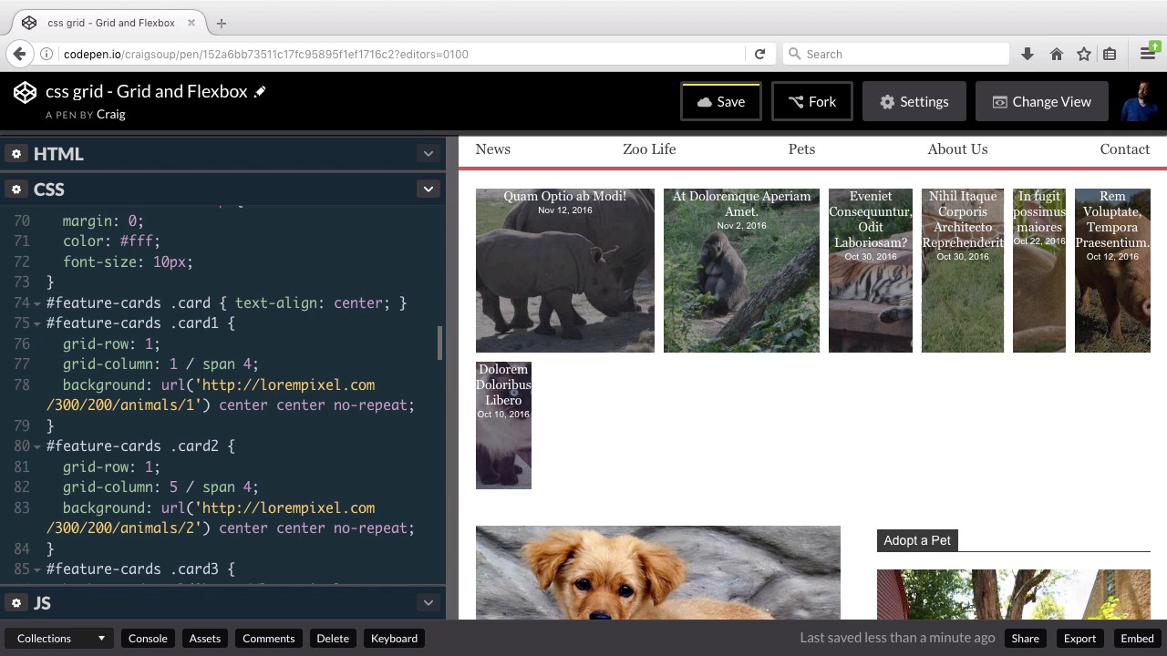
Now that the main grid is laid out, it’s time to move on to our nested grids. In this lesson, you will lay out the cards for the first section of our grid.
Related Links
1.Introduction
1.1Introduction00:40
1.2Using Firefox Nightly03:15
2.Project 1: Simple CSS Grid Layout
2.1Basic HTML Setup for Grid Layout02:37
2.2Creating a Simple Layout Using Column Spans09:21
2.3Creating a Simple Layout Using grid-area08:20
3.Project 2: Intermediate CSS Grid Layout
3.1Looking at the HTML04:43
3.2Nested Grids08:19
3.3Alignment and Justification06:06
3.4Finishing Up02:30
4.Project 3: Advanced Grid Layout
4.1What You Will Be Building09:26
4.2Flexbox Menu02:09
4.3Laying Out the Main Grid09:04
4.4Styling Cards09:49
4.5Laying Out the Archives02:52
5.Conclusion
5.1Final Thoughts00:31
4.4 Styling Cards
Hello and welcome back. In this lesson we're going to tackle our feature cards section which is this top section of our website right now it's just a bunch of boxes of text closely clumped together and now we want to spread it out into a nice layout. So the first four of Of these items are going to be laid out in the first row of our nested grid and the last three are gonna be laid out in three columns. So let's get started. Let's start off by forking our starting pen which you can find the URL for in your course notes for this lesson. We'll click on fork. And we'll jump into our C.S.S. So this section is the feature cards section and we're going to scroll down in our C.S.S. until we find that here. And remember we gave this a grid area name of cards. That's for our outer grid but the inside of this section is going to be an inner grid so not only are we giving this a grid area name We're also going to set this up as a new grid system, so we're gonna set our display here to grid. Now, I want there to be a gap of about ten pixels between each of these grid items, so we're gonna set up our grid gap to a value of ten pixels, then we're gonna set up our grid the template columns. And the way we're gonna set this one up Is going to be a little different. We're going to use the repeat function and I'm going to type this out and then I'll explain why after I type it out. We're gonna use the repeat function. We're going to repeat 12 times at 1fr, using that fractional unit. So we're gonna have 12 separate columns of equal width laid out next to each other. Now as you can see by default these are not equal with. Because the content inside them is kind of pressing them open and making them take up more space than they need to. But initially we're going to have 12 columns, they're going to be pretty small that all take up the same amount of space by default. And the reason I chose the number 12 here is because we're going to have I believe I said four columns on the top. Are actually going to have three columns on the top row and four columns on the bottom row, so that the top row the images are gonna be a little bit larger and the smallest number of columns we could potentially use to set up a grid system that would incorporate a three column grid as well as a four column grid Is twelve. So if we have 12 columns. Then if we want to three column row. Each of those three columns could span 4 of those 12 columns and then for second row which is going to have 4 columns in it. Each of those 4 columns will span 3 columns. Of the twelve column system. So, I hope that made sense, It's gonna make more sense, once we lay everything out. So, we've set it up, again, to have 12 equal sized columns. Let's jump to the next line, and let's set up our rows. We're gonna have grid-template-rows, and I wanna set up the height of these two rows. For our first row, I want it to be 180 pixels tall And we can see that those items have already adjusted, and for our second row which I'm going to put a space here with the second row to be a little shorter we're going to set it up to be one hundred forty pixels tall. So you can see that it's already nudged everything else down a little bit to make room For that second row. So, now all we have left to do is to go into each one of these individual cards and tell our browser. How many of those twelve columns we want that particular card to span. So, our first row again is going to have three images or three columns in it. So each of those three images needs to span four columns of that twelve grid twelve column grid system excuse me. So let's do that we're going to scroll down to card one where Where we have the background the url setup. And we're going to specify a couple of things here I'm gonna specify the column and the row just to make sure that our browser knows exactly what we want to do with this. So we're gonna set our grid row two a value of one we want to show up on the first row. Then I'm going to set up the grid-column and I want this to start in column 1 and I want to span 4 columns. And that will make that particular image that first image one third of the total width. So then, we're going to go down to card2. And we want it to be on grid-row 1 as well. And then we're going to set it up to take up the same amount of space. So, this one is gonna start at grid column of 5. Remember, our first item is spanning four columns. So, our second one needs to start at the fifth column. So, we're gonna start in column 5 and it also is going to span Four columns and we see that that has stretched out and it's now gotten wide enough to knock that second item down or to knock that last item. Excuse me down to the next line. Then we're going to jump down to card three. And we're gonna do kind of the same thing. We're going to start with grid row one and then for our grid column It's going to start at the ninth column, and it also is going to span four columns of that twelve column system, and now we can see all three of those side by side. Now you'll see that the first one is wider than the second and third. Why is that?. Well the reason for that is we haven't finished testifying Everything for our second row so it's trying to fit all of those into 4 columns and assuming that everything else is just supposed to be blank. Obviously that's not what we want, so we just need to finish filling this out. So we're going to go to card 4 And this one is gonna start at Grid row 2. Then we'll set up the grid column. It's gonna start in column 1. It's going to span 4 columns. There we go. Now the top and bottom. I'm sorry this is not supposed to spend 4 it's gonna spend 3. Because there gonna be four of these side by side and those need to add up to twelve. So we're gonna have four columns that each has spanned three of the twelve columns. So we'll jump to card five. This one is also gonna start at Grid row two. And for our Grid column this time remember they're each expanding three columns. So this one is gonna start a column four. And spans three columns and we're getting closer. So we'll move down to cards six will start it at grid row two. And we'll set up its Grid column layout to start at columns seven. And it's gonna span three columns as well. Let's make sure we spell that out, span 3, there we go. And then finally our last one. And if we don't set up a span, as you can see, it just assumes that we just wanted to take up one single column. So that's why it's just taking up a little bit of the room that's left. It's not going to assume that we wanted to take up all three of those Last three columns, so we have to specify that. So for card seven, again we're gonna set it up for the second row and then we'll set up our grid column as well, it's gonna start at 10, And it also is going to span three so now it is as wide as the rest. So now we have this really nice layout or we have three columns on the top row and four. Ones on the bottom row. So the last thing I want to do here before we move on to the next lesson is, I want to align our text so that it's not just horizontally centered, but that it's also vertically centered and we're going We're gonna do this in our card content class and let's take another look at our HTML so we can see what that looks like. So, for each of our cards, we have what we see right here. So we have a div with the class of card Inside that we have a diff with a class of card content and inside that we have our text. Now the card itself the outer div is the one that has the background image. To it. So those are going to be the divs that have the rhino And all of the other animals set up as the background images. The inner divs here, has our text yes but it also has a semi transparent black background, and it's so much transparent so that we can see through it but the goal of that is just to darken up the image a little bit so that we can really read the text that's on top of it. So, this card content div of again it's the one with the text on it. So, it's the one we want to set up now, and we're actually gonna use the flex box model to vertically center our text. So, let's jump back to our CSS, and here's our card content rule here, and you'll see we've already set up that background color to be a it's actually a dark gray at 50% transparency. And underneath height 100% we're going to set this up. So we're going to set our display here, to flex and as you can see that messes with our text a little bit but we can quickly fix that We're going to set our flex direction because it's assuming that we want this to have multiple columns which is why it said there are title text up next to our date text that set those up as two separate columns, but we want to set this up as As a single column of multiple rows. So we're gonna set flex direction to column, and now we see we're back to having just one row. Then in order to vertically center our content, all we need to do Is use the justify-content rule and set it to center, and then our text will jump down to exactly where we want it. So we've got the cards section set up. Let's save our work, and we'll move on to the next lesson. Thank you for watching.


