

- Overview
- Transcript
3.2 Nested Grids
Sometimes, you may find yourself in need of a grid system within another grid system. In this lesson, you will create nested grids using the CSS Grid Layout module.
Related Links
1.Introduction
1.1Introduction00:40
1.2Using Firefox Nightly03:15
2.Project 1: Simple CSS Grid Layout
2.1Basic HTML Setup for Grid Layout02:37
2.2Creating a Simple Layout Using Column Spans09:21
2.3Creating a Simple Layout Using grid-area08:20
3.Project 2: Intermediate CSS Grid Layout
3.1Looking at the HTML04:43
3.2Nested Grids08:19
3.3Alignment and Justification06:06
3.4Finishing Up02:30
4.Project 3: Advanced Grid Layout
4.1What You Will Be Building09:26
4.2Flexbox Menu02:09
4.3Laying Out the Main Grid09:04
4.4Styling Cards09:49
4.5Laying Out the Archives02:52
5.Conclusion
5.1Final Thoughts00:31
3.2 Nested Grids
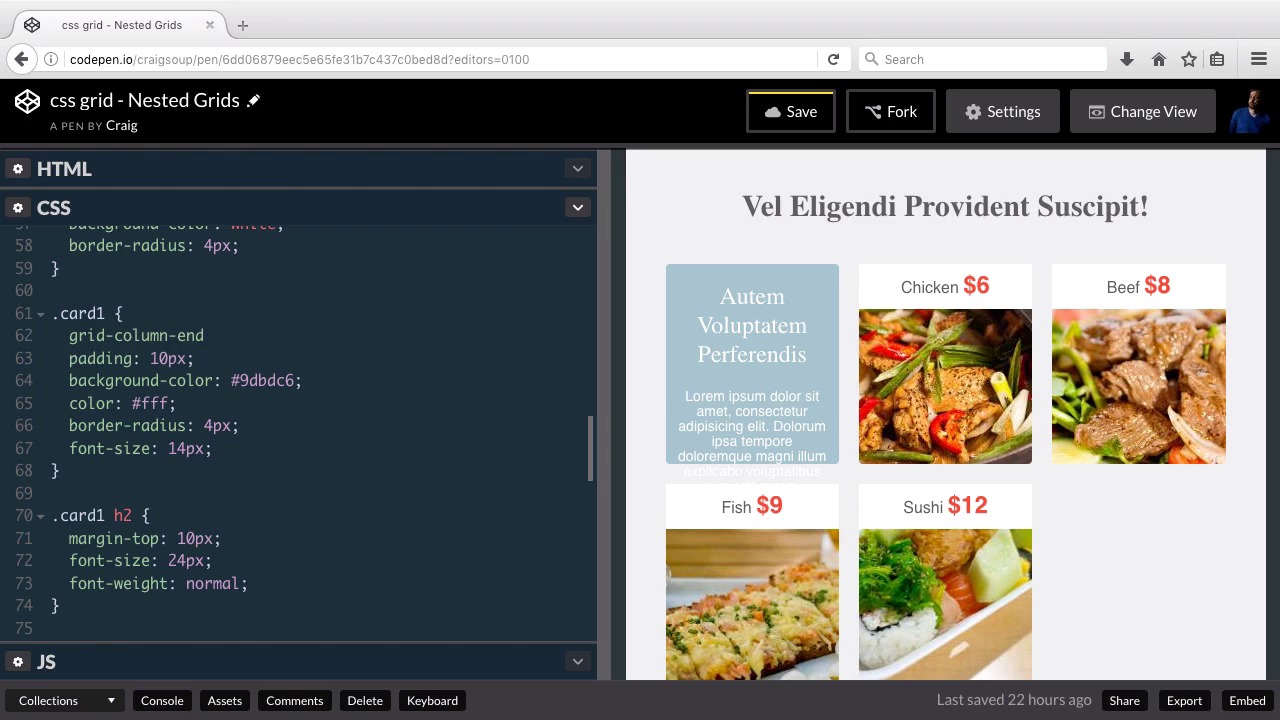
Hello and welcome back. Now that we understand the basic structure of our HTML, let's move forward and start styling our new grid system. So, if you don't completely understand everything about the HTML, then I would highly encourage you to go back to the last lesson and watch over that video one more time, as well as taking the time to look through the HTML and really understand how it's structured. So, again we have our section with a class of container, that's gonna contain everything that we see over here on the right. It contains all of our content, that's also gonna be our main grid container. Inside that, our main grid items or grid areas are gonna be this main one div, and that's gonna contain the title here as well as all of these cards. And right now they don't look like cards but they will soon. And that ends at the bottom of this card's section and then under that we have our second section which has a class if we scroll down of main two. And as we talked about in the last lesson, this main two section is going to have some text here but also to the right which we can't see yet there's going to be an image. So our outer containing grid system is really just one column, and technically we wouldn't really need it to behave as a grid system. I just wanted to show you the potential that we have for nesting grids one inside of another. So really right now we have a one-column grid. The first row of that column is going to contain this title, all of these cards here, and then the second row is gonna contain everything else, and it's gonna have two columns itself. So let's start with our container class, so let's just jump into our CSS. And again, our container class is the item that contains all of our content here. And we wanna turn that into a grid system. So just beneath margin 0 auto, I'm gonna add a new property for display. We're gonna set that equal to grid, and then we're gonna set up our single column. So we're gonna do grid, template-columns, and you could very easily add a second column here if you wanted to. So don't necessarily consider this a fully fleshed out design. This is kind of a starting point. You could easily add another column over here to the right if you wanted a sidebar with some other items on it. But for now we're just gonna make this a one-column setup, so we're gonna have grid- template-columns, and we're just gonna do 1fr. And again, that fr unit is a fractional unit that was set up for this grid system, and basically that fractional unit is just relative to any other fractional units you use. So, if we have three items that say 1fr, then that's gonna set it up as three columns that all have the same width, and we only have two columns here, so you can see each of those two columns takes up one third of the viewable area. If we did have more content in another column, it would show up over here on the right. Now if we were to change one of these to 2fr, then it would end up being twice as large as the first one, but keep in mind that these numbers are somewhat arbitrary. If for example we were to do three columns with 2fr, then that would be the exact same thing as doing three columns with 1fr. So it really just, it's kind of an arbitrary number that you can select to determine how wide each of your columns are in relation to the other columns you've created. But again, we're just using one column here. So I'm gonna set this to 1fr. And then under rows, we're gonna have two separate rows, and I want the height of these rows to auto adjust. So we're gonna set grid template rows to auto auto, because we have two separate rows here, if we had three rows we might do auto three times or we could use the repeat function, if we wanted one of these rows to be a specific height, we could do that here. So, if we wanted it to be 200 pixels high, we would set it up like this, so our first two rows would auto adjust to the content that's in them, and then the third row would be 200 pixels tall. Well again, we're just using two rows here, so we just have auto auto, so our main container is set up and as you can see nothing really changes here. So now we can jump into our cards section and set it up. Now remember, this heading here is just an H1 element and that's inside this first row, but after that H1 element we have our cards which starts with this text block and ends with the last image of food that we have here. And we're going to set these up so that we have three columns here, and this text box is gonna take up two columns, this chicken image is gonna take up the last column, and then on the second row these three items are gonna take up one column each. So, let's scroll down in our CSS, and here we have a rule for the card class itself which represents one of these cards, but we don't have a rule, I believe, we don't have a rule for the entire cards section. So just above that card rule I'm gonna create another rule for the container of that section which has a class of cards applied to it. So, this as well is going to have a display of grid, so now we have a nested grid system, we have one grid inside another, and then we're gonna set up our columns. So we're gonna do it the same way we've done it before with grid template columns and we're gonna have three equal sized columns, so I'm gonna use 1fr for all three of those, if I can spell it right, there we go. And you can see automatically that they're starting to jump into place, into these separate columns. Now, they're not exactly where we want them just yet but we're getting a little bit closer. Now, for our rows I want them to each be 200 pixels tall. And one thing you'll notice is that these items are already set up to be 200 pixels tall in our card class. So I'm gonna get rid of that now. And I'm gonna set that up inside our cards grid. So after grid-template-columns, I'm gonna do grid-template-rows, and these are gonna be 200px each. So we could say 200px 200px, and they would all be 200px tall, or we could do it a different way using the repeat function, we could do repeat. And an inside parentheses, we would say we want it to repeat two times. So we'll say two comma, and then 200px. So for every row, we're going to make it 200px tall. Now, I don't want these cards to be right up against each other, so I'm gonna put a little bit of a gap in our grid. And we can do that using the grid-gap property, and let's say we want that gap to be 20px. And then I don't want our grid system here right up against the edges, so I'm gonna put a little bit of padding inside our cards container, and we're gonna make that 40px, and there we go. So the last thing I wanna do as far as the layout of these cards, is I wanna make sure that the first card is twice as wide as the other four cards. And the first card has a class of card one applied to it which is what we've got here, we set our background color and we set some styles for the h2 inside that card as well, but I also wanna make sure that it spans two columns. So what I'm gonna do is I'm gonna use the grid column end property, and you can do this to tell your browser how many columns you want this to span, so we could say span two. And what that will do is it will tell us no matter where our grid column starts, we want this particular column to take up two columns of our grid system, so we can now see that it is taking up two columns. So that's a good place to stop for now, I wanna apply some more styles to our cards here and then finish up with our second row down here at the bottom. But again that for now it's a good place to stop. So if you've been working with your own copy of this, go ahead and save a copy of that before we move forward, and I'll see you in the next lesson. Thank you for watching.


