- Overview
- Transcript
3.4 Finishing Up
In this lesson we’ll finish up the layout of the current project by styling the second row of the outermost grid system.
Related Links
1.Introduction2 lessons, 03:55
1.1Introduction00:40
1.2Using Firefox Nightly03:15
2.Project 1: Simple CSS Grid Layout3 lessons, 20:18
2.1Basic HTML Setup for Grid Layout02:37
2.2Creating a Simple Layout Using Column Spans09:21
2.3Creating a Simple Layout Using grid-area08:20
3.Project 2: Intermediate CSS Grid Layout4 lessons, 21:38
3.1Looking at the HTML04:43
3.2Nested Grids08:19
3.3Alignment and Justification06:06
3.4Finishing Up02:30
4.Project 3: Advanced Grid Layout5 lessons, 33:20
4.1What You Will Be Building09:26
4.2Flexbox Menu02:09
4.3Laying Out the Main Grid09:04
4.4Styling Cards09:49
4.5Laying Out the Archives02:52
5.Conclusion1 lesson, 00:31
5.1Final Thoughts00:31
3.4 Finishing Up
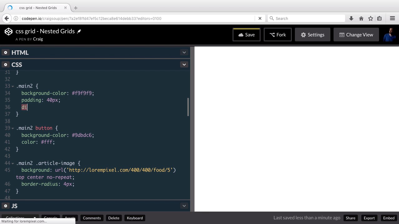
Hello and welcome back. In this lesson we're gonna finish up our second intermediate grid layout by styling our second row down here at the bottom which is going to have two columns in and of itself. And this second row is contained inside a div of the class of main2, so that's what we're working with here. As you can see, we've already given it a background color of F9, F9, F9. And the padding of 40 pixels. We've also styled the button inside that particular section as well as an image. So, you'll see that we have an article image div inside main two and right now that's just a blank div. There's nothing inside that there's no content. We're simply going to use a background image for that, as we've laid out here and and we're gonna fill it in that way. So let's set this up as another nested grid system. So you can find the URL for this particular CodePen in the course notes for this lesson. Once you open that up, go ahead and click on Fork, and we'll start with our new version here. So I'm gonna expand this out a little bit so we can see a little better. And then we'll scroll down to the main2 section. So for main2, again, just like we've done before, we're gonna set it up by creating a display property and setting that equal to grid. And then this is just going to be two equal sized columns. So we're gonna have the text on the left and the image on the right. So, by now you should know how to do that really well. We're gonna use the grid-template-columns property, and we're gonna set both columns to 1fr so that they will be equal size. Then I'm gonna set the grid gap here, just like we did for our other grid to 20 pixels, so that there will be 20 pixels of spacing in between those two grid items. And as you can see, we have now set up our grid system here. Now, the reason I did it this way using a background image instead of an actual image tag, is because it's easier to resize this using background images. With a background image, we can set up the width and height of this area within our grid system. And then we can just resize the background image to fit and that's about it. So we've we finished up our second intermediate project here and now we can move on to our third. So let's save our changes and we'll move on. Thank you for watching.


