

- Overview
- Transcript
3.1 Looking at the HTML
Let’s review the starter HTML that has been set up for our second project. We’ll also discuss goals for how this content will be styled.
Related Links
1.Introduction
1.1Introduction00:40
1.2Using Firefox Nightly03:15
2.Project 1: Simple CSS Grid Layout
2.1Basic HTML Setup for Grid Layout02:37
2.2Creating a Simple Layout Using Column Spans09:21
2.3Creating a Simple Layout Using grid-area08:20
3.Project 2: Intermediate CSS Grid Layout
3.1Looking at the HTML04:43
3.2Nested Grids08:19
3.3Alignment and Justification06:06
3.4Finishing Up02:30
4.Project 3: Advanced Grid Layout
4.1What You Will Be Building09:26
4.2Flexbox Menu02:09
4.3Laying Out the Main Grid09:04
4.4Styling Cards09:49
4.5Laying Out the Archives02:52
5.Conclusion
5.1Final Thoughts00:31
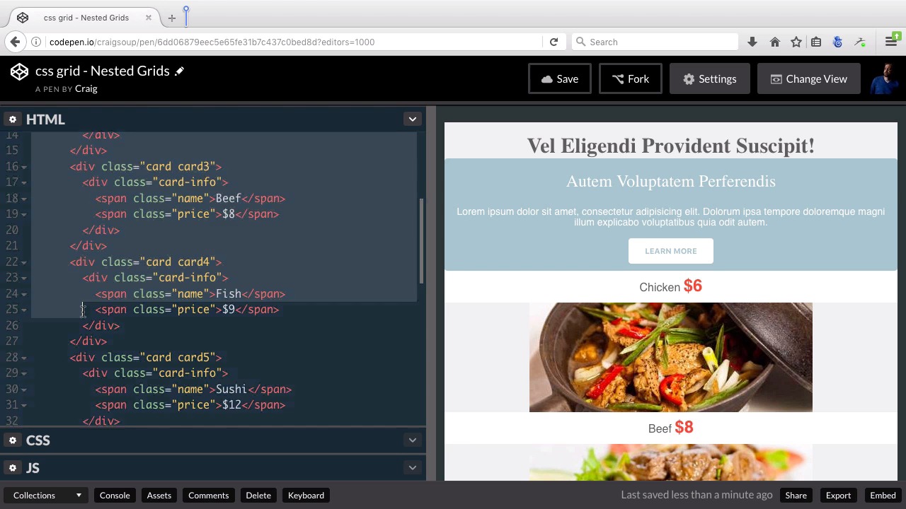
3.1 Looking at the HTML
Hello and welcome back. In this lesson, we're gonna get started on our second project, which is kind of an intermediate level grid layout here. And if we look at our starter pen here you'll see that right now we just have a bunch of content stacked on top of each other, and that's obviously not what we want. We wanna put this in a grid format. So what I wanna do with this, is I want this first box here with the blue background, I want it to be part of the same grid that's gonna have all of these food items here, so I want this first item to be a little bit bigger than the rest of them. So this text box here with the learn more button and it's gonna take up two columns, while the rest of these each take up one column. They're gonna be like small cards displaying a food item ana a price. So all in all for this section we're gonna have three columns and this text here is gonna take up two columns, and then this chicken will be the last item or the last column on that first row, and then the last three items are gonna be the second row. Then below that section, we're gonna have another section with some more text and then we're gonna have an image to the right of that text. So we gonna have a two column layout there. So in this particular project, we're gonna have nested grids. We're gonna have our overall grid which contains everything, and it's basically gonna be, for all intents and purposes, it's just a one column grid. But it's gonna have a couple of grids inside it. So the very first area in the outer grid is gonna be everything from this title all the way down to these menu items and then, the second row of that grid is gonna be this bottom section. So let's take a look at the HTML and again you can find the URL for this starting pen in the course notes for this lesson. And if we look at our HTML you can see that again. I've got everything inside a section element called container. It has a class of container inside that container, remember the direct descendants of the container are going to be the areas within your grid system, so our first area is this main one area which has the H1 heading. It has this section with all of the cards in it, which are going to be all of these pictures of food with their prices and everything. And then we have the main two section which is gonna have some text. And then an article image and you can see that this article image is inside an empty div. We're gonna take care of the image itself using CSS. And if we jump into our CSS, we can see what we've started with there. So at the top, we've just set the box sizing, the border box. In our body, we've set a few styles related to text and margins and padding. We've set some styles for some of our heading tags, we've set styles for our buttons and then we have our container which is our main container which we're going to add the grid display property to. But for now we've just set a background color and aligned it to the center, given it a with 640px and set margin to 0 auto to center it on the stage. Then we have our main2 section which is, what comes below all of these pictures of food that's this bottom section here. We set it, scroll down there. We set it to a different background color, added some padding and style that button. And then we have the article-image which is gonna come to the right of this particular item. And you'll see that I've already entered in the url for that image. Once we've set up the grid for that part, then that image will show up right now, that article-image div, doesn't take up any space, so we're not able to see that background image, but will get to that later on. And then we have the CSS for our card set up. So, each individual card is gonna have a background-color of white, boarder-radius of 4px, height of 1200px and, we're gonna, eventually, get rid of this height, and let the grid take care of it, but, for now, it's there so that we can see the images. And then we have some style specific to all of the individual cards. And you'll see that card1 is a little bit different, because card1 is this top card with the text in it. It's not the same as all the other cards that have the images of the food in it. So this first one is gonna be larger and it's also styled differently, because it's a different type of card. And then you can see all the background images for all the other cards. So you can look through all of that CSS, all of the HTML make sure you have a pretty good grasp of what's going on there before we move on to the next lesson. So thank you for watching. And I'll see you then.


