


- Overview
- Transcript
2.3 Creating a Simple Layout Using grid-area
In this lesson, you will create a similar layout to the one we discussed in the previous lesson, but this time you will be defining template areas and giving them names.
Related Links
1.Introduction
1.1Introduction00:40
1.2Using Firefox Nightly03:15
2.Project 1: Simple CSS Grid Layout
2.1Basic HTML Setup for Grid Layout02:37
2.2Creating a Simple Layout Using Column Spans09:21
2.3Creating a Simple Layout Using grid-area08:20
3.Project 2: Intermediate CSS Grid Layout
3.1Looking at the HTML04:43
3.2Nested Grids08:19
3.3Alignment and Justification06:06
3.4Finishing Up02:30
4.Project 3: Advanced Grid Layout
4.1What You Will Be Building09:26
4.2Flexbox Menu02:09
4.3Laying Out the Main Grid09:04
4.4Styling Cards09:49
4.5Laying Out the Archives02:52
5.Conclusion
5.1Final Thoughts00:31
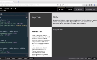
2.3 Creating a Simple Layout Using grid-area
Hello and welcome back. In our last lesson, we created a simple grid layout using columns spans. And this lesson, we're going to create the same layout. But we're going to do it in a slightly different way. We're going to do it this time using grid template areas. We're still going to define the width of our columns. But then we're gonna use the grid template areas property, to define which of these sections here belongs in what areas of the total grid layout. And it's kind of hard to explain without showing you, so let's just get started. So I've got a new code pen opened up here and you can find the starting pen, you can find the URL here in the course notes for this particular lesson, once you open that up. Go ahead and click on Fork to create your own copy of it. And then we'll start with this new copy. So you'll see it's the same basic HTML that we had before, the only difference between this and the very first starting pen is I've added a little bit of CSS here to kind of style the padding in the colors, and these are the same styles that we applied in the last lesson as well. So now I want to set up our grid one more time, so if you remember our containing element has a class of containers, so we're going to point to the container class and we're going to set the display here to grid just like we've done before. And as you can see, that doesn't by default change anything because we haven't defined our properties yet. So we're gonna do the same thing with our template columns, we're gonna use the grid-template-columns property to define how many columns there are and how much space those columns are gonna take up. And we're gonna have the same set up here, where we have a 30% width column, and a 70% width column. So we're gonna have two columns side by side, but this time we're going to define where each of our sections. Needs to be placed within this entire grid system, and we're gonna do that using a property called grid-template-areas. So what we're gonna do is we're going to give each one of these areas a name, and we're gonna use those names that we're gonna give to these areas. We're gonna use those names within this property. So the way this property is set up is kind of interesting, it's kind of different. And let's go and take a look at it. So we're gonna start by creating a string. We'll have opening and closing quotation marks and then inside this first set of quotation marks, we're going to define what's gonna go in each of the columns for the first row. Now remember, we only have two columns a 30% column and a 70% column. And the first row is going to be our header, our header is going to span both of those columns, but instead of using spans we're gonna have named areas. So let's call this particular area header, easy enough. So when we define what area is going to be placed in this top left column or top left cell. We're just going to type in the word header here, now we haven't actually created the grid area with the name of header but we're gonna do that in a moment, we're gonna give it the same name we see here. But the thing is we want this header to take up both columns. So what I'm gonna do, is I'm going to type space and then I'm going to type in the name of the area that we want to place in the second column of the first row. On the second column of the first row, I still want the header to span across that so I'm also going to type header here for the second item. So what this is gonna do is, it's not gonna create two different columns, two different identical copies of this header area, instead it's gonna span that single header area across the entire first row. So then when we define our second row, we need to go outside the quotation marks here. I'm gonna jump down to the next line and just tab over, so that it's easier to read this way. And I'm gonna do the same thing for the second row here. I'm gonna put another set of opening and closing quotation marks. Notice there's no comment in between them, we just have it on the next line, and then we're going to define what we want to place in the first and second column for our second row. Well in our first column I want the side bar. So, let's give that area a name of sidebar. In our second column, the wider column, let's put our article. So I'm gonna give it a name of article. Now again we haven't actually created these names yet, we're just spelling them out here to kinda give us an idea of where everything's going to be laid out. So in our first row, we're gonna have the header taking up both columns. In our second row, this sidebar will take up the first column which is 30% of the width. And then our article will take at the second column which is, 70% of the width. And you can probably guess what we're going to do with the third row. With the third row we have our footer, and that footers gonna take up the full width again so we want it placed in both columns. So we're gonna name it footer, we'll say footer space footer. So this gives us our entire grid layouts. So we're gonna end that with a semi-colon. And now all we need to do to get this to work is to go into each of these sections or areas and name them, and the way we name them is we use the grid area property, and then just give it a name. So let's go to. Our main header. We got to create a rule for it by itself. And we're going to again call in the grid-area property and we're going to give it a name of header. And so now you can see that header takes up both columns, because this name here matches the name we gave it up here. And you can give it any name you want to. If you wanted to you could just call this section a and then we would define it as section a and section a. And it would give us the same result. And I've seen people do that. I've seen them use a, b, c or one, two, three or whatever. So I'm just gonna change that back to header, because I like a more explicit names. It's easy to look at and see what's going on there. And then we'll change it here as well. So then we're gonna jump in to our side bar, which is going to be our next section, and has a class of sidebar. Actually we already have a rule for the sidebar class right here. So we're giving it a background color of light gray, and we're also going to assign it a grid-area name. So grid-area and this one we gave the name of sidebar. So we'll just copy that and we'll paste it here. And you'll notice that everything up here is in quotation marks. Down here, you'll notice the word sidebar is not in quotation marks. It's just the name that we gave it. So you'll notice it's already placed in place there. So nothing really changes there and it's gonna be the same whenever we point to our main sections of .main we can give it a grid-area. And that is called I believe article. There's article right there. So we'll give that grid-area and name of article so that it matches, and again as you can see nothing really changes. But when we go to our footer, we should see something change because right now it's only expanding one column. So let's point to our .main-footer class. And we need to call this grid-area footer. Again because that's the name we gave to it up here. And now we see that footer is taking up both columns. So as you can see, the changes we've made here have given us the exact same result that we had in the last lesson. It's just a different way to do things. We're setting up our template areas using the grid-template-areas property and giving new each of our areas a different name, as opposed to just telling each section where we want to start and how many columns or rows we wanted to span. So thank you for watching and I'll see you in the next lesson.


