- Overview
- Transcript
4.5 Laying Out the Archives
It’s time to finish up the last section as we set up a three-column layout for the archives section of the web page.
Related Links
1.Introduction2 lessons, 03:55
1.1Introduction00:40
1.2Using Firefox Nightly03:15
2.Project 1: Simple CSS Grid Layout3 lessons, 20:18
2.1Basic HTML Setup for Grid Layout02:37
2.2Creating a Simple Layout Using Column Spans09:21
2.3Creating a Simple Layout Using grid-area08:20
3.Project 2: Intermediate CSS Grid Layout4 lessons, 21:38
3.1Looking at the HTML04:43
3.2Nested Grids08:19
3.3Alignment and Justification06:06
3.4Finishing Up02:30
4.Project 3: Advanced Grid Layout5 lessons, 33:20
4.1What You Will Be Building09:26
4.2Flexbox Menu02:09
4.3Laying Out the Main Grid09:04
4.4Styling Cards09:49
4.5Laying Out the Archives02:52
5.Conclusion1 lesson, 00:31
5.1Final Thoughts00:31
4.5 Laying Out the Archives
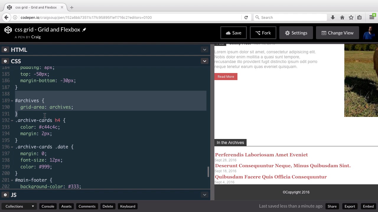
Hello, and welcome back. In this lesson, we're gonna set up our very last section which is down here at the bottom. It's the Archives section, and this should be quick and easy. We've got three different articles we're gonna link to, and we wanna set those up in columns. So it's gonna be a three-column setup, very, very easy. So let's take a look at the archive section in our HTML. So we have the section with an id of archives and then underneath that we have this h4, which is our section title in the archives. That's this heading up here at the top of the archives section and then we have this div inside it with a class of archive cards. This is where we're gonna set up our grid layout because each of these cards inside of it is going to take up one column. So you can probably already figure out how to set this up on your own and I would even challenge you to go ahead and pause the video and set it up for yourself before I move forward. But I'm gonna assume we've already done that and I'm gonna jump into our CSS and get started. So underneath our feature card section we have our feature articles section. Underneath that, let's just keep scrolling until we find our archives, there's a side bar. And here's our archives, oops, didn't mean to right click there. Here's our archives right here, so again, we're not gonna use this archives id, as our new inner grid container because remember we have that archive-cards class inside it. So here we have archive-cards h4, that's gonna be this red text here. So just before that, let's create a new rule for the archive-cards class by itself. So archive-cards, and then inside that rule, we're gonna set the display to grid. And we're gonna set up our grid template columns, and if we want three columns of equal width, we'll just set each one to one fr. Now keep in mind, you don't have to use the fr fractional unit here, you can use specific pixels. You can use the word auto if you wanted to automatically adjust the width. But if you want equal sized columns you would use the fr unit. So now that we've done that you can see that everything has already been laid out exactly how we want it. The last thing I might do here is put a little space below this archive section just to separate it from the footer a little more, and we can do that here with the archives id. I'll just add margin bottom of maybe 20 pixels and there we go. That gives us a little bit of separation there you can do more if you want but there we go. So that wraps it up for our more advanced layout, hopefully you've learned a lot in the process of doing this. But let's go ahead and save our work and move on to the next lesson. Thank you for watching


