

- Overview
- Transcript
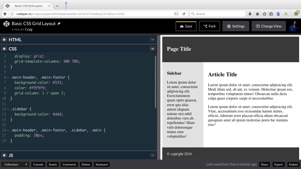
2.2 Creating a Simple Layout Using Column Spans
In our first version of this simple Grid layout, we’re going to define our grid areas using the grid-column and grid-row properties.
Related Links
1.Introduction
1.1Introduction00:40
1.2Using Firefox Nightly03:15
2.Project 1: Simple CSS Grid Layout
2.1Basic HTML Setup for Grid Layout02:37
2.2Creating a Simple Layout Using Column Spans09:21
2.3Creating a Simple Layout Using grid-area08:20
3.Project 2: Intermediate CSS Grid Layout
3.1Looking at the HTML04:43
3.2Nested Grids08:19
3.3Alignment and Justification06:06
3.4Finishing Up02:30
4.Project 3: Advanced Grid Layout
4.1What You Will Be Building09:26
4.2Flexbox Menu02:09
4.3Laying Out the Main Grid09:04
4.4Styling Cards09:49
4.5Laying Out the Archives02:52
5.Conclusion
5.1Final Thoughts00:31
2.2 Creating a Simple Layout Using Column Spans
Hello and welcome back. In this lesson we're going to get started styling our first project, and there are two different ways that we're going to style this one. And we'll be using both of these two different ways as we move forward with our other two projects. So you can find the URL, for this code pin that we're gonna be starting with, in your course notes for this lesson once you open up that starting pin and go ahead and click on the fork button to create a new copy of that so that we don't overwrite what's already there. So, we're gonna start with a new copy and you should have all of the HTML in place there, and now we're going to move forward and add some styles. So, we have our section with the class of container which as you remember is the container for the entire entire grid system. Inside that grid system we're going to have our main header here. Note this as a class of main header. That's gonna take up the full width. Underneath that we're gonna have two items side by side, we're gonna have this sidebar in this main sections we have a class of sidebar in the class of main. And then under those we're gonna have a footer with a class of main-footer. So let's jump into our CSS, and let's apply some basic styles first. So let's point to our header first, and our header has a class of main- header. So we're gonna create a rule for the main header class, I'm going to give it a background color, of pound 333 and a text color, of pound f9f9f9 which is gonna be a very light gray color. And that's good enough for now. I'm not worried about the padding or anything like that yet. I just wanna get the basic colors in place. So then we're gonna go to our footer section and it's gonna be basically the same. So, we could just go into this rule here, and type comma space dot main hyphen footer. And our header and footer both have those basic colors applied to them. And then for our sidebar, I'm gonna give it kind of a light gray color. So we're gonna point to the sidebar class, which contains our aside element, and I'm gonna give it a background color of #ddd. And the reason I wanted to start off with this is so that we could clearly see,, where each of these sections is so our first section is up here at the top our side bar has a lead gray background. Our main section is just a plain white background, and then we have a dark background for the footer. So now we're going to set up our grid and it's very easy to do. We're first gonna point to our container and let's go ahead and do this at the very top. So lets nudge these down a couple of lines, and our container is the section that we created with a class of container, you don't have to give it a class of container you can call it whatever you want to but for the sake of consistency. I've called mine container and what we want to do first is change the display property and we're going to give it what a display of grid now, as we've talked about before the support for the grid system is very limited right now which is why we're using the nightly, the Firefox Nightly browser. With other browsers you can turn on support for the grid system, but those other browsers usually aren't as up to date as the Firefox and Nightly browser. So if you're getting things that don't look quite right, you might go ahead and try out that nightly browser because it's gonna work a lot better for you for now. Okay, so we've given our container a display of grid. Now we want to define our columns. We want to define how much space our columns are going to take up. Well, we have a pretty simple set up here, we have an aside which is this side bar, then we're going to have our main section with our article and it. Now I want the main section to take up a lot more room than our sidebar. Our sidebar which is this section here. It's going to be narrow and it's going to be off to the side as you can imagine, and then main section will be to the right, and it's going to take up more room. So, let's say that we want the sidebar to take up 30% of the width and the main section to take up 70% of the width, and then our header and footer are still gonna take up the full width of that grid, but they're basically going to span those two columns, just like you would if you were creating an HTML table. If you wanted something to span multiple columns, you would tell it how many columns to span. We're gonna do kind of the same thing here, but we're gonna do it using CSS. Now as we get into some more complex column set ups later on, we'll have to plan it out a little bit more but for now we've got a really simple set up so, I want to set up our columns again to be 30% for the left column and 70% of the width for the right column and we can do this. Using a new property called the grid, template, columns. And we're gonna set that to 30% space 70%. So what this does? Is this tells our browser that we're gonna have two columns. If we were gonna have three columns, we would just put another value out here, maybe 20%. Obviously, that adds up to more than 100 but you get the basic idea. As many entries as you have here, that's how many columns you're gonna end up with. Well, we just want two columns, So we're gonna have two different values here. First column will be 30% and our second column will be 70%. Now as you can see it's created that column set up force already, but it hasn't put everything where we want it and we'll fix that later. For now that's a good start. Now as I mentioned before, I'm not gonna go into all of the fundamental details of the CSS grid layout specification, and the reason for that is, since it still in development. Since it's still a working draft, it's very, very possible, even probable that some of the specification will change a little bit, before we're actually ready to deploy these sites to production. So I don't want to spend a lot of time walking you through all of these details, that may or may not change someday, for now I just want to give you a kind of a preview of what we have to look forward to. And a preview of how we can set these up because, I'm sure, overall the basic approach isn't going to change very much but there might be small details here and there that do. So again we've set up our columns to be 30% of the width for the left column, the other 70% will be the right column. So now, all we have left to do to set these columns up is to tell in our CSS. We need to specify each one of these sections, and how many columns we want them to span. So again, we have two columns which we've defined here, and for our header, this main header section we want it to span both of those columns. So the way we would set that up. Let's just come down here we already have a rule for main header and main footer. Let's create another rule for just main header by itself, main hyphen header. Actually, we could do this for both because they are both going to take up or span two different columns. So we can put this inside the main header main footer rule. And what we're gonna do is we're gonna call on a property called a grid column. And what we're gonna do is we're gonna tell it first of all which column to start with. We're gonna start with the first column, and then we can tell it how many columns we want to span, by putting a forward slash, and then we're gonna type out the word span and then the number two which tells it it's going to span to columns and we can already see that everything immediately jumps into place. Even though we haven't specified in our CSS where we want the sidebar and article, to be placed it makes some pretty valid assumptions about where to place those if we're not explicit about it. It's basically gonna to take the order of the HTML elements inside that containing element and just lay them out. So, it's going to assume that if you have two elements, and two columns that the first element will go in the first column, the second element will go in the second column and that's what's happened here. So then all we really need to do to finish this up, is to add some padding because it doesn't look too hot right now. So we can just gonna into our main-header, our main-footer, and our sidebar, and then our main section, which if we go back to our HTML and take a look, it has a class of main applied to it. So, we go back to our CSS and then after our sidebar we'll point to dot main. So inside this rule. I'm just gonna add some padding here maybe 20 pixels of padding. You can do more but you get the basic idea that will set everything up like we need it. Now obviously we can go into this and make it a lot prettier. But for now I just wanted to point out, how we would lay that out using this grid-template-columns set up. So in the next lesson we're going to create the same layout, but we're gonna do it in a little bit of a different way. So thank you for watching, and I'll see you then.


